
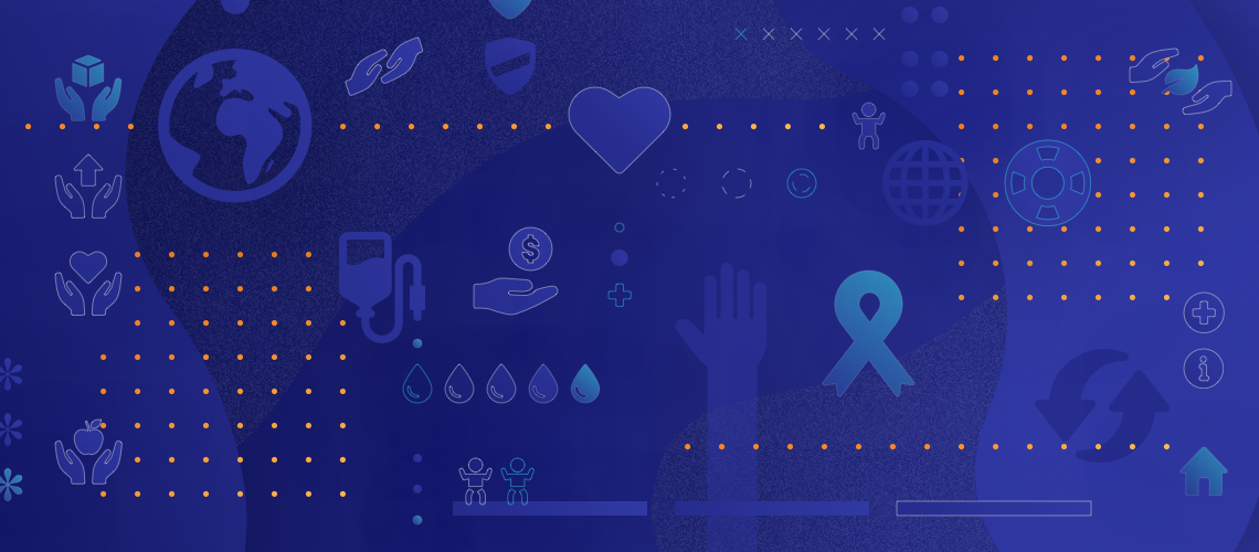
Building Good Websites for Do-Gooders
According to the National Center for Charitable Statistics (NCCS), more than 1.5 million nonprofit organizations are registered in the U.S.
The nonprofit space is becoming more cluttered, and it’s never been harder to break through and tell your story to the people who need to hear it. A strategic website can help nonprofits capture attention, raise awareness, and move people to action.
How to Best Build a Non-profit Website
Let mission drive everything.
More and more, organizations are taking the “start with why” approach. They’re letting their mission drive their marketing, rather than the service or product that they’re selling—and it’s working.
For the non-profit industry this concept is nothing new: your. mission informs all other aspect of your work. And, it should also influence your digital strategy. Tell your story with your mission at the center. Share the resources you provide, showcase communities you’re helping, and highlight the impact you’re having.
Show (don’t tell) your impact.
When people are deciding whether or not to support an organization, one of the biggest factors they care about is impact. Where will my money go? Who will it help?
Incorporating relevant proof points throughout your website can help build your ethos and help communicate the impact you’re having in your mission.
For example, if you’re asking for people to sign up for your annual 5K fundraiser, drop in how much it raised last year. Stories from volunteers, fundraisers, or people you’ve helped have a bigger emotional pull than a pitch coming from you.
Simplify the donation user flow.
Raising money is one of the most important things a website can do for your organization. That means “donate” is arguably the most important conversion. Don’t make it difficult to donate.
Include a clear CTA button in the top navigation, build multiple routes to the donation page, and create a donation form with clear microcopy and instructions. In addition, targeted user testing can help you discover any hiccups in the process and ultimately build the most frictionless donation flow possible.
Listen to all of your team members.
Nonprofits have a lot of goals: getting people involved, driving donations, helping their community or cause. Taking time to conduct multiple stakeholder interviews can help you truly understand how to cater your site to their needs.
Here’s some of Clique’s non-profit websites that we’ve designed for our partners over the past few years.
Lincoln Park Zoo
Lincoln Park Zoo is a fun, engaging place for Chicagoans to connect with wildlife, but it’s also so much more than that. They lead research around the world, educate Chicago communities about wildlife and conservation, and monitor animal care and welfare each and every day. The website needed to speak to all of these commitments and to all of their audiences. It needed to be engaging, inclusive, and representative of what the zoo means for everyone. Further, the Zoo is committed to being accessible; their website should be too. From the beginning of the project, accessibility was a priority—informing design, content, and strategic decisions.

Strategy
- User-centric information architecture to make navigation easier and more intuitive
- User-based landing pages to act as a quick resource for the high-priority, yet niche audiences
- Digital accessibility training with their marketing team to ensure the website stays accessible after launch
Design & Content
- 7 workshops throughout the project to help drive decisions and direction in content and design
- 40+ pages of copywriting done in collaboration with their in-house copywriting team to refine and finalize the messaging across the website
- Membership tier tables to better communicate the benefits of supporting the zoo
- Custom iconography to match their new brand execution
- Digital brand style guide to equip the zoo team for future digital projects
Development
- A calendar and events page that allows for featured events, as well as the option to view a list or expanded view of upcoming events
- Interactive, app-like map that allows a user to explore the zoo using their mobile devices
- Modular template with 26 different sections to create customizable pages for the various current and future the content to life on customizable pages
- CSS implementation over Javascript to increase performance and remove extraneous information from the build
- Smooth, delightful moments of animation to create an immersive experience
Action for Healthy Kids
Action for Healthy Kids (AFHK) is a non-profit dedicated to empowering schools, families, and communities to take actions that help kids lead healthier lives. In a time where poor health is becoming more and more of a national issue, they needed a website to spread their message and increase their impact.

The website is structured to communicate AFHK’s impact and be a resource to their target audiences—school staff, parents, and community members. There are interactive features, success stories, and meaningful statistics throughout the experience to increase engagement. Additionally, custom copywriting and design work together to convey the seriousness of their work, while honoring their playful brand.
Highlights include:
- Design elements to create a playful and professional experience, including non-traditional shapes, pattern icon treatments, and a footer scroll feature
- Interactive elements to help drive engagement, including a decision tree, fundraiser idea generator, and clickable map
- Decision tree to help school staff and parents get involved
- Fundraiser idea generator to help brainstorm ways to raise money
- Click-able map showcasing AFHK’s reach nation-wide
- Custom copywriting on key pages to connect with target audiences and tell an urgent, yet hopeful story throughout the site
- Integrations with various form sources—Salesforce, Pardot, and Formstack—to support the AFHK team’s workflow
United Way of Metro Chicago
United Way of Metro Chicago fights for the health, education, financial stability, and safety of every person in every neighborhood of Chicagoland. They needed a website that acted as a true resource for their different communities and told their stories.

As one of the biggest non-profits in the area, United Way has a lot of users to serve, including neighborhoods, corporate partners, affinity groups, volunteers, donors. The website is built for different user-need flows, making it a true resource for all, not just a repository. To drive donations and get people involved, stories are woven throughout the site and paired with clean, subtle design elements.
Highlights include:
- Story-driven content strategy to make a functional and emotive experience
- Modern design that embodies Chicago but follows national brand guidelines
- Modular templates to create a cohesive look-and-feel and remain flexible
- Accessibility-minded design and development
- Integration with Stripe for easy donation collection
- Interactive maps integrated with Google API to communicate where they do their work and display individual neighborhood networks
The AMA Foundation
The AMA Foundation sponsors mentorship, education, and scholarship programs for medical students. Prior to working with us, their organization was embedded in the AMA’s larger website, causing users to get lost. They needed a separate platform to drive engagement with their members and increase donations.

The new site creates a distinct voice for the AMA Foundation. With an audience spanning across generations, the UX is designed to work for all devices and users. Lastly, the simple, custom CMS, empowers their team with the flexibility and power to move quickly and capitalize on membership engagement opportunities.
Specific highlights include:
- User-centric forms enabling more engagement and simpler conversions (hosting an event, sharing a story, or signing up to donate monthly)
- Subtle design elements to enhance, not distract (ex. design layers for videos)
- Designed and developed to be an engaging experience on mobile and desktop
- Smooth banner animations that work seamlessly across devices
- “Get Involved” slideshow functionality optimized differently for mobile experience
- Smooth banner animations that work seamlessly across devices
The Cancer Research Foundation
The Cancer Research Foundation is dedicated to making early investments in bold ideas in the fight against cancer. The organization funds the cancer game-changers of tomorrow, on a mission to reduce cancer deaths to 0. Their history of funding over 180 young investigators to make a huge impact over the past 60 years needed to be amplified on their new site, as they had so many incredible stories to tell.

Highlights include:
- Brand refresh including logo redesign, new color palette, typography
- Introducing visual assets and new brand elements throughout to bring the brand to life
- Used real hand-written letters from cancer pioneers as design accents
- Modern, interactive design to balance showcasing the history of the organization with its future-thinking vision
- WordPress donation integration to generate more donations; social media feed integration
- Donations increased 500% in the first month after launch
Read more about our work with CRF.
The Pritzker Children’s Initiative
The Pritzker Children’s Initiative is committed to building a better future for our country by investing in early childhood development. This initiative has enabled the J.B. and M.K. Pritzker Family Foundation to champion quality early education for nearly two decades. As strong proponents that early childhood development is the best investment we can make in our nation’s future, they are dedicated to unlocking sources of capital, increasing evidence-based interventions, and accelerating innovation and knowledge sharing.

Having a history of successful engagements with Clique, Pritzker approached us to create a compelling website to introduce this initiative to the public. They previously kept it out of the digital spotlight, choosing to focus solely on the people and causes they invest in. But, the time was right to shine a light, so Clique helped build the brand and created the online persona for the initiative.
We picked the color schemes, designed the logo, and crafted the communication strategy, showcasing the impact of The Pritzker Children’s Initiative in a well-executed, engaging site.
To do this, we:
- Customized logo
- Customized iconography
- Designed 5+ templates
- Crafted and implemented communication strategy
- Enterprise implementation of WordPress
See how we executed the branding & design, and read more about this incredible cause.
The Anthony and Jeanne Pritzker Family Foundation
The Anthony and Jeanne Pritzker Family Foundation has been investing in strengthening many of the unique institutions that define Los Angeles for over a decade. Their grants in the areas of education, the environment, foster care, medicine, and community will have a lasting effect on the Los Angeles area for decades to come.
Clique created the first public facing presence for the foundation, including an elegant design and information architecture that allows visitors to learn who the foundation is, what they care about, where their grant money has gone, and the research and press generated from and about the foundation and its grantees.
