10 of the best association websites and what makes them effective

Originally published February 4, 2020 by Brendan Hufford. Updated May 29, 2026 by Sean Maconachy.
The best association websites turn a mission into membership by pairing a clear value proposition with effortless navigation. For every profession, cause, and shared interest there is a membership organization competing for attention, so a site that merely lists benefits loses to one that makes joining feel obvious. At Clique Studios, a Chicago agency that has handled association website design and development for groups including the American Bar Association, we study what separates a good member site from a memorable one. Below are ten association websites we admire, what each does well, and the design and engagement lessons your organization can borrow.
What makes an association website effective?
Key Takeaways. An association website is effective when it communicates member value quickly, simplifies joining and renewing, and serves both prospects and logged-in members. The best sites combine public content that attracts members with gated resources that retain them. Intuitive navigation, accessible design, and a connected membership system separate memorable sites from forgettable ones.
An association site carries a double burden that a typical business site does not: it must persuade non-members to join while giving existing members a reason to log in week after week. The sites that succeed treat those two jobs as one experience, guiding a curious visitor from mission to membership without friction and rewarding members the moment they sign in.
Three traits show up again and again in the examples below. Navigation stays uncluttered even when the organization is sprawling. Accessible, WCAG-aligned design widens the audience rather than narrowing it. And a component-based design system keeps large content libraries consistent as the site grows. Use the checklist below as a lens while you read the ten profiles that follow.
- Member value, stated fast — a visitor should grasp why joining matters within seconds of landing.
- Frictionless join and renew — a visible path to membership and a painless renewal flow.
- Public-plus-private architecture — open content to attract, gated content to retain.
- Accessible, consistent design — reusable components and inclusive patterns across every template.
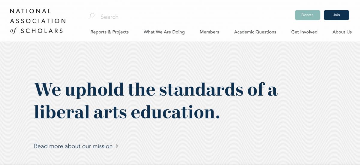
National Association of Scholars
The National Association of Scholars stands for intellectual freedom and the values of a liberal-arts education, and its site reflects that purpose with restraint. A minimalist homepage greets visitors with generous white space and a header that reveals articles, academic questions, and ways to get involved on hover.
Navigation is effortless: a visitor can read the mission, see current work, and join in a few clicks. For members, dues that span student rates to a lifetime tier include a subscription to the quarterly journal Academic Questions, conference discounts, and free publicity for member books and articles. Renewal lives one easy click away, with a donate option for anyone who wants to give more.
Retail Industry Leaders Association
The Retail Industry Leaders Association began in 1969 and now represents the retail sector from its base in Arlington, Virginia. Its crisp blue-and-white site organizes a deep library of content so each focus area earns its own page, with blog posts and press releases anchored lower to keep members current.
As the association expanded its remit, the header grew to launch three tailored destinations covering innovation, litigation, and compliance. Each behaves like a fully realized microsite attached to one landing page, giving members an experience matched to their work. Membership connects retailers, manufacturers, and solution providers across hundreds of annual events and dozens of communities, and the site mirrors that supportive culture in its structure.

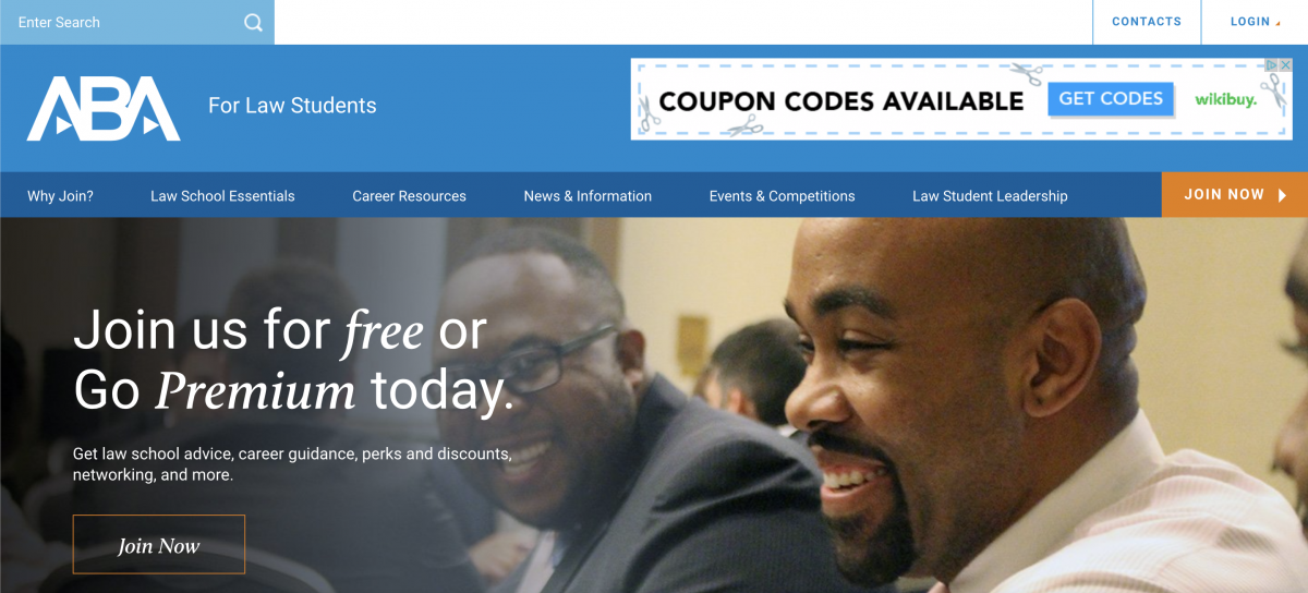
American Bar Association for Law Students
The American Bar Association for Law Students has anchored the educational and ethical standards of the legal profession since 1878, and its student site channels that authority into approachable resources. A welcoming color scheme and a clean top menu let visitors reach material for every stage of a law degree without wading through filler.
Members and non-members alike can find useful articles, while joining unlocks the real value: discounts on casebooks and study guides, access to bar-review tools, and markdowns on prep courses. The association layers on training and career counseling, plus an easy-to-find events calendar of writing challenges and webinars. The design keeps a large resource set legible, which matters when your audience is studying for one of the hardest exams there is.
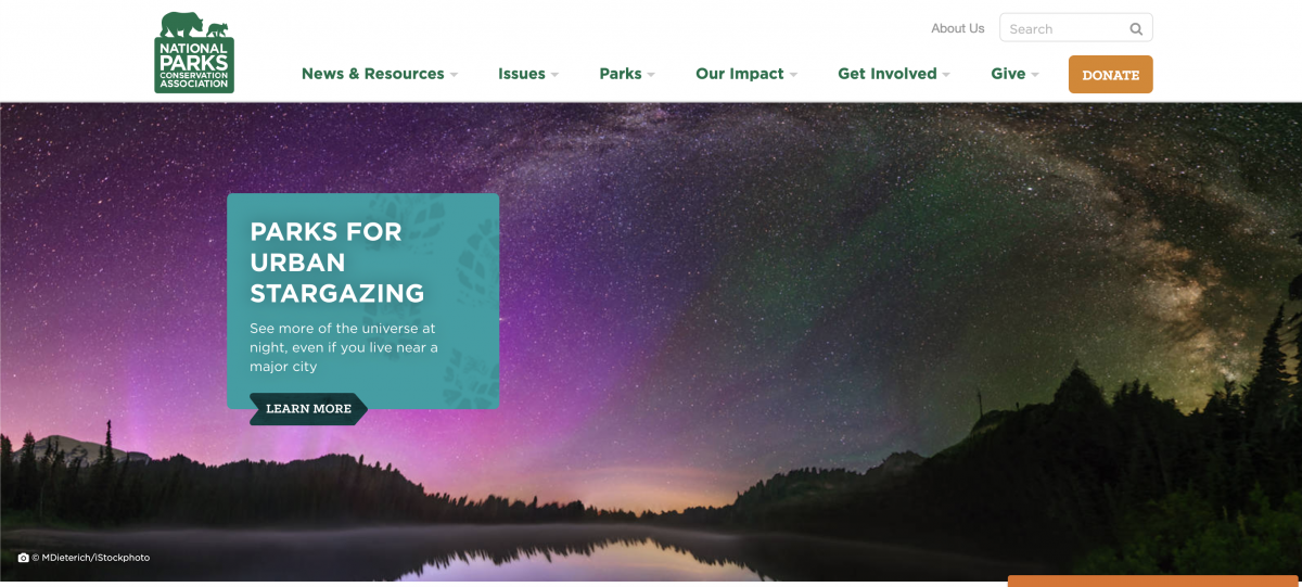
National Parks Conservation Association
As the independent watchdog for the National Park Service since 1919, the National Parks Conservation Association carries a high volume of content and tames it with disciplined drop-down navigation. The site overlays sweeping landscape imagery on a plainly stated mission, so beauty and function reinforce each other rather than compete.
Visitors move easily from pressing environmental issues to park-specific pages. Members receive the award-winning National Parks magazine, a branded blanket, and an exclusive Park-Pak of maps and travel tips. The experience does more than explain why membership matters; it nudges generosity, placing a simple donation path within reach as a visitor scrolls. That gentle prompting turns interest into support without ever feeling pushy.
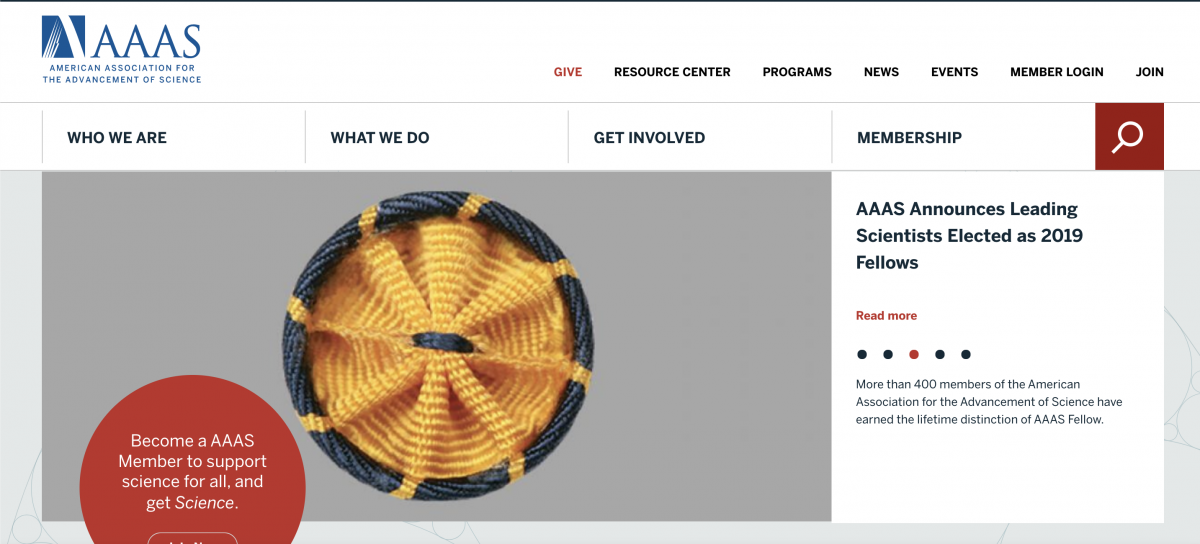
American Association for the Advancement of Science
The American Association for the Advancement of Science is the largest general scientific society, with a membership in the six figures and a mandate to defend scientific freedom and collaboration. Its site states the organization’s identity and purpose within a few clicks, then routes visitors toward articles and current events that bring the mission to life.
That direct communication pays off for members, who gain entry to member-only content, weekly issues of Science, and unlimited access to Science News Online. The standout benefit is the AAAS Member Community, a personalized platform where researchers privately share work and connect across disciplines. The site frames each benefit plainly, so the path from curiosity to membership reads as a natural next step rather than a sales pitch.
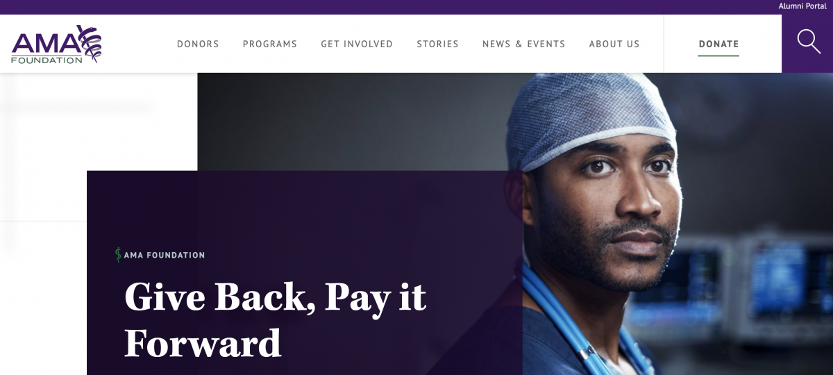
American Medical Association Foundation
The American Medical Association Foundation advances public health alongside the broader American Medical Association, and we have a soft spot for this one because Clique Studios designed it. Setting that bias aside, the long-scroll homepage earns its praise: relevant programs and a visible donation call to action sit front and center, with detailed sections waiting in the header.
The standout element is the stories section, which invites visitors to “share your story” and connects them to a contact form where they can reach the organization directly. That CTA converts passive readers into participants. See more of this work on our portfolio. For donors, the Foundation offers early news, invitations to private events, and a few surprise perks each year, framed as belonging rather than transaction.
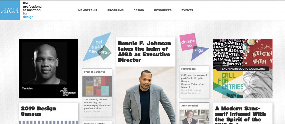
American Institute of Graphic Arts
Designers know the American Institute of Graphic Arts, which has built a community for typography, branding, and communication design since 1914 across dozens of chapters. Fittingly, its homepage is uncluttered, leading with the latest news and project announcements while tucking the rest behind a tidy drop-down menu.
From that menu, members reach resources and newsletter sign-up without hunting. Joining is generous: access to AIGA Design Jobs, discounts on hiring creatives, reduced fees for events and design competitions, and a free year of a .design domain. The site treats membership as a way to stay current in a fast-moving field, and the design itself models the professional standards the organization promotes — a quiet proof of credibility.
Rotary International
Headquartered in Evanston, Illinois, Rotary International unites business and professional leaders behind humanitarian service, with more than a million members across tens of thousands of clubs worldwide. A group this large risks an overwhelming site, yet a fully navigable header surfaces dozens of launch pages without clutter.
The homepage answers the question every association site should: why care about this mission? Rotary highlights causes, projects, and concrete ways to get involved, inspiring members and newcomers alike. A dedicated section lists active club projects, which sparks ideas for other chapters and invites support for causes close to a visitor’s heart. Members also gain networking, a yearly convention, and goods-and-services discounts, making the site as practical for careers as it is for service.

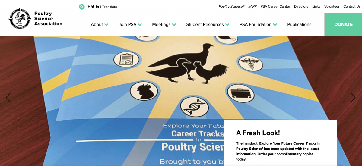
Poultry Science Association
The Poultry Science Association has advanced research and education in poultry nutrition and processing since 1908, serving roughly two thousand scientists, educators, and students. Its compact homepage feels confident rather than showy, offering relevant news, a plain list of member benefits, and freedom to navigate at will.
Membership earns free online access to the journals Poultry Science and the Journal of Applied Poultry Research. Members also get discounted rates for an annual meeting that ranks among the field’s best networking events. Members can also submit original research to those journals, gaining exposure while keeping peers current. The site proves that a focused audience does not need a sprawling site — it needs the right content, easy to reach.
How do associations increase member engagement through their website?
Key Takeaways. Associations increase engagement by personalizing the logged-in experience and surfacing relevant content, events, and community the moment a member signs in. Member-exclusive resources, discussion forums, and member spotlights give people a reason to return. Mobile-responsive design and automated, behavior-triggered email sustain participation between visits.
Engagement starts the second a member logs in. A personalized dashboard that shows relevant events, saved resources, and community activity beats a static welcome page every time. Member-only tools, discussion forums, and member spotlights turn a website from a brochure into a habit. Easy access to advocacy campaigns lets members act on the mission rather than just read about it.
Sustaining that momentum between visits depends on a few choices. Mobile-responsive design matters because a large share of members check in from a phone. Automated emails triggered by on-site behavior pull people back at the right moment. And as search itself shifts toward AI-generated answers, associations should make their public content easy to cite — our breakdown of the Google core update and AI search explains why. Built well on a platform like WordPress or Webflow, these patterns compound into measurably better retention.
Association websites Clique Studios has built
Reviewing other organizations’ sites is easy; building one that members rely on is the harder craft. Across more than 400 website redesigns, our digital marketing and design teams have shipped association and member-organization work that puts these principles into practice. A few examples:
- Designed the American Medical Association Foundation site, pairing a long-scroll homepage with a prominent donation CTA and a story-submission form that converts readers into participants.
- Delivered enterprise work for the American Bar Association, where a component-based design system kept sprawling resource libraries consistent and maintainable.
- Grew international recruitment for Northwestern University by foregrounding its proximity to Chicago throughout the site experience.
- Set a usability benchmark with our roundup of the best healthcare websites, judged by working designers and strategists.
Our published approach shows how we move from member research to launch, and we are candid when a project is not a fit. When it is, we explain exactly why.
What can these association websites teach your organization?
Key Takeaways. These association websites teach that great member sites solve problems for users while adding measurable value for the organization. Structure, design, and message together can teach, surprise, and inspire members to participate more. The best sites shine a light on the spirit of the association rather than just cataloging its information.
The pattern across all ten is consistent. The best association websites do more than file information neatly under mission, history, and events. They engage members and prospects with calls to action that feel like invitations. They earn attention by solving a real problem for the person on the other side of the screen.
The right mix of structure, design, and message can teach, surprise, and move members to participate more deeply, all without overwhelming or confusing them. If your own site falls short of that bar, the fix usually starts with strategy rather than a fresh coat of paint. Our guide to association website design and development and our advice on how to choose a web design agency are good next reads when you are ready to raise that bar.