Why associations should have component-based design systems

One of my first grown-up jobs was working at a membership organization with a ton of divisions and other groups. There was a lot under one roof, and nowhere was that more apparent than the association’s website.
Initially, each group was allowed to maintain their own space with their own design, but after the association rebranded, they put an end to that. It did not go over well, to put it lightly. The groups found the templates they were forced to use were too strict, and often included parts that didn’t apply to them.
I left the organization while they were still figuring it out, but I know what I would recommend now if I were in a similar situation: a component-based design system.
So what is component-based design? Think of it like Legos: The kinds of bricks available are limited, but you can use them to build something unique. The benefit of this approach is that it ensures the association’s branding is maintained, but it still gives groups some flexibility. How much flexibility is completely up to the association! Maybe they want everyone to use the same fonts and colors; maybe they want groups to be able to choose their own branding colors for some elements. By using style themes with components, you can easily allow some customization without it turning into the Wild West.
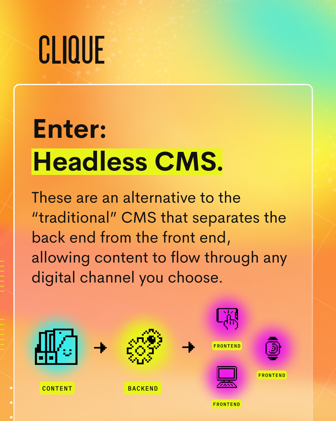
Other benefits that component-based design provides include simplifying site maintenance and enhancement; allowing SEO to be built in so that it doesn’t need to be managed by your groups; ensuring that your site meets accessibility requirements (as long as your components are built correctly); and streamlining training. In addition, components can be used with a variety of content management systems, from a headless CMS (my favorite), to WordPress, to Drupal.
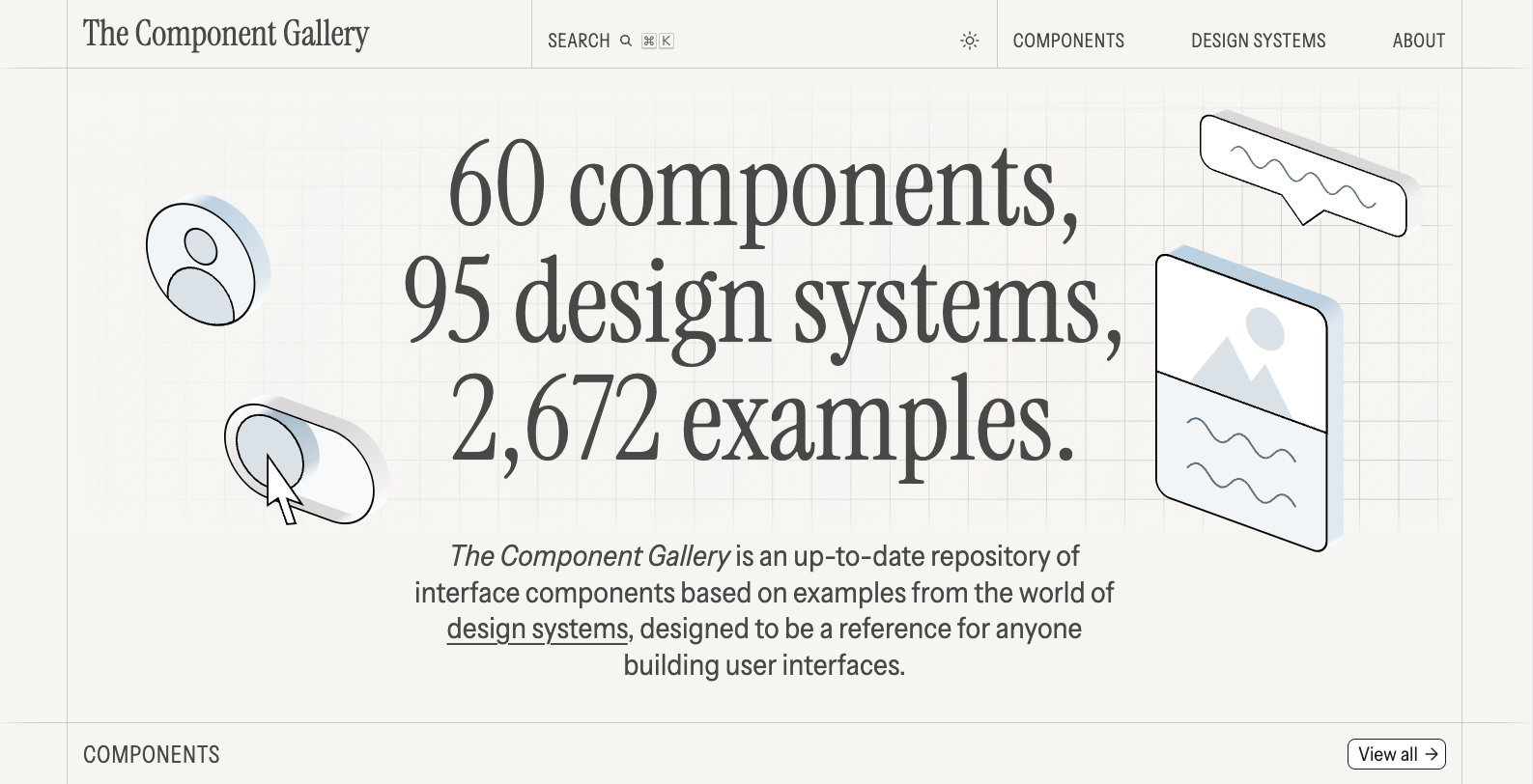
Wondering where to start? I would perform an audit of the current site, and see what pain points your groups are encountering. Is there content they would like to add, but there isn’t an existing place for it? Do they want more options with existing fields? Once you have a good idea of what is needed, you can start designing your components and deciding how flexible you want them to be. For example, you might offer a few different styles for CTAs, from a bold button to a simple underline. A good place for inspiration is The Component Gallery, which lists just about every component you can imagine as well as some design system examples. Then make sure you have robust documentation! You’ll want to make sure your groups know what components are available to them, and how they can (and should) be used.
I’d be lying if I said that putting a component-based design system in place was easy. There’s a lot to consider, and navigating the politics of it can be tricky. But once you establish your design system (and its governance), the benefits will make it well worth the effort.
At Clique, we’ve been lucky to work with a ton of amazing member associations, including USA Volleyball, American Osteopathic Association, National Aphasia Association, and many more. If you’re looking for digital solutions to help your association run smoother, we’re always happy to chat! Drop us a line whenever.