The history of web design: how websites evolved from 1989 to today

Originally published February 7, 2022 by Brendan Hufford. Updated June 30, 2026 by Jeff Molitor.
The history of web design spans more than three decades, from a single text page at CERN to today’s AI-assisted, mobile-first experiences. Web design history matters because every era left habits that still shape how Clique Studios and other teams build websites in 2026. Tim Berners-Lee published the first web page in 1991, and the craft has since moved through HTML, CSS, Flash, search engines, social platforms, smartphones, and generative AI. This timeline walks through the milestones that turned plain documents into the interactive, searchable, accessible sites people expect now. Each section pairs a moment in web design history with the design lesson it left behind.
When did web design begin?
Web design began in 1989, when Tim Berners-Lee proposed the World Wide Web at the CERN physics laboratory in Switzerland. Berners-Lee released the system publicly in 1991, creating the foundation for every website built since. The earliest web carried no graphics, only text and hyperlinks.
Tim Berners-Lee wrote the original proposal for the World Wide Web in 1989 while working at CERN, the European physics laboratory. He built the system on the NeXTSTEP operating system, later purchased by Apple, and combined existing pieces such as hypertext and multi-font text into one shared documentation system. By 1990 he had written the first browser and server, and in 1991 the web reached the public.
This starting point explains a lot about what web design means today: a website is still a set of linked documents at its core, even after decades of visual change. Berners-Lee went on to direct a standards body that continues to publish the specifications behind HTML, CSS, and accessibility. Web design, in other words, was never just decoration. It started as a way to connect information, and that purpose still anchors good design work in 2026.
The first websites: plain text and blue links
The very first website ran at CERN, the workplace of Tim Berners-Lee, and went live on 6 August 1991. You can still visit the first website, which CERN preserves as a historical record. Visual design was not a discipline yet, so the page used a sans-serif font, a plain white background, and blue underlined links to mark clickable text. Those three choices were practical, not stylistic, yet they set conventions that endure.
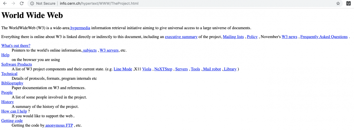
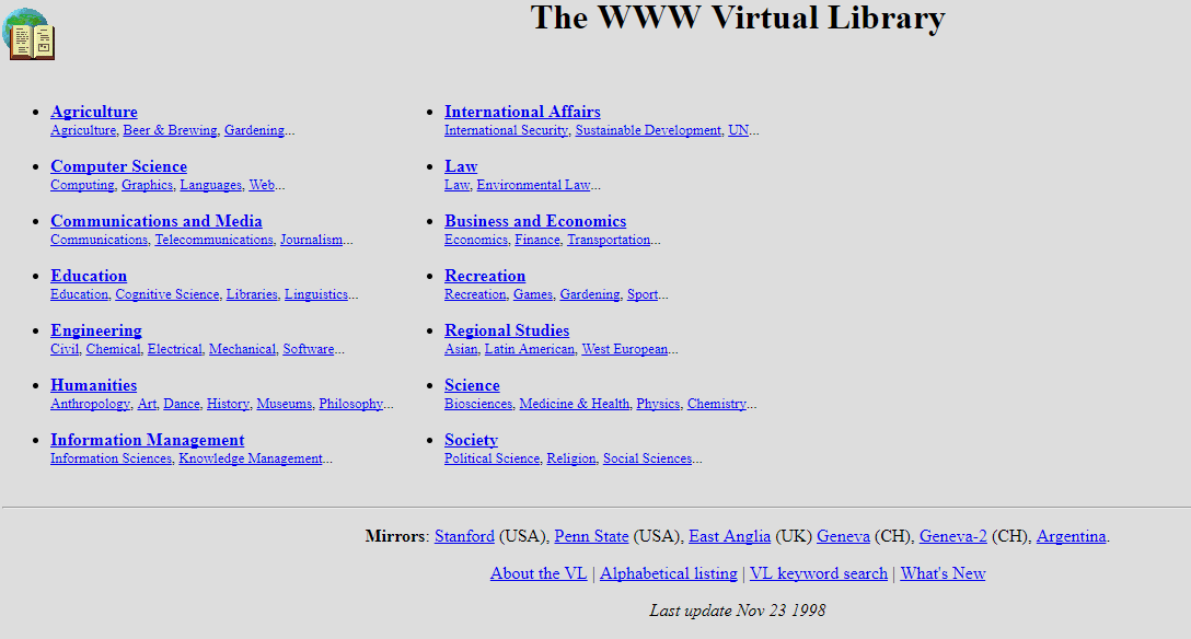
Early pages were written by hand in Hypertext Markup Language. Berners-Lee published a short document called HTML Tags in 1991, describing the first eighteen elements developers could use to structure a page. He also built an early WWW Virtual Library, a directory that pointed visitors to other pages through hyperlinks. Browsing, linking, and indexing all trace back to this period. For roughly the first few years, websites were research tools rather than designed experiences, and the idea that a page should look a certain way arrived only once browsers could display more than text.
How did browsers like Netscape change web design?
Browsers changed web design by making the web visual and reachable for non-technical audiences. Mosaic introduced inline images to a wide audience in 1993, and Netscape Navigator became the dominant browser after its 1994 launch. Broader adoption pushed designers to consider colour, layout, and screen rendering.
The first browser was Berners-Lee’s own WorldWideWeb program in 1990, but it reached very few people. Mosaic, released by the National Center for Supercomputing Applications in 1993, changed that by displaying images alongside text in a friendly interface. Marc Andreessen, who worked on Mosaic, co-founded Netscape, and Netscape Navigator arrived in 1994.
Netscape Navigator grew quickly, reaching a browser market share widely reported around 80 percent by the mid-1990s before Internet Explorer challenged it. This was the start of the first browser war, and it had a direct effect on designers. When millions of ordinary people could see images, colours, and layouts, the appearance of a page suddenly mattered to businesses. Designers had to account for how the same page rendered in competing browsers, an early version of the cross-device testing that web teams still perform. The browser, more than any single tool, turned the web from a text archive into a visual medium.
The arrival of CSS
By the mid-1990s, plain HTML could no longer keep up with what designers wanted to do. Håkon Wium Lie proposed Cascading Style Sheets in 1994, and the World Wide Web Consortium published the first CSS standard in 1996. CSS separated content from presentation, letting site owners control layout, colour, and typography without rewriting the underlying markup.
This separation was a turning point. Before CSS, most HTML sites looked broadly similar because formatting lived inside the content itself. Afterward, a single stylesheet could restyle an entire site, which made design faster to update and easier to keep consistent. The language still powers modern sites alongside JavaScript, and the discipline it introduced shows up across our web design tips. CSS is also why responsive layouts became possible years later, since styles could respond to the device displaying them rather than being baked into the page.
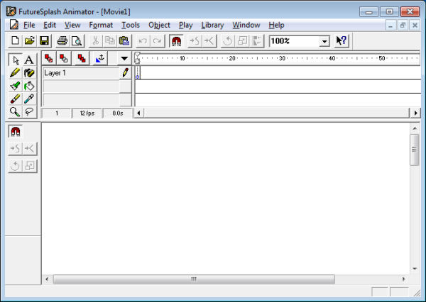
The rise and fall of Flash
As businesses began publishing websites in the late 1990s, standing out became a priority. Designers first reached for animated GIFs, then for Macromedia Flash, later renamed Adobe Flash. Flash let site owners add high-quality animation, audio, and interactivity that HTML alone could not deliver, and it shaped the look of the web for roughly a decade.
Flash dominated rich media through the 2000s, and a large share of online video once depended on it. The turning point came in 2007, when Steve Jobs announced that the first iPhone would not support Flash, citing proprietary control, security flaws, poor battery life, and weak mobile performance. As smartphones spread, Flash lost its audience. Adobe officially discontinued Flash on 31 December 2020, and open standards such as HTML5, CSS3, and JavaScript absorbed its role. The lesson endured: web design that ignores performance, security, and the dominant device of its era tends to fade, no matter how impressive it looks at launch.
How did search engines shape web design?
Search engines shaped web design by rewarding pages that are easy to crawl, structure, and read. Archie launched the first internet search tool in 1990, and Google arrived in September 1998. Search visibility pushed designers to organise content, headings, and links for automated indexing.
Search predates the modern web design industry. Alan Emtage and fellow students at McGill University in Montreal built Archie in 1990, an early tool whose name plays on the word archive.

The World Wide Web Wanderer, sometimes called Wandex, followed in 1993 as one of the first robot-driven indexes. Yahoo launched a popular online directory in 1994, and Google launched in September 1998, eventually becoming the most-used search engine.
By the late 1990s, businesses realised that search robots decided who appeared on the first page of results. That realisation created the practice now known as search engine optimization, and it changed design itself. Pages needed clear structure, descriptive headings, sensible links, and readable content so crawlers could understand them. Many habits that web teams treat as standard, such as logical heading order and clean navigation, exist because search engines reward them. Search did not just sit beside web design. It reshaped how pages were built from the ground up.
What was Web 2.0?
Web 2.0 describes the mid-2000s shift toward interactive, user-generated, easy-to-publish websites. MySpace and Facebook brought social networking to the mainstream in 2003 and 2004, while WordPress made publishing available to non-coders in 2003. Web 2.0 moved designers toward usability and visitor-created content.
Around 2004, websites became social. MySpace and Facebook, the latter first built for Harvard students, launched within a short span and changed what people expected from a site. Publishing also opened up: WordPress arrived in 2003 and let people without coding skills create and update content. The era moved the web away from static, hand-coded pages toward dynamic platforms built around accounts, profiles, and contributions.
Designers responded with a recognisable Web 2.0 aesthetic of glossy buttons, gradients, and rounded corners, but the deeper change was about usability. When visitors could create their own content, a site succeeded or failed on how easy it was to navigate and contribute. Google began favouring sites with a better user experience, tying design quality to search performance. The same expectations shape our work on websites for technology companies today, where clear structure and self-service content remain central. Web 2.0 is the moment usability became a design requirement rather than a bonus.
How did mobile devices change web design?
Mobile devices changed web design by forcing layouts to adapt to every screen size. Ethan Marcotte described responsive web design in 2010, and Google adopted mobile-first indexing starting in 2018. Mobile generates roughly 60 percent of global web traffic, according to StatCounter Global Stats.
The first iPhone in 2007 began a shift that reshaped the web. In 2010, the designer Ethan Marcotte first described responsive web design in a 2010 article, proposing fluid grids, flexible images, and media queries so one site could adapt to any screen. Responsive web design quickly became the default approach, replacing the separate mobile sites that came before it.
Google reinforced the change by adopting mobile-first indexing, beginning in 2018, which means the mobile version of a page became the primary version for ranking. Performance standards followed: Core Web Vitals, introduced as ranking signals in 2021, measure loading, interactivity, and visual stability. The stakes are large, since mobile now accounts for roughly 60 percent of global web traffic according to StatCounter Global Stats. Designers who ignore small screens alienate most of their audience. Modern projects, including many association websites, are now planned for phones first and scaled up to larger displays.
How is AI changing web design now?
Artificial intelligence is changing web design by adding generative tools, personalisation, and answer engines to the production process. Search results and chatbots now summarise pages directly, so content must be written for extraction. Accessibility standards such as WCAG also shape how modern websites are built and tested.
The current era of web design is defined by artificial intelligence and accessibility. Generative tools now assist with layout, copy, and imagery, while AI Overviews and chatbots answer questions by summarising pages rather than sending every visitor to a site. That shift rewards content that is structured, well-sourced, and easy to extract, which is an extension of good search practice rather than a separate task. Writing clear answers, naming entities, and citing real figures all help a page surface inside AI-generated results.
Accessibility has moved from afterthought to standard, with guidelines such as WCAG shaping how teams build and test. No-code and visual platforms have also matured: tools like Webflow let designers ship production sites without hand-coding every element, while keeping clean, semantic output. These forces are why a website redesign today weighs AI visibility, accessibility, and performance together, not as separate projects. The web has returned, in a sense, to its origins: pages that are readable, linkable, and built to be understood, now by people and machines alike.
What should you look for in a modern web design partner?
A modern web design partner should combine strategy, design, development, and marketing in one team. Look for a portfolio in your industry, measurable results, and platforms such as WordPress and Webflow. A capable partner plans for mobile performance, accessibility, and search visibility from the start.
Choosing a partner is easier once you understand how the web reached this point. The eras above show that lasting websites pair design with performance, search, and the dominant device of the day. A modern partner should therefore connect strategy, design, development, and marketing rather than treating them as separate handoffs, because every milestone in web history reinforced that these areas move together.
Look first at relevant experience: a portfolio in your sector, case studies with real outcomes, and a process that explains how decisions get made. Ask how a team handles mobile performance, accessibility, and search visibility, since those determine whether a site reaches and serves its audience. Platform fluency matters too, whether a project calls for WordPress, Webflow, or a headless setup. As a Chicago web design agency, Clique Studios evaluates partnerships the same way, weighing communication, measurable results, and long-term support alongside design talent. The right partner treats history as a guide, building for the standards of today while planning for what comes next.
How Clique Studios approaches web design
Clique Studios has applied these lessons across hundreds of projects, pairing design with strategy, development, and marketing. The history of web design is not an abstract timeline for our team; it informs how we structure content for search, build for mobile, and design for accessibility on every engagement. Two examples show how that approach produces measurable results.
American Osteopathic Association
- Increased conversions by 54 percent by unifying a fragmented brand experience across dozens of separate sites.
- Rebuilt navigation and reduced content so students, members, and physicians could find specialties quickly. See the full American Osteopathic Association case study for details.
Northwestern University
- Modernised the Bienen School of Music site to support international student recruitment while honouring established university brand guidelines.
- Designed an interactive history timeline and clearer navigation to communicate the school’s reputation. Read the Northwestern University project to see the results.
These projects, and many more in our work, show how decades of web design history translate into sites that perform today.
Web design history by the numbers
1991 - the year the first website went live at CERN.
1998 - the year Google launched and search began reshaping design.
31 December 2020 - the date Adobe officially discontinued Flash.
~60% - the share of global web traffic from mobile devices (StatCounter Global Stats).
Build something with us
Clique Studios designs and builds websites that carry decades of web design lessons into modern, measurable results. Talk to a real person to start your project.