Man in suit holding coffee while smiling and looking at his phone

Helping 1.5 million+ commuters get from point A to point B.

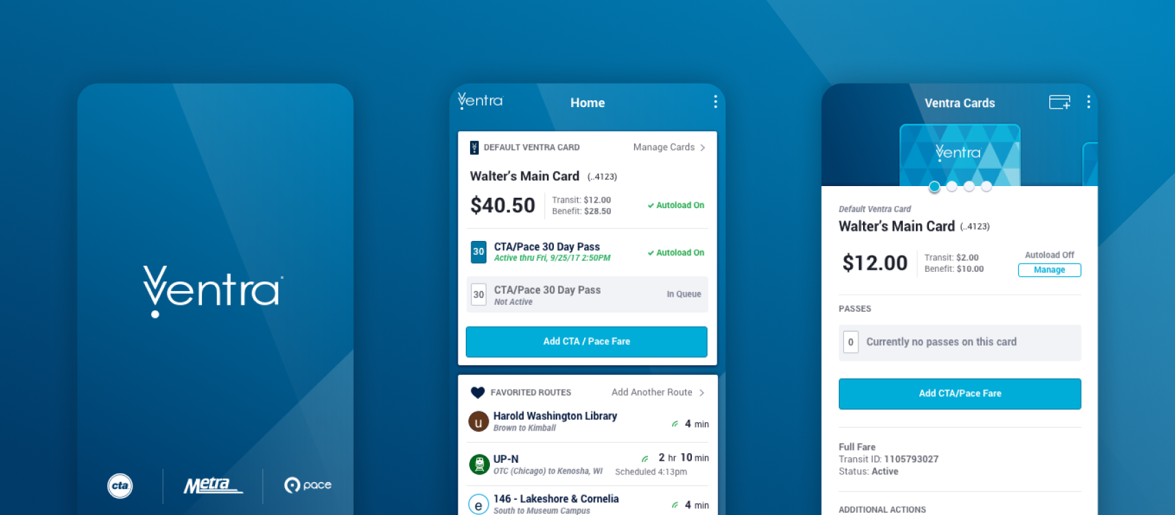
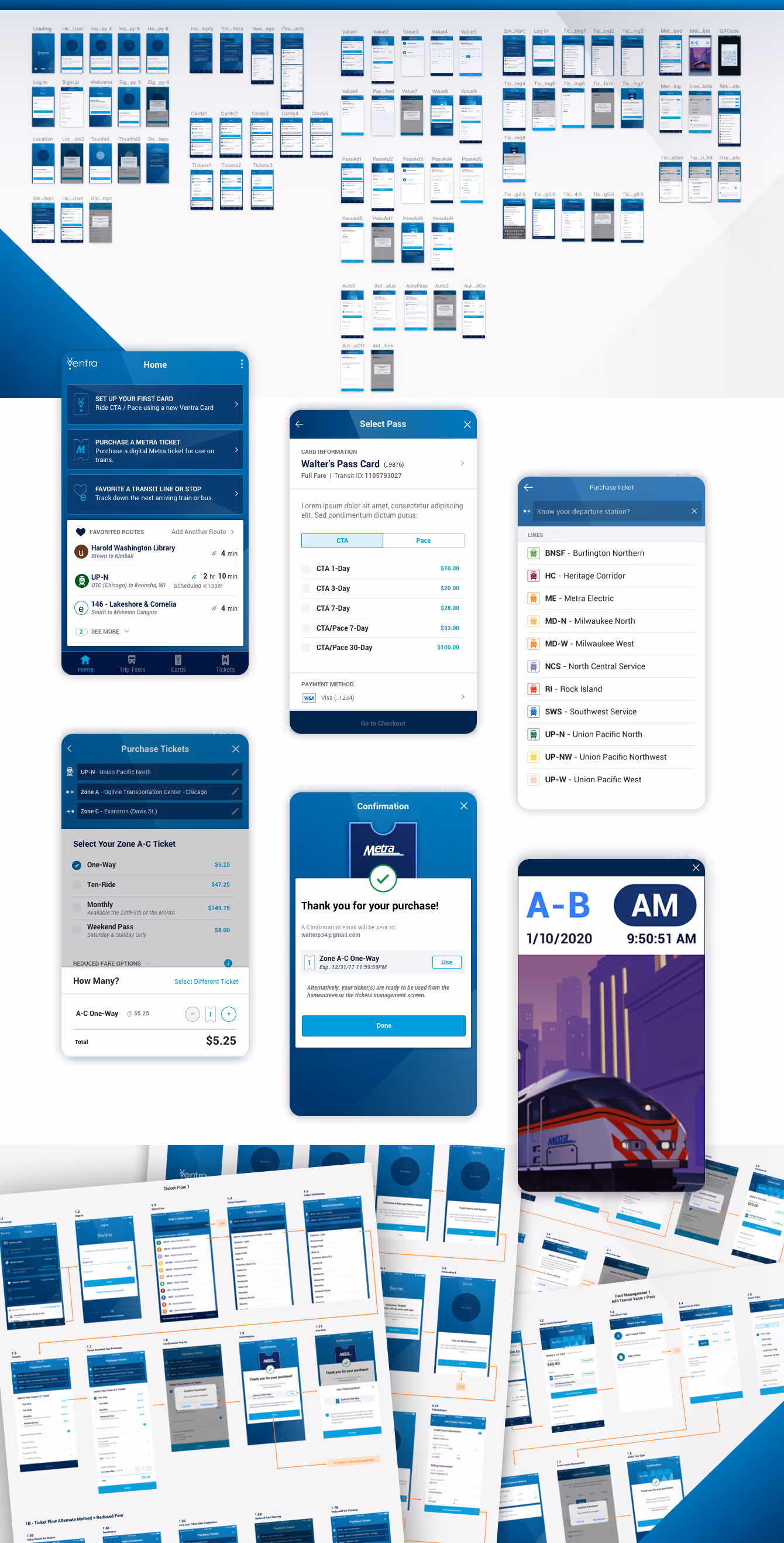
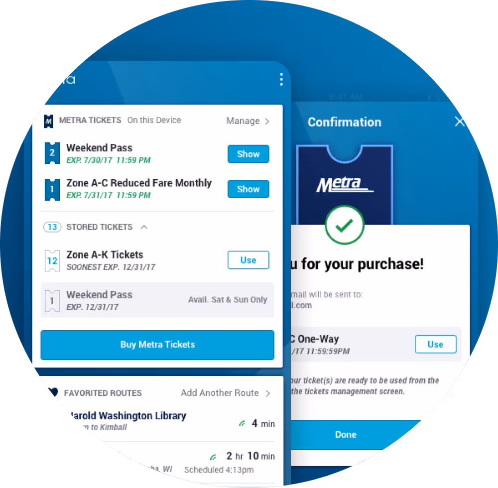
Ventra is Chicago’s public transportation system: it manages the payment, scheduling, and facilitation for the Chicagoland area. In partnership with Cubic Transportation Group, they wanted to redesign and rebuild their app to better suit the needs of all travelers. We integrated with their team to strategize and execute the User Interface (UI) and User Experience (UX) design for the app—making the complex process of purchasing, planning, and riding public transportation simple.

The Challenge

Driving urgency to take action.

CRF has an amazing story to tell, but their previous website wasn’t doing that story justice. It was outdated, difficult to update on the backend and confusing to navigate on the frontend. They needed their website to drive the urgency of their mission to increase donations and, in turn, help further their impact.

The Chicago Transit Authority has an avg daily ridership of 1.5 Million.

The Chicago Transit Authority has an avg daily ridership of 1.5 Million.

The Chicago Transit Authority has an avg daily ridership of 1.5 Million.

The Chicago Transit Authority has an avg daily ridership of 1.5 Million.

The Process

Balancing the different users.

From user research, we uncovered three different user types to service: 1) Everyday Commuters, usually traveling from the suburbs into the city; 
2) Exploratory Commuters, who wanted to optimize their travel and compare routes for specific events; 3) New-to-Transit Travelers, oftentimes visiting the city for the first time. With these audiences clearly identified, we focused the design to benefit specific needs and wants of each group, without prioritizing one experience over another.

Insight-led design.

Each audience had a different pattern of behavior and needed a slightly different experience. Metra riders take the same train every day. They need to easily access the arrival schedule and their pass (we heard this from the conductors too, who constantly field questions and waited for riders to find their ticket). Meanwhile, other riders needed to be able to adjust their routes—like someone going to their doctor on their way home from work. And an out-of-towner needed to learn the system and feel confident getting there.

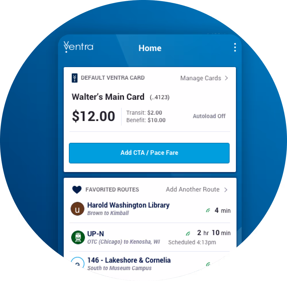
Surfacing what matters most.

Prior to the redesign, it was a hassle for travelers to commute with their device: they had to navigate a series of prompts to find their ticket, access their card, or reference their travel history. We discovered that the most important priorities for most users are managing cards & tickets, so that’s the first thing on everyone’s home screen. Then, with a scroll, users can access other common tasks, like trip planning, transit tracking, and accessing their “favorite” locations. The home screen information hierarchy helps minimize user effort.

Frictionless project team integration.

Design and technology needed to work together to make the user experience great. A large project team was in place representing engineering, product, and numerous stakeholders. We became collaborators with our partners, integrating our project plan with theirs to align our delivery. We began by evaluating the work already done, and then—in a series of sprint-style workshops—brainstormed “blue sky” ideas and prioritized what was possible. Working with their team, we found ways to accelerate the technical delivery and stick to the timeline, without sacrificing UX strategy.

Collaborative and constant iteration.

Aligning across teams is important and works best when ideas are supported with insights. The challenge? Getting alignment from Ventra, CTA, Metra, and our Technology partner, while also moving quickly and deliberately. We established a communication cadence that pulled each team into the conversation so that validation occurred across areas of expertise. Using collaborative prototyping tools like Invision, each conversation was facilitated with a Designer in the room. That enabled live interactive feedback and kept the conversation focused on the end user experience.

The Solution

In a matter of 2 ½ months, we strategized, designed, and finalized the core user interface and experience for the Ventra application. We executed designs to fit within the schedule of the Cubic development team, created an on-brand experience that “felt like Ventra,” and—most importantly—simplified the user experience for all commuter types. Now, Chicagoans everywhere (including some of our own team members) can travel with a little less chaos.

Key Process Solutions

Agile delivery, aligning workflows to feed the engineering team’s build schedule and accelerate the timeline

UI prototypes to foster collaboration, feedback, and discussion throughout the design process

Stakeholder coordination to ensure feedback was incorporated and communicated between Ventra, Metra, CTA, Apple, and Cubic

User flow maps to help strategize and manage individual user types while making design decisions

Key Features

Home screen information architecture that surfaces the most important content for all user types: ticketing, card management, trip planning, and transit tracking

“Favorite” locations to help everyday travelers quickly find their most trafficked routes and plan their commute

Digital execution of Ventra’s new brand to make the application a cohesive member of the bigger brand experience

Like what you see?

Build something with us.