Defining a legendary brand for digital
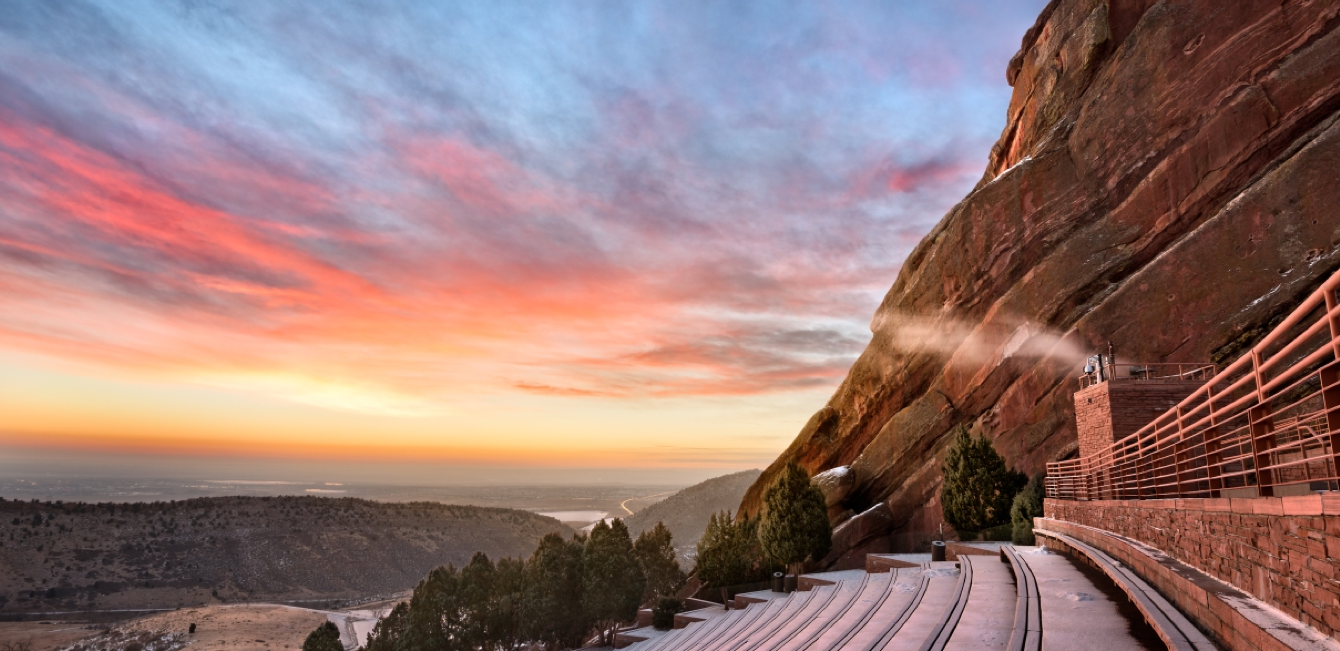
Red Rocks Amphitheatre is the only naturally-occurring, acoustically perfect amphitheater in the world. It’s an outdoor park, a spiritual concert-venue, the essence of Denver—and now, their website reflects this story. We worked with the Red Rocks’ team to build a digital visual identity and launch an experience that defines their brand, lays the foundation for today, and provides the flexibility to evolve for tomorrow.
"We saw digital as the place where we could have the initial branded experience with our audience. Leading with the new website, we wanted to create a more consistent brand. We also wanted to make it easy for people to find what they’re looking for AND discover new content and spend more time immersed in Red Rocks."

Josh Lenz

The Challenge
Who is Red Rocks?
With over 20 million site visits annually, Red Rocks’ website wasn’t lacking in visibility, but in impact. The design was a misrepresentation of the place, the feeling, and the brand that Red Rocks is. And, most importantly, the functionality was unwieldy, clunky, and difficult to use. They needed a digital experience that surpassed their marketing goals, told their historic story, and extended the iconic experience beyond their gates.
The Process
But first, strategy.
Over the years, the Red Rocks’ brand and website evolved unintentionally into an unwieldy experience for their fans and their internal team. To understand their industry, audience, and story, we assessed current performance, developed user personas that focused on their digital pain points, and built a strategic information architecture. As we learned about their organizational goals and operations, their team shared the need to have a functional store as soon as possible, given that the summer is their most important merchandising season. Because we flagged the Red Rocks Store early on, we were able to build and launch an eCommerce microsite to serve as their online store a full year prior to the full experience.
What if we...?
Red Rocks didn’t have a strict brand definition, and we developed several iterations of the design without an “aha” moment. So, rather than continuing to swing and miss, we created a new Visual Identity Workshop, where their team—given direction, time, and guidance—collaborated with our designers to define the direction for the Red Rocks’ brand moving forward. Then, from that shared place of understanding, our design team regrouped, strategized, and presented the brand style guide that finally nailed the essence of Red Rocks (“aha!”).
Capturing a feeling.
Red Rocks means so many different things to different people. We created a design language that allows for flexibility across mediums but still feels uniquely “Red Rocks.” To create the illusion of depth in digital and echo the expansive, outdoor, rugged feeling of the amphitheatre, the design uses texture as an element. The speckled layer appears throughout the website—applied to backgrounds, text, and buttons—and also inspired the custom, bold typeface that’s now a Red Rocks’ brand staple.
Getting clever about priority.
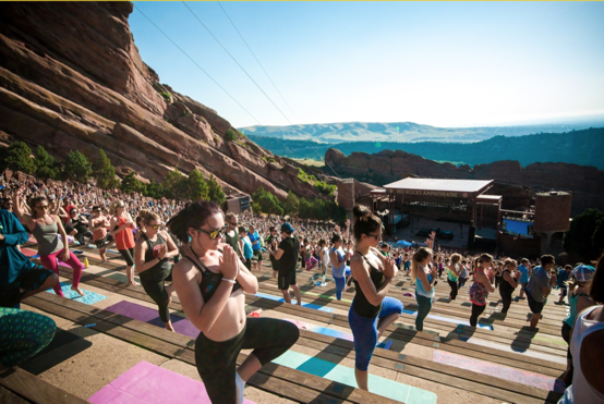
Red Rocks has a lot of activities to promote—from electronic dance concerts to “Yoga on the Rocks.” To prevent content-overload, we balanced their bold branding with simple UX, giving the users more control. On the calendar and events page, users can toggle between calendar, list, and grid views, as well as filter and/or sort the content. Ad space is strategically placed throughout the site to empower the sponsorship team to earn revenue, without distracting from the overall experience.
At lightning speed.
With so much content, there was a lot of data to manage behind-the-scenes. For the backend, we diverged from a traditional WordPress install in a few areas. To get quick responses on the calendar and the archived events, we used custom REST endpoints to pull the data we needed when we needed it, and cached the results for quick execution of core website features. For some pages, we rolled a custom disk-based caching method for blocks of event data. It’s compiled on a seperate server and then distributed (via file) to the load balancer. For these pages, this removes the querying burden from the database, which can be a potential bottleneck and cause performance issues.
For every fan.
From the beginning of the project, accessibility was a part of the design and development decisions. An example of this in practice is the top navigation menu: it had 8 state changes throughout the experience (meaning that visually, it looked different depending on what page the user was on). Our design and development teams worked to ensure that, with the different elements, states, and platforms, the top navigation was accessible at all times. Elements were engineered to be accessible without losing their effect.
Integrated for a better experience.
One of the biggest complaints about the user’s previous experience was the online ticketing system: it was silloued, confusing, and clunky for users to purchase a ticket. To make it a more streamlined process, we integrated the website with AXS, which included the technical integration but also the point in the experience to send users to AXS for checkout. Another insight uncovered by our customer journey map was the need to check the weather. With a widget, we have built a weather feature on the homepage. Custom icons are changed and displayed in real time (updated every 5 minutes). Other incoming integrations include Dinetime for easy reservations at the Ship Rock Grille. On an outgoing basis, the website provides the new app with webviews to seamlessly pull in content. The result, the Red Rocks team only has to manage content in one place.
Redefining the agency/client relationship.
Working as one team, Red Rocks and Clique brainstormed direction for visual brand identity, analyzed integration systems for development, evaluated potential CMS platforms for build. The project was successful because of the collaboration and support on both sides. It wasn’t the traditional formula of an agency delivering for a client, but the give and take of one high functioning team.
The Solution
In a true partnership, we worked with the Red Rocks team to understand a place that holds meaning for so many people. We captured their identity and provided assets to use throughout their marketing campaigns to create one cohesive experience for their audience—all through a platform that supports their future growth initiatives as an organization. It’s big. It’s beautiful. It’s bad ass. It’s Red Rocks.
A brand and site that is worthy of what it represents: The best place in the world to see music, a happy place, and Denver’s crowning jewel
Defined and implemented best practices for event calendars across desktop and mobile
Optimized ticket purchasing flow with integration to AXS
Trail Mix: A robust video streaming experience to set the stage for Red Rocks as a media organization
Custom typography and weather icons to support the visual brand
Automatic event archive to allow fans to explore past shows and relive memories made at Red Rocks
The Identity
Getting the font just right.
the quick brown fox jumped over the lazy dog.
Accessible colors that capture Red Rocks.
#B84405
#363636
#DC994A
#CC0000
#69725A
#EAE5D8
#5F4E4A
#F4F2EB
Subtle yet rugged textures.


The Results
Validating the enhancements
We compared the usability of the new Red Rocks website with the previous version. Examining the interface and measuring compliance against recognized usability principles, strategists conducted a user experience audit called a Heuristic Evaluation. The results detail a clear picture of the success of the redesign, as well as areas for continued improvement.


Features
92%
Old site: 79%
Homepage
93%
Old site: 67%
Navigation
95%
Old site: 67%
Search
76%
Old site: 73%
Performance
91%
Old site: 72%
Help
90%
Old site: 56%
“At one point, we collectively realized that the project was going in the wrong direction. But, when we raised a flag, Clique listened. Excuses weren’t made. They didn’t say, ‘this is impossible,’ but instead, ‘let’s find a way to make it work.’ Collaboration was a huge point that helped the project be so successful.”

Ben from Red Rocks


