Taking it up an octave
With best-in-class faculty, facilities, and concerts, The Bienen School of Music is one of the best music schools in the country and a leading concert venue in the Chicagoland area. They needed their old website—outdated, unresponsive, and on an old version of Drupal—to better serve their team and their users. Through extensive UX research, improved content strategy, thoughtful design, and powerful development we created a modern new site that reflects the caliber of the institution. The result is one of the best university sites in the world for one of the best universities.
The Challenge
Designing something worthy of the best.
The Bienen School of Music’s website—with four key user types (students, faculty, staff, and community members)—is an important part of everything they do. To support all of the school’s goals, the new site had to be 1) an everyday resource for students, faculty, and staff, with thousands of informational pages 2) an essential sales tool for major events throughout the year, and 3) a reflection of the school’s prestige, inspiring the same feeling of awe that visitors experience in-person. We had a lot of work to do.
The Process
Driven by data.
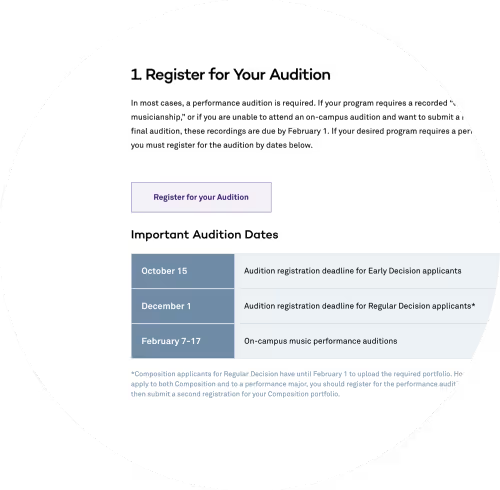
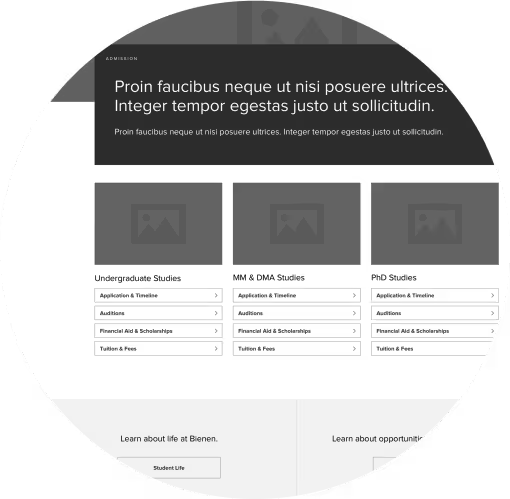
An in-depth competitive analysis and UX audit informed our approach. Huge spikes in traffic correlated with two big user needs: audition registration and acceptance decisions. We prioritized the information architecture to cater to these target conversions and help maximize the University’s ability to communicate with prospective students.
Improving the ticketing experience.
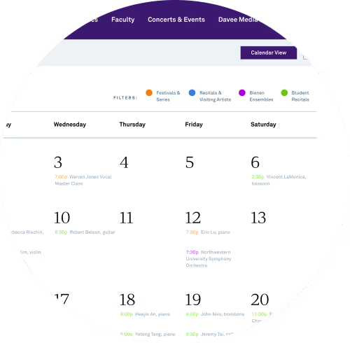
Taking these insights, we simplified the user journey for eCommerce and ticketing transactions. Before, users had to fight a clunky, oftentimes confusing, experience to find events and buy tickets online. The new site gives the power to the people: allowing users to find events with different views (calendar, list, etc.) and filters (by date, by type, by series). Integrating with Patron Manager allows their team to pull events straight from the source, review them within Drupal, and publish to the site with ease.
An agile approach.
To accommodate the scope of the project, we leveraged an Agile methodology to maximize efficiency. Wireframing, designing, and developing different parts of the site happened in tandem to keep the project marching down the timeline. Overall, it was a massive haul, with countless experiments and iterations to refine the site to the seamless experience it is today.
A fresh take on tradition
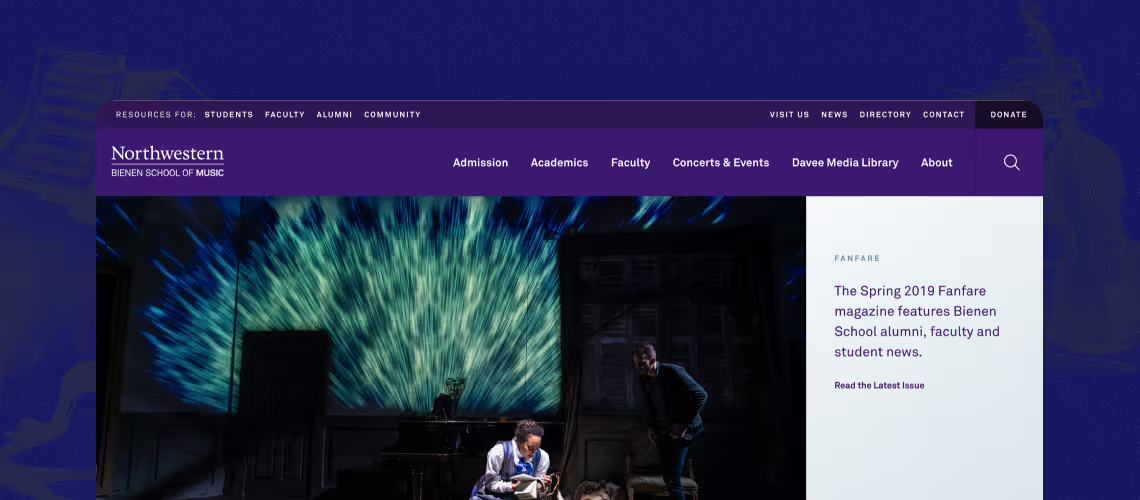
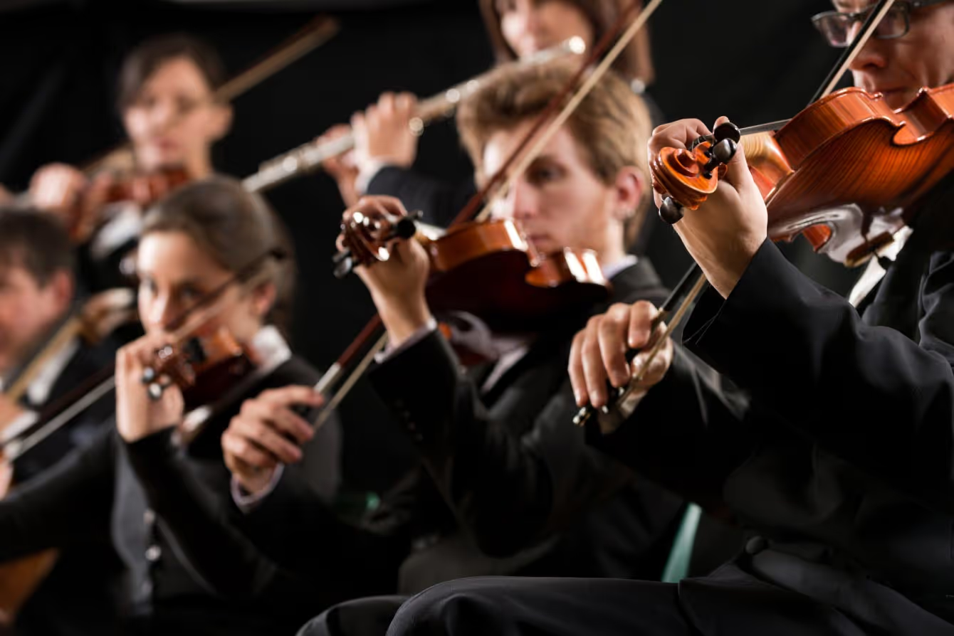
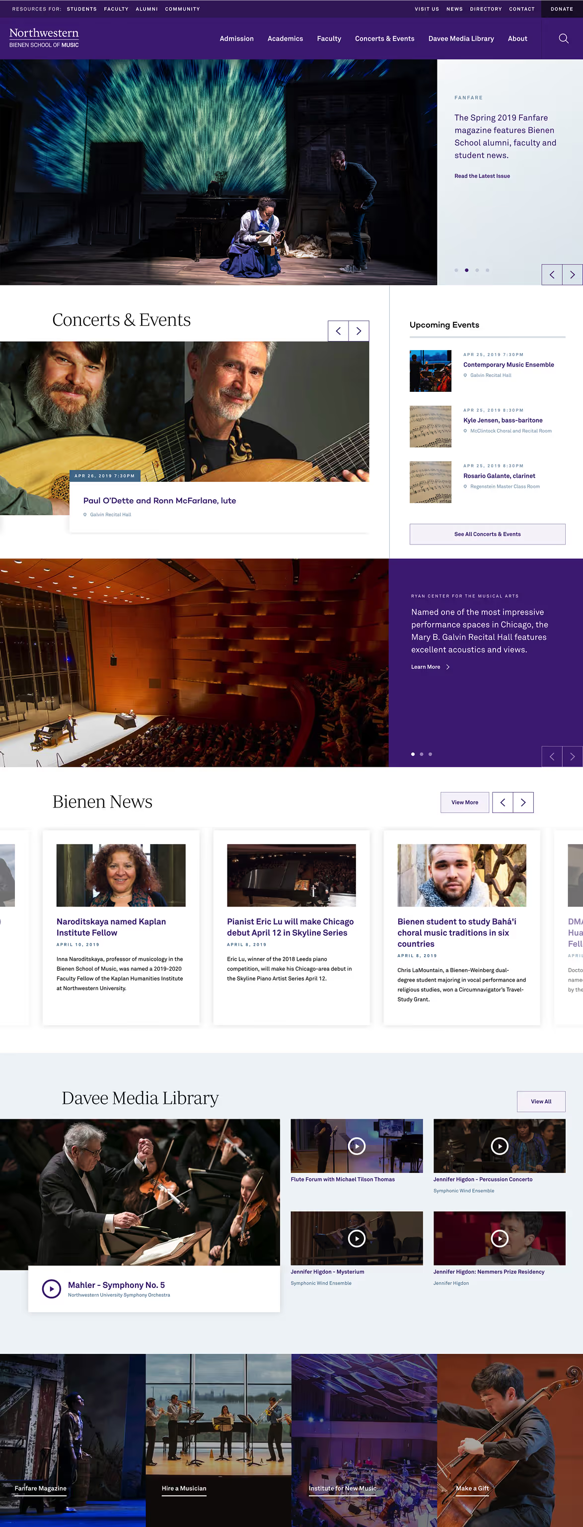
Northwestern’s brand is all about one feeling: prestige. While pushing design to modernize the look and feel, we also leveraged University brand guidelines to ensure unity with Northwestern’s larger, established brand reputation. Large scale imagery showcases their beautiful space, vibrant student culture, and awe-inspiring concerts. The design creates cohesive digital experience for users with straightforward navigation, a simple color palette, and subtle, smooth transitions.
Sharing the good stuff.
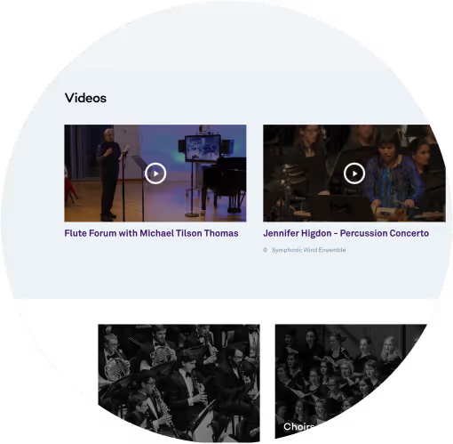
The school’s biggest content assets are their videos of concerts, programs, and events. To better share and showcase their world-class productions, we redesigned and developed a multimedia video library that allows users to explore the content chronologically or by type of production. Now, there’s a single place to share these extraordinary experiences directly with their users.
Future-proofed.
With the vast amount of content on the website and a future with endless possibilities, the content management system had to be seamless. As we built on Drupal, we collaborated weekly with their team to uncover pain points and make decisions that made complex engineering easy to understand and easy to use. Modular templates enable their team to select, stack, and reorganize content as needed. The site is built to help the organization grow—for short and long-term goals.
The Solution
This project is one of the biggest builds we’ve ever done—both in depth and breadth. With a strategy-driven, agile approach, we created a flexible, modern site worthy of the prestigious reputation of the organization.
In-depth UX research to inform the information architecture
Competitive analysis to understand the industry in the digital marketplace
UX audit of their site to uncover user patterns of behavior
10+ stakeholder interviews with faculty and staff to define clear goals and objectives of the project
10+ user interview with students to understand wants, needs, pain points, etc.
20+ card sorting participants to build intuitive paths of discovery for users
Improved ticketing flow and e-commerce experience for concerts and events
Design that elevates the experience without distracting from the content
Clean, sophisticated, modern design
Simple navigation to guide users to the information that they need
Large scale imagery opportunities to “wow” users
Subtle, smooth transitions between sections
Custom Drupal 8 implementation to perform for their users and their team
Integration with Patron Manager, a third-party event management service
Integration with the larger University’s digital presence, specifically their search repository
A scalable multimedia, video library
Modular templates to support the future growth
"The homepage is a personal favorite of mine because it curates the best of our website in one place. It is functional and beautiful, which I think is a reflection of the rest of the website."
KATELYN BALLING, SENIOR COMMUNICATIONS COORDINATOR
The Results
90
unique screen designs
1k+
pages in total
The Awards
CSS Awards: Best UI, UX, Innovation
CSS Awards: Special Kudos
"An advanced Musicology student from Santiago, Chile was most emphatic in declaring his preference for Northwestern, saying that our website was one of the most important reasons he was inclining towards Northwestern...the clarity, ease of navigation, and detailed descriptions and biographies for the professors were all major factors in his decision to accept our offer of admission."
Musicology Professor, Northwestern's Bienen School of Music