Less is more: How a minimalist approach helps us design better websites
What is Minimalism? What is Minimalist Design?
Minimalism is the concept of minimizing distractions from what’s truly valuable or essential. Minimalist design is defined by a few principles: repetition, formal simplicity, use of voids, and repetition (bad joke?).
- Repetition = minimal variation in design elements (the same patterns, styles, shapes, etc.)
- Formal simplicity = preference for geometric shapes (perfect circles, perfect squares, and uninterrupted lines)
- Use of voids = empty white space (and lots of it)
Minimalist design focuses on what really matters.
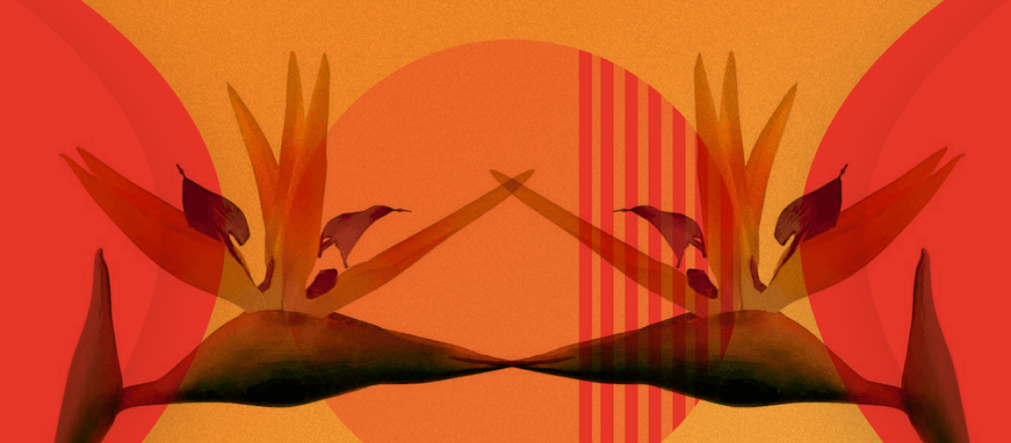
That’s why a lot of website designers opt to use it—and the reason why our Chief Creative Officer Sue Janna Truscott chose minimalist design for our client True North Venture Partners.
In our project kick-off meeting, True North defined itself with a few key words: clean, sophisticated, humble, and innovative. So, with minimalist design across the site, we built an experience to let their mission stand on its own and their work speak for itself. The design uses the elements of minimalist design: repetition of shapes, formal simplicity (perfect circles, squares, etc.), and a lot of white space.

“The best way we could capture True North’s purpose as an organization was with minimalist design, and hidden, bright, colorful hover effects to differentiate True North from other venture capital sites. The minimalist design cut clutter and communicated the information clearly. We didn’t want users to miss the company’s main mission. With this design, it’s not possible,” said Truscott.
But at Clique, not every website we build has a minimal design. Actually, it’s the opposite: most aren’t. That’s because, sometimes (a lot of the time), minimal isn’t enough—not enough for our clients, not enough for their users, and not enough for us to solve their problems.
Instead, we use a minimalist approach.
What is a Minimal Approach to Design?
A minimalist approach is intentional design. It’s asking “why?” for every design choice made. It’s thinking strategy first, aesthetic second. It’s starting with a minimalist design, then adding complexity only when it makes sense.
“Design matters. It’s not just pretty images or pretty animations. We’re impacting people’s lives, our client’s lives. We’re building businesses. We’re not just doing things to make it visual. Minimalist design keeps us focused on what really matters.” said Austin Golownia, Design Lead at Clique.
Why Take a Minimalist Design Approach?
It favors strategic decisions
Before we start our design phase, our strategy team puts together a creative brief—a document detailing the client’s goals, challenges, and opportunities for the content experience we are setting out to create.
“Sometimes, a design project feels a little like being lost at sea. You know the solution—find land—but you don’t know how to get there. A creative brief is the lighthouse. It guides you not just to land, but to the dock. It removes ambiguity and helps designers define a clear path to success,” said Golownia.

For every project, the creative brief anchors design choices, but with a minimalist approach, the brief is the bible. It maintains a strategic scope throughout the project—from discovery to delivery.
For example, if a client wants their website to increase leads, the strategy should focus on pushing that specific conversion. With a minimalist approach, there should be one “call us now” button in the navigation. Not a million. Not a few. One clear, strong call-to-action.
That’s because choice can distract the user. Sometimes, users don’t need options, they just need to do the thing they came to do. A minimalist approach eliminates the unnecessary choices for the users. It makes copy more impactful, simplifies usability, and increases conversion rates.
It makes the build better
A minimalist approach usually translates to a simpler design. A simpler design usually means a simpler build. And not only does that help us spend more time on building better front and back end experiences, but it means means shorter timelines and faster page speeds.
Time is important for our clients. An overwhelming majority of our projects—Austin argued 98%—have a strict deadline. So, any chance to shorten a timeline is huge.
Page speed measures the time it takes for content to load on a page. And it matters…
...to clients: If a site is slower than a close competitor by more than 250 milliseconds (a millisecond is a thousandth of a second), people will visit a site less often.
...to Google: On July 9, 2018, Google formally announced that page speed is now a ranking factor for mobile searches and all users.
...to users: 53% of mobile site visits abandon a page if it takes longer than 3 seconds to load.
How to Execute a Minimal Design Approach
A minimalist approach is about two things: cutting back on elements without purpose, while building up elements with purpose.
Eliminate the excess
“Kill your darlings, kill your darlings, even when it breaks your egocentric little scribbler’s heart, kill your darlings.” ― Stephen King, On Writing
Sometimes, as creatives, we have to make personal sacrifices for the users’ (or client’s) benefit. With a minimalist approach design, there’s no room for self-indulgence. You have to think about what’s important and what’s extraneous. You have to ask why.
Why am I designing it like this? Why am I putting this element on this page? Why am I choosing this shape? font? size?If the answer is based on designer preference rather than strategic purpose, the element needs to be cut. Kill your darlings.
But, that doesn’t mean “brand” or “feeling” aren’t good answers. It’s okay to design for visual aesthetic—it’s the intangibles that make great designs great. But, the intention should be to elevate the brand, not heighten your chances of receiving an award.
Build with purpose
Once the distractors are eliminated, it’s time to build up the strategic elements.
One way to do it is to maintain a visual hierarchy. Traditional best-practices apply—making the headline bigger, body copy mid-sized, subtext small.
You can also break the repetition of minimalist design; making something different draws users’ eyes and can help lead them down a conversion-driven path.
In a recent partnership with Kindle Communications, we built a suite of three platforms for McDonald’s WorldWide convention. Because the applications were only for internal employees (and we wanted to share our work), we built a case study website.
For the case study, Austin wanted to highlight the applications’ unique features—personalization, gamification, real-time data, interconnection, social media interactivity—and created a badges section unlike the others on the site. First, it’s designed minimally. There’s simple animations and shapes. There’s a traditional visual hierarchy with the font choices. But, to add, the section reverses the traditional scroll pattern; when a user reaches the section, it scrolls to the right instead of down.
“The badges section is a unique experience. It broke the user’s flow, but in a simple way that didn’t make them do any work for the effect,” said Golownia

The complex switch in design puts more prominence on the badges section. It makes users more likely to pause and read the copy—the copy that outlines what features made the applications so cool.
Taking a minimal approach to a project can be a little restrictive. That’s kinda the point. Restrictive doesn’t mean the end design can’t be creative (in fact, restriction has been shown to boost creativity). With minimalist design, straight, simple lines are favored, but with a minimalist approach, strict rules can be broken.
On a recent project for the Adler Planetarium, we built a blog for them to share news, events, and stories. As a brand, a minimalist design didn’t make sense. Their organization is all about nerding out about science. A huge target audience is kids—kids that love loud colors, doodles, and bold design. And although the site itself is not minimally designed, some elements are.
For example, the animation on the blog posts: when users hover over the card, a simple animation activates to show the user that it's actionable. It’s not minimalist design by definition (it’s a colorful, blob-like shape), but it was a decision made through a minimalist approach—a decision made with purpose.

“The central theme of the design is playful and interactive with colorful planets and stars. Adler planetarium provides real-time experiences to audiences, so I wanted that unique experience to be visualized in the morphing animation, while not interrupting the user’s experience,” said Seeon Kim, Designer at Clique.
The interaction itself is unobtrusive, elegant, and fast. It doesn’t distract from the purpose of the user (to read the post) or the conversion goal of the client (to drive traffic to their content).
Additional Reading
The Allure and Impact of Minimalist UX Design
Always ask “why?” Cut the clutter. Build with purpose.
When something is over-designed, users can tell—they can feel it. A minimalist approach helps keep things simple: simple for the sake of strategy, not the sake of simplicity. Intention guides every choice.
“A minimalist design approach allows the best parts of the website to shine—be it the content, design, or imagery—without being buried behind unnecessary clutter. It brings clarity to not only the user, but the client and designer,” said Golownia.