Build something for the city.
Design Sprint
Usability Testing
App Design
Custom Development
Apis & integrations
Web Design
Custom Development
Mobile and Responsive
Government
2018
CSS: Special Kudos, CSS: Best UI, UX, Innovation
WCAG 2.1
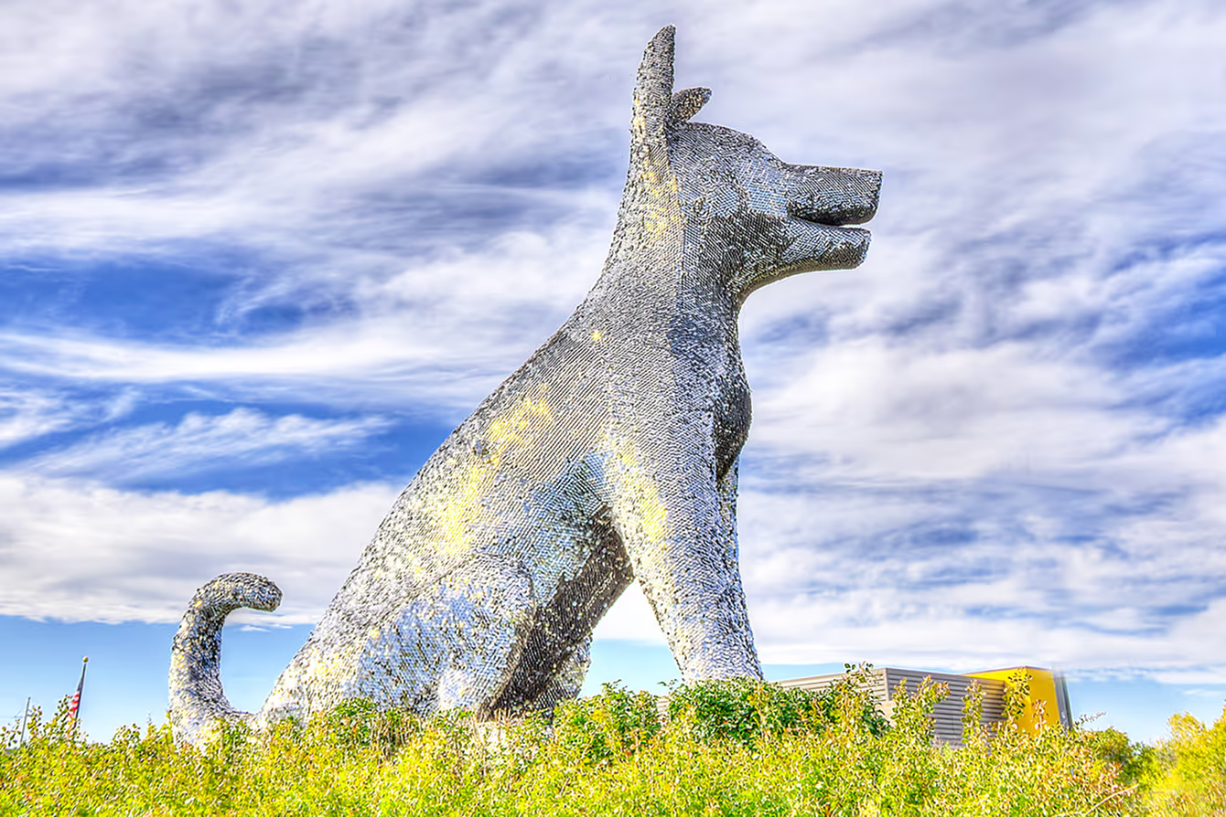
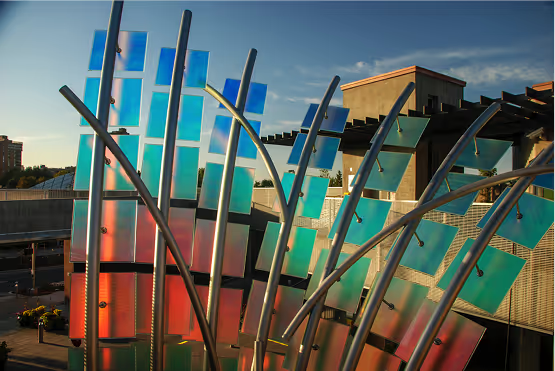
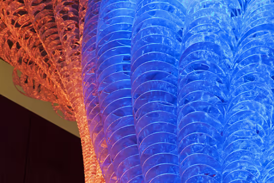
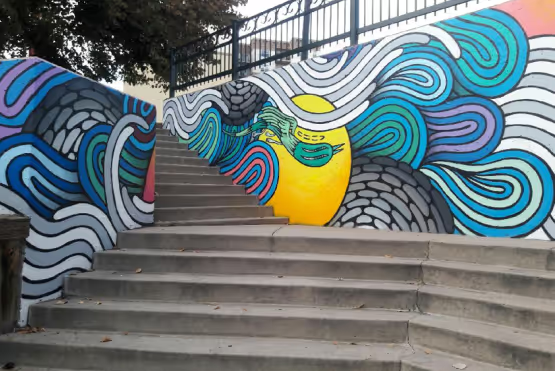
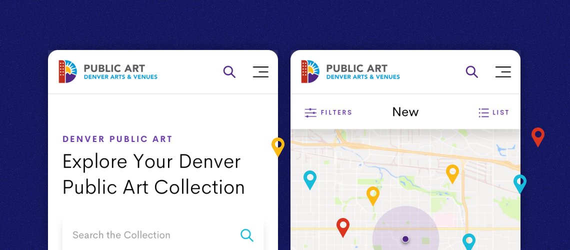
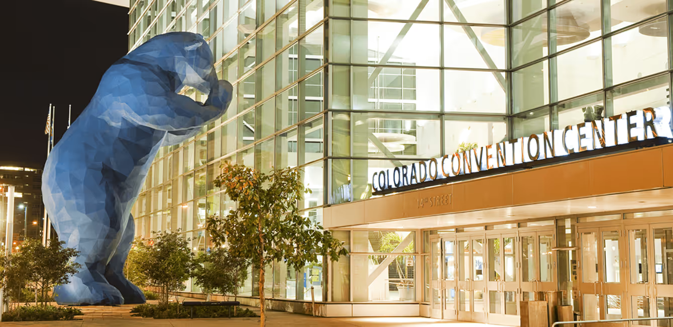
Public art isn’t necessarily something people ask for. It’s just there. In Denver, it’s not just there, it’s everywhere. The Public Art team at Denver Arts & Venues wanted to create a digital experience to connect people to the art that colors their city. We conducted a series of design sprints to refine the idea and test our prototype. The outcome: a mobile-first website to encourage exploration and help make public art more accessible.
“I'm very proud of the efforts we have made to make it useful for everyone.”
Michael Chavez, Public Art Program Manager
The Challenge
Putting Denver on the map.
With 400 pieces and counting, $40 million invested, and a continuous contribution of 1% of all public improvement projects, Denver has a budding art scene. But they only had a subsection on Denver Arts & Venues’ website to showcase the collection and promote events, tours, and education. They wanted a website of their own to feature and share the collection. As a government organization, it also needed to adhere to brand standards, be evaluated against WCAG 2.1 accessibility standards, and prove its value to the public.


The Process
Start with a sprint.
To ensure maximum impact, we started with a design sprint. First, we narrowed down the goal: increase viewership and interactivity with public art. We ideated on some tactics, mapped out the desired outcome, and picked a sprint target: communicate nearby art pieces to the public. This created the blueprint to bring our ideas to life.
A community effort.
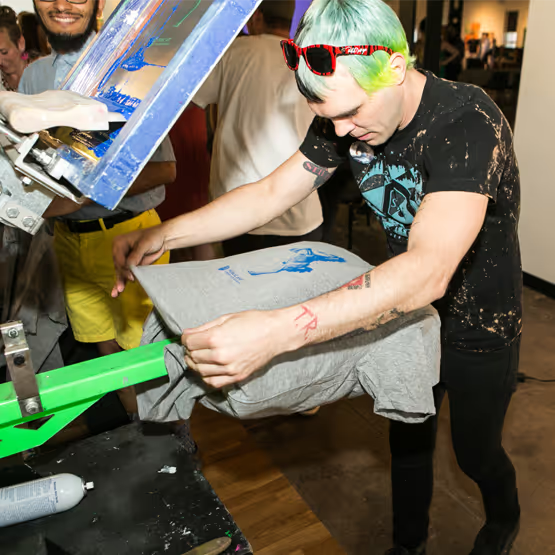
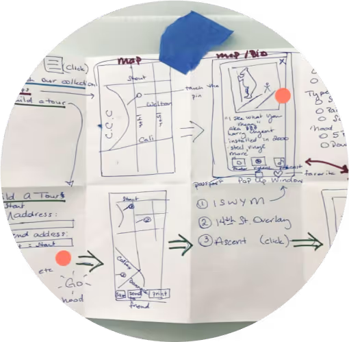
The purpose of this project was to connect people in Denver with their public art collection. We couldn’t do that without involving them in the process. At Denver Startup Week, we led a community design sprint focused on solving the same problem. Taking the ideas from participants, as well as those from the Public Art team, we created a clickable prototype. We then tested it with passersby on the streets of Denver, and got the insights needed to start building the website.
Mobile-first, accessible design.
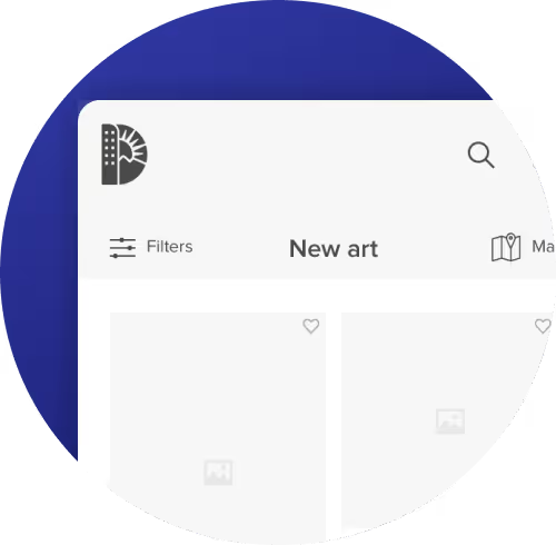
We toyed with the idea of building an app, but decided it would limit the user base. Designing mobile-first and incorporating advanced functionalities, we created a “web app” that is as interactive on desktop as it is on your phone. Working with our in-house accessibility experts throughout the project, we designed against 2.1 WCAG standards.
Built for exploration.
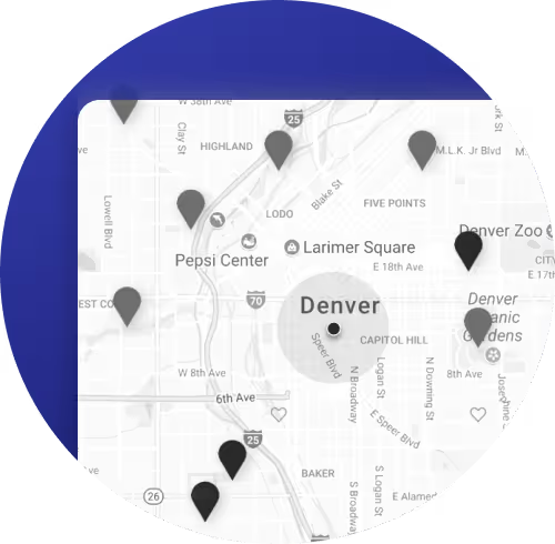
To promote exploration with the physical collection, we prioritized an interactive map. Users can find nearby pieces, explore neighborhoods, and check-in. There’s a login functionality for people to save where they’ve been, favorite pieces, and curate their own “collections.” We also wanted to encourage exploration with the digital collection, integrating with and updating their database.
The Process
Start with a sprint.
To ensure maximum impact, we started with a design sprint. First, we narrowed down the goal: increase viewership and interactivity with public art. We ideated on some tactics, mapped out the desired outcome, and picked a sprint target: communicate nearby art pieces to the public. This created the blueprint to bring our ideas to life.
A community effort.
The purpose of this project was to connect people in Denver with their public art collection. We couldn’t do that without involving them in the process. At Denver Startup Week, we led a community design sprint focused on solving the same problem. Taking the ideas from participants, as well as those from the Public Art team, we created a clickable prototype. We then tested it with passersby on the streets of Denver, and got the insights needed to start building the website.
Mobile-first, accessible design.
We toyed with the idea of building an app, but decided it would limit the user base. Designing mobile-first and incorporating advanced functionalities, we created a “web app” that is as interactive on desktop as it is on your phone. Working with our in-house accessibility experts throughout the project, we designed against 2.1 WCAG standards.
Built for exploration.
To promote exploration with the physical collection, we prioritized an interactive map. Users can find nearby pieces, explore neighborhoods, and check-in. There’s a login functionality for people to save where they’ve been, favorite pieces, and curate their own “collections.” We also wanted to encourage exploration with the digital collection, integrating with and updating their database.


The Solution
People in Denver can now get more out of their public art collection by exploring both online and in-person with an interactive "web-app," built to strengthen the city’s art community and help make public art more accessible.
Mobile-first web “app”
Personal profiles for users to curate and share collections and tours
Gamification through points awarded for interacting with pieces of art
Interactive map functionality to encourage exploration
Users can locate the nearest piece of art, navigate to it, and check in to earn points
Built custom APIs to integrate with the Collective Access art database
Designed and built against WCAG 2.1 accessibility standards


The Results
210
members in the first 3 months
116
user-curated galleries created in the first 3 months
36,391
page views in the first 3 months
The Awards
CSS Awards:
Best UI, UX, Innovation
Best UI, UX, Innovation
CSS Awards:
Special Kudos
Special Kudos
“We loved designing the Denver Public Art website with you and the team. Thanks for being an awesome partner!”
Brendan Picker, Public Art Administrator
Behind the scenes
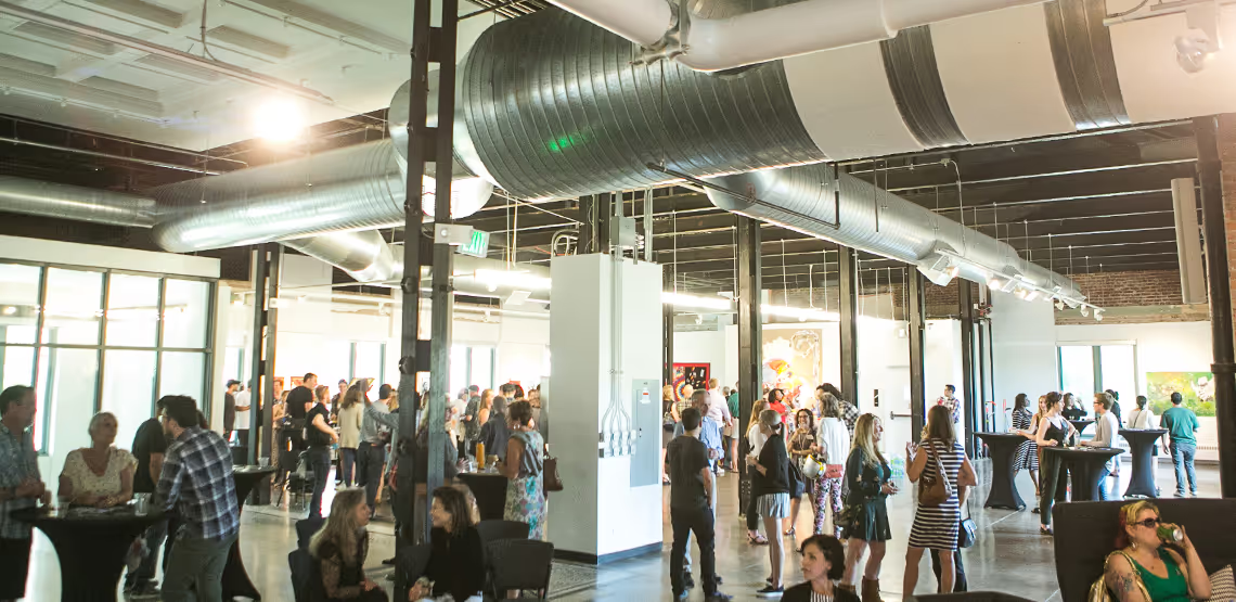
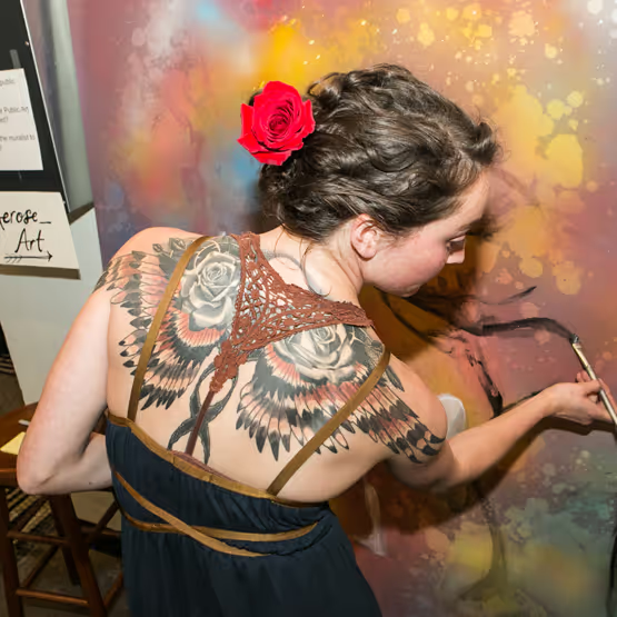
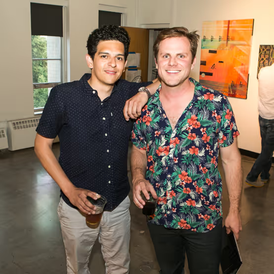
Denver Public Arts Launch Party
