How web design affects conversion rates: a practical guide
Originally published April 2, 2025 by Jeff Molitor. Updated May 25, 2026 by Jeff Molitor.
Web design directly affects conversion rates through five measurable levers: page load speed, call-to-action clarity, visual hierarchy, social proof placement, and mobile responsiveness. Each lever can be tested in isolation, and each compounds when designed together. At Clique Studios, our design team has rebuilt sites for Northwestern University, Chicago History Museum, Punchbowl, and Apollo, and the conversion lifts on those projects came from disciplined application of these five levers rather than aesthetic instinct. This guide breaks down how each design decision maps to a conversion outcome, with examples drawn from our portfolio and the testing data behind them. Read it once for the framework, then revisit it section by section when you are auditing a specific page on your own site.
Why does web design directly affect conversion rates?
KEY TAKEAWAYS: Web design affects conversion rates by shaping user trust, navigation speed, and decision clarity within the first few seconds of a visit. Five design levers carry most of the impact: page load speed, CTA prominence, visual hierarchy, social proof placement, and mobile responsiveness. Conversion lifts of 30% or more are realistic when all five levers are designed together rather than tested in isolation.
Conversion rate is the percentage of visitors who complete the action a page is built around — a purchase, a form submission, a sign-up, a download. Web design shapes that percentage at every step of the user journey. The header bar tells the visitor where they are. The hero section tells them whether they belong here. The CTA tells them what to do next. Each design decision either reduces friction or adds it, and the cumulative effect compounds across the page.
The five conversion levers — speed, CTAs, visual hierarchy, social proof, and mobile responsiveness — are not independent. A fast-loading page with a buried CTA still underperforms. A prominent CTA on a slow page never gets clicked. Strong social proof above the fold is wasted if the form below it asks for fifteen fields. The design team's job is to optimize all five simultaneously, then test the combinations to find which configuration produces the highest lift.
AI-driven search has raised the stakes on every one of these decisions. Following Google's May 2026 Core Update, AI Mode is answering more informational queries in-place, which means the pages users do click through to need to convert at a higher rate to make up the lost click volume. The rest of this guide walks through each lever in order, starting with speed and ending with the A/B testing discipline that makes any of these gains repeatable.
How does website speed affect conversion rates?
KEY TAKEAWAYS: Website speed affects conversion rates at a measurable rate of roughly 7% lost per additional second of page load time. E-commerce sites loading in under 1 second convert at roughly 3 times the rate of sites loading in 5 seconds. Speed optimization is the highest-ROI conversion fix because gains compound across every page and every visitor.
Page load time is the single most measurable design decision affecting conversion. The widely cited 7% conversion drop per added second of load time holds across e-commerce, lead generation, and content-driven sites. Amazon's own internal data shows that every 100 milliseconds of additional load time costs roughly 1% in sales. For most mid-market sites, the difference between a 2-second and a 4-second page is a 14% conversion gap that no amount of copy optimization can recover.
The three highest-return speed fixes are image compression, eliminating render-blocking JavaScript, and deploying a content delivery network. Image compression alone often cuts page weight by 40 to 60 percent on sites that have not had a recent audit. Render-blocking scripts are the most common cause of poor Largest Contentful Paint scores — Google's Core Web Vitals metric for how quickly the main page content appears. A CDN reduces server distance to the user, which compounds with the first two fixes.
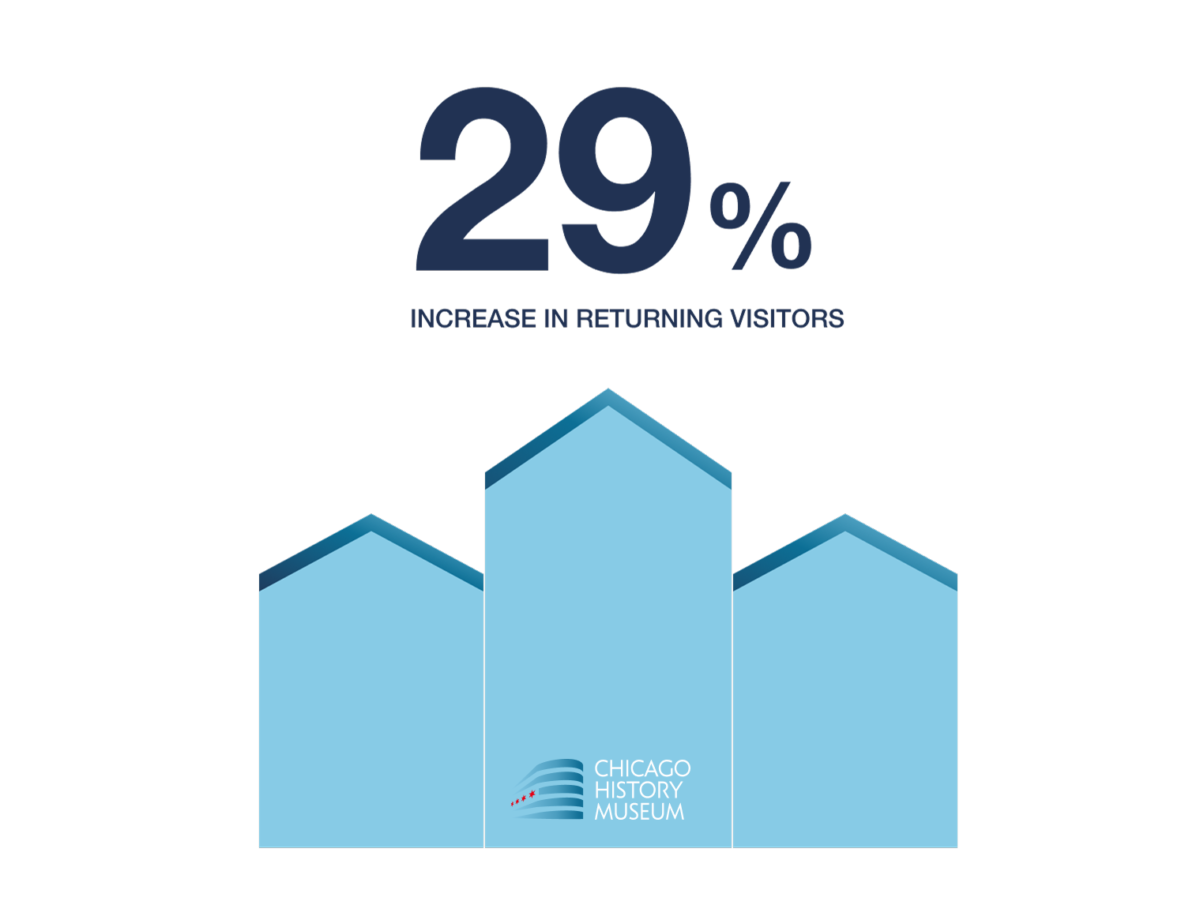
When Clique Studios rebuilt the Chicago History Museum site, reducing load time on the homepage contributed to a 29% lift in returning visitors over the period following relaunch. Speed is rarely the single cause of a conversion improvement, but it is almost always part of the cause. Measurement tools matter here: Google PageSpeed Insights, GTmetrix, and Pingdom each give a slightly different read on the same page, and using more than one keeps the team honest about which fixes are real.
What landing page elements drive the most conversions?
KEY TAKEAWAYS: The landing page elements that drive the most conversions are a single primary CTA above the fold, a headline that names the offer in under 12 words, and one piece of social proof visible without scrolling. Form length is the single largest friction lever; Baymard Institute research shows reducing checkout form fields from 14 to 6–8 measurably lifts completion rates. Every additional CTA or competing visual element measurably reduces the primary conversion rate.
Landing pages exist to drive one action. The discipline of landing page design is removing everything that does not serve that action.
Call-to-action design
A landing page should have one primary CTA, repeated up to three times as the page scrolls. Multiple competing CTAs — "Sign up" plus "Download" plus "Schedule a demo" — force the user to make a choice before they have committed to any single path, and many leave instead. CTA copy should name the action rather than the brand experience: "Start a free trial" outperforms "Get started," which outperforms "Learn more." Contrast matters more than color — a CTA button must stand visually apart from the rest of the page, regardless of brand palette.
Form length and friction
Form length is the single largest friction lever on most landing pages. Baymard Institute research shows the average e-commerce checkout has 14.88 form fields, against an optimal range of 6 to 8 for guest checkout. The pattern holds for lead-gen forms: cutting from 11 fields to 4 typically lifts completion rates by 30 to 50 percent. Every field is a question the user has to answer; every question is a chance to abandon. The audit question for any form is whether each field is necessary at this stage of the relationship, or whether it can wait until after the conversion.
Above-the-fold hierarchy
The first viewport must answer three questions in under three seconds: what is this, why should I care, and what should I do next. Headlines run 5 to 12 words and name a specific outcome. The supporting line below the headline carries the proof point or differentiator. The primary CTA sits in the upper-right quadrant of the viewport, where natural reading patterns land the eye. Trust signals — a recognizable client logo, a star rating, a testimonial line — belong in the same viewport, not three scrolls down.
Split testing the layout
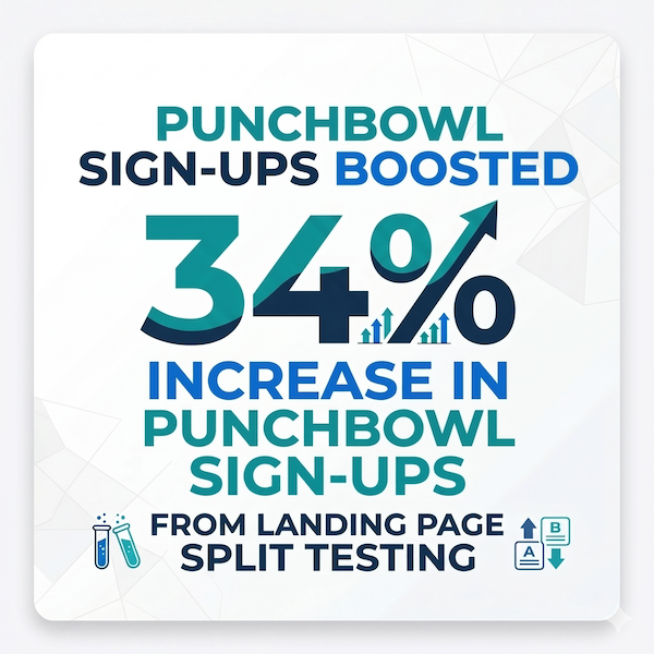
Most landing page assumptions are wrong on the first try. When Clique Studios worked with Punchbowl, split-testing different landing page layouts across headline, hero, and form variants produced a 34% increase in sign-ups. The discipline is not having an opinion before testing — the discipline is testing before committing to an opinion. Section 6 covers the testing methodology in more detail.
How do color, typography, and visual hierarchy influence conversions?
KEY TAKEAWAYS: Color, typography, and visual hierarchy influence conversions by directing user attention to the next action and signaling brand trustworthiness within milliseconds. CTA buttons with strong contrast outperform on-brand buttons by 15–34% in click-through tests. Typography choices affect comprehension speed: line lengths between 50 and 75 characters and a 1.5 line-height improve readability and lower bounce rates.
Color, typography, and visual hierarchy are the three design choices most often dismissed as "aesthetic" — and most often responsible for measurable conversion changes. Each one shapes the user's experience at a pre-conscious level, before the visitor decides whether to read the page.
Color decisions affect conversion through contrast first, brand alignment second. A CTA button that blends into the background underperforms regardless of how on-brand the color is. Nielsen Norman Group's eye-tracking research established that users scan web pages in an F-pattern — across the top, then partway down in a shorter horizontal sweep, then vertically along the left edge. A CTA placed in the natural F-pattern endpoint converts measurably better than the same CTA placed elsewhere on the page.
Typography affects comprehension speed, which affects bounce rate, which affects conversion. Body copy should run between 50 and 75 characters per line — shorter lines force too many eye movements, longer lines make it hard to find the start of the next line. Line height of 1.5 to 1.6 times the font size produces the strongest readability scores in controlled tests. Font choice matters less than weight and spacing; a well-set system font outperforms a poorly set custom font.
Visual hierarchy is the discipline of making the most important element on the page look like the most important element. Heading sizes, color weight, white space, and proximity all signal priority. When a page has three things that look equally significant, none of them registers as important. The hardest part of conversion-focused design is removing the elements that compete with the primary action.
Accessibility and conversion design overlap more than most teams expect. High-contrast color choices help users with low vision and also boost click-through on bright outdoor screens. Larger tap targets reduce mis-taps for users with motor impairments and also reduce mobile form abandonment. Designing for the edge case usually improves the median user experience at the same time.
How does social proof influence conversion decisions?
KEY TAKEAWAYS: Social proof influences conversion decisions by reducing the perceived risk of taking action when the user has not yet built trust with the brand. Northwestern University's Spiegel Research Center found that displaying reviews can lift conversion rates by 270% for products moving from zero to five reviews. Placement matters more than volume: one credible testimonial above the fold outperforms ten testimonials buried below.
Social proof works because most people would rather follow than decide. The strongest social proof signals come from sources the visitor already trusts or recognizes — a peer in their industry, a familiar brand logo, a third-party rating. Generic testimonials without a name, role, or company carry almost no weight.
Reviews and ratings
Customer reviews are the highest-ROI social proof for ecommerce and consideration purchases. Northwestern University's Spiegel Research Center analyzed retail conversion data and found that products moving from zero reviews to five reviews see a 270% increase in purchase likelihood. The first five reviews carry most of the impact; gains diminish quickly after that. Higher-priced items see disproportionately larger lifts than lower-priced ones — Spiegel's research showed a 380% conversion lift for high-priced products versus 190% for low-priced ones.
Case studies and metrics
For B2B and services audiences, named case studies outperform anonymous testimonials. A case study works when it includes the client name, the specific outcome, the metric behind the outcome, and the timeframe. When Clique Studios partnered with Loyola Today, strategically placed testimonials from students and faculty lifted newsletter subscriptions by 52%. The lift came from placement, not volume — moving existing testimonials above the fold did the work.
Expert endorsements
Industry analyst recognition, awards, and credentialed reviewer quotes carry weight in regulated industries — healthcare, financial services, higher education — where peer validation moves decision-making. One genuine analyst quote with attribution outperforms a wall of customer star ratings in these verticals. The trust signal works because the source is harder to fake than a five-star rating.
Logo walls and client lists
A row of recognizable client logos is the lowest-friction social proof to deploy and surprisingly effective for B2B sites. The logos must be real, current, and recognizable to the visitor's segment. A logo wall featuring unfamiliar names from outside the visitor's industry adds visual noise instead of trust. For most B2B clients, three to six well-chosen logos above the fold beats twenty logos in a scrolling marquee.

How does A/B testing improve a website's conversion rate?
KEY TAKEAWAYS: A/B testing improves a website's conversion rate by replacing design opinions with measured user behavior on isolated elements. Disciplined A/B testing programs typically deliver 20–30% cumulative conversion gains in the first 12 months, compounding across CTAs, headlines, form layouts, and pricing display. The technique only works when traffic volume produces statistical significance within a reasonable test window.
A/B testing replaces the question "do we like this design?" with "does this design convert better than the current one?" The two questions produce different answers more often than design teams want to admit.
A useful test isolates one variable at a time — headline, button color, form length, image — and runs against a control until statistical significance is reached. Significance typically requires 2,000 to 10,000 visitors per variant for a 5% confidence interval, depending on the size of the conversion effect being measured. Sites with lower traffic should test bigger changes (full layout swaps, fundamentally different copy) rather than small variations, because the smaller the effect, the more traffic required to confirm it.
The metrics that matter for testing are conversion rate first, then secondary engagement signals (time on page, scroll depth, click-through), and bounce rate last. Bounce rate is a lagging and noisy indicator — a page that loses bouncers to a clearer "this is not for you" signal can have a higher bounce rate and a higher conversion rate at the same time. Heat-mapping tools like Hotjar and Microsoft Clarity show where users actually click and scroll, which often contradicts what the analytics dashboard suggests.
The mistake most teams make is treating A/B testing as a project rather than an ongoing program. The first test usually produces the largest single lift; subsequent tests produce smaller lifts that compound. A disciplined testing program running for 12 months can deliver 20 to 30 percent cumulative conversion gains across CTAs, headlines, form layouts, and pricing display. The team that tests three changes a month for a year out-performs the team that tests thirty changes in a single quarter.
Our experience designing for conversion
Conversion-focused design is a practice, not a theory. The case studies below are projects where Clique Studios redesigned around a specific conversion objective and measured the outcome. Numbers are first-party, drawn from each client's analytics platform.
Northwestern University — international student recruitment platform
- Rebuilt the Northwestern University international student recruitment platform, simplifying navigation across the core program pages.
- Streamlined navigation produced a measurable lift in session duration and program-page engagement — two leading indicators for application starts.
Chicago History Museum — homepage and donation redesign
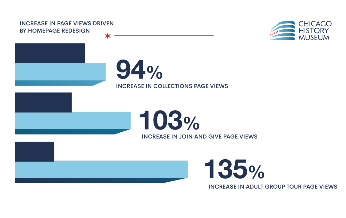
- Redesign delivered a 94% lift in collections page views, 103% lift in Join & Give page views, and 135% lift in adult group tour page views.
- Returning visitor count rose 29% in the period following relaunch.
Punchbowl — social planning platform
- Worked with the Punchbowl social planning platform on conversion-focused landing page rebuilds.
- Split-testing across headline, hero, and form variants produced a 34% increase in sign-ups.
Apollo — healthcare technology platform
- Rebuilt the Apollo healthcare technology platform with a mobile-first responsive design system.
- Mobile-first redesign lifted user engagement by 47%.
Loyola Today — university news platform
- Redesigned the Loyola Today university news platform with revised testimonial placement and editorial hierarchy.
- Strategically placed testimonials from students and faculty lifted newsletter subscriptions by 52%.
IFANCA — certification organization
- Partnered with IFANCA, a global certification organization, on adaptive redesign work responding to changing market conditions.
- Engagement and conversion metrics improved across the post-relaunch reporting period.

What to look for in a conversion-focused design partner
Not every design agency optimizes for conversion. The discipline requires research, testing infrastructure, and a willingness to validate design opinions against user behavior data. The criteria below separate teams that design for conversion from teams that design for aesthetics and hope conversion follows.
- Documented test results from past projects, with first-party metrics rather than vendor-supplied case studies.
- In-house UX research capability — heuristic audits, user interviews, and analytics review before any design work begins.
- Platform-agnostic recommendations rather than reflexive defaults to one CMS regardless of the use case. Clique Studios builds in Webflow, WordPress, and Contentful depending on which platform fits the client's editorial workflow and budget.
- A defined CRO methodology that distinguishes between page speed work, copy testing, and visual hierarchy testing — each requires different measurement windows and different statistical thresholds.
- Transparent communication on what is measured, how long tests run, and what counts as statistical significance.
- Portfolio depth in the client's industry or audience type. Conversion patterns vary widely across higher education, healthcare, ecommerce, and member organizations — a team that has only worked in one vertical brings narrower instincts to a new one.
Ready to design for conversion, not just for looks?
Most websites lose more conversions to design friction than to a weak value proposition. If you want a partner who can identify which design choices are costing you customers — and rebuild around the levers that actually move the number — Clique Studios can help.