Build something educational.

Dashboard interface for Northwestern University learning platform with welcome message and progress tracker for a mindfulness module.
UX Research
UX Strategy
UI Strategy
User Interface Design
Illustration
Web Design
Custom Development
Industry
Higher Education
Year
2023
Services
UX/UI, WordPress, Illustration, Design
Illustration of colorful interlocking gears labeled with concepts like strategy and goals inside a larger purple cog.
Gearing For Success

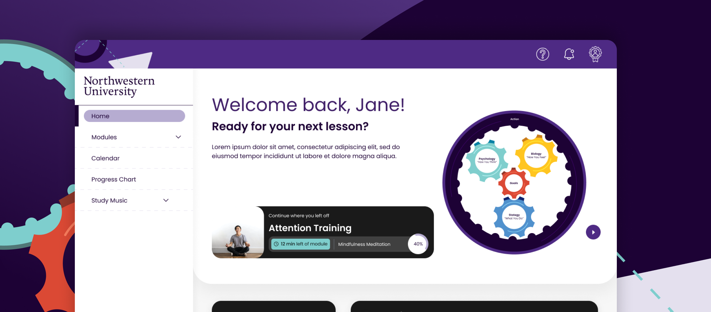
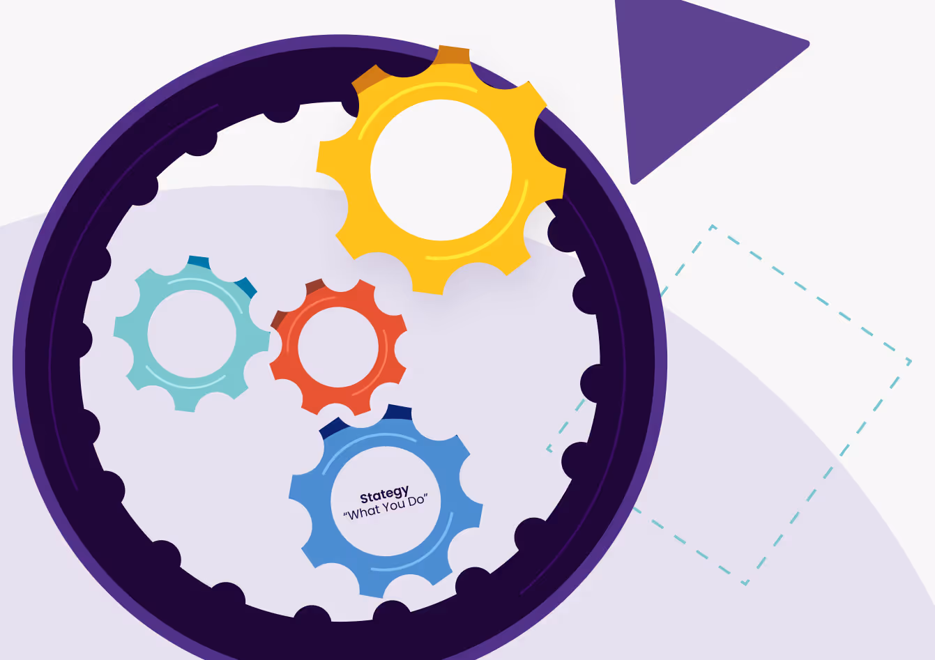
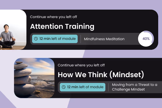
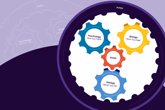
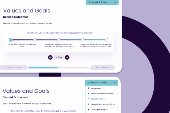
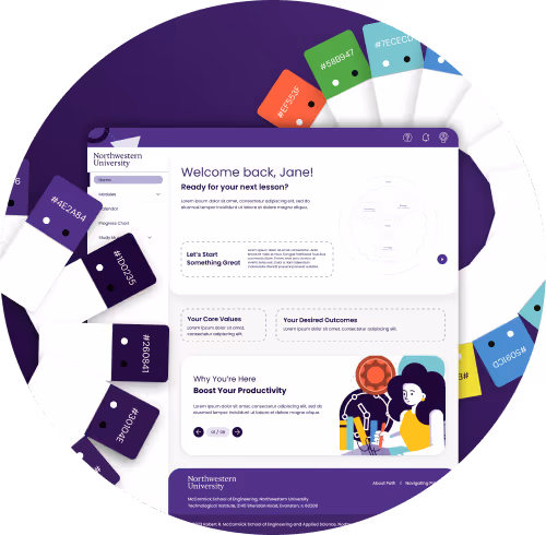
Northwestern PATH is a program and learning management system (LMS) geared towards engineering students at Northwestern University who seek to learn techniques and habits around studying, goal-setting, introspection, and maintaining positive mental health. They came to us to modernize the look and feel of their LMS so that students are more engaged, while amplifying their Gears of Performance ethos; a manifesto of how you think, how you feel, and what you do that powers your values and goals on the path to taking intentional and courageous action.

The Challenge

From stale to scale.

Students use the PATH LMS to learn by completing weekly modules, filling out their weekly calendar, and gaining a sense of course-long trends with their progress charts. Previously, the UI was stale and outdated. Usage data showed that the majority of the students completed the modules last-minute. They rushed through the content and failed to adopt features geared toward reflection. Working as a cross-functional team, we leaned into gamification to drive personalization and retention. We also strove for modularity to future-proof the platform and help the university eventually license it to other institutions.
Grid of student reflections and value statements on a dark purple background.
The Process

But first, strategy.

Over the years, the Red Rocks’ brand and website evolved unintentionally into an unwieldy experience for their fans and their internal team. To understand their industry, audience, and story, we assessed current performance, developed user personas that focused on their digital pain points, and built a strategic information architecture. As we learned about their organizational goals and operations, their team shared the need to have a functional store as soon as possible, given that the summer is their most important merchandising season. Because we flagged the Red Rocks Store early on, we were able to build and launch an eCommerce microsite to serve as their online store a full year prior to the full experience.
Weekly calendar interface showing student schedule with time breakdown and user feedback notes.

What if we...?

Red Rocks didn’t have a strict brand definition, and we developed several iterations of the design without an “aha” moment. So, rather than continuing to swing and miss, we created a new Visual Identity Workshop, where their team—given direction, time, and guidance—collaborated with our designers to define the direction for the Red Rocks’ brand moving forward. Then, from that shared place of understanding, our design team regrouped, strategized, and presented the brand style guide that finally nailed the essence of Red Rocks (“aha!”).
Illustrated slides from a course module promoting productivity and habit-building.

Capturing a feeling.

Red Rocks means so many different things to different people. We created a design language that allows for flexibility across mediums but still feels uniquely “Red Rocks.” To create the illusion of depth in digital and echo the expansive, outdoor, rugged feeling of the amphitheatre, the design uses texture as an element. The speckled layer appears throughout the website—applied to backgrounds, text, and buttons—and also inspired the custom, bold typeface that’s now a Red Rocks’ brand staple.
Milestone achievement dashboard displaying module badges and gear progress tracker.

Getting clever about priority.

Red Rocks has a lot of activities to promote—from electronic dance concerts to “Yoga on the Rocks.” To prevent content-overload, we balanced their bold branding with simple UX, giving the users more control. On the calendar and events page, users can toggle between calendar, list, and grid views, as well as filter and/or sort the content. Ad space is strategically placed throughout the site to empower the sponsorship team to earn revenue, without distracting from the overall experience.
Northwestern University learning platform homepage with colorful cards and welcome message for the student.

At lightning speed.

With so much content, there was a lot of data to manage behind-the-scenes. For the backend, we diverged from a traditional WordPress install in a few areas. To get quick responses on the calendar and the archived events, we used custom REST endpoints to pull the data we needed when we needed it, and cached the results for quick execution of core website features. For some pages, we rolled a custom disk-based caching method for blocks of event data. It’s compiled on a seperate server and then distributed (via file) to the load balancer. For these pages, this removes the querying burden from the database, which can be a potential bottleneck and cause performance issues.
The Process

Let’s get personal.

After speaking with deans and program coordinators, it was imperative for us to get a more intimate and unfiltered point of view directly from the platform’s users—students. Unfortunately, students were on summer vacation, so we had to get creative. We sent a survey to past students to gather attitudes around the PATH platform. We also scheduled a handful of follow-up, contextual inquiry sessions with alumni to see how they interact with the site. This research helped us better shape our design convictions and understand and prioritize pain-points.

Collaborate over coordinate.

In a fast-paced working environment, it’s common to delegate work to subject matter experts for efficiency’s sake. The tradeoff is this can lead to silos. We strove to have all project team members in the same conversations with stakeholders and students to create a culture of empathy and shared understanding. We compiled industry reading and design pattern examples in order to form common language, understand the landscape, and inform product vision. Weekly working meetings ensured that research and design considerations could be voiced and evaluated promptly.

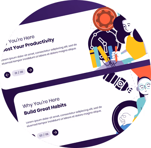
Remind students why they're there.

Our research showed that students could benefit from being reminded of the program’s value. We decided to use a carousel on the main dashboard screen listing value propositions, which also provided scalable value for the platform. In the same spirit, we created a push notification design system. Accounting for the cadence and frequency of notifications would help drive students back into the platform or the material to engage in a wider variety of ways throughout the week. While our UX Designer created the types of notifications rooted in business and user needs, our UI Designer created the interaction style and toggle functionality needed to bring the concept to life.

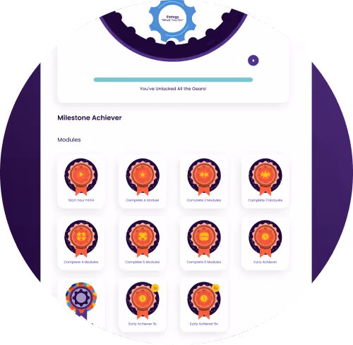
Reward student progress.

We decided to lean into a rewards-driven gamification strategy to incentivize engagement. A recent study found that 67% of students in the US prefer learning methods that incorporate game-like elements, such as rewards and competition.

Future-forward.

We explicitly defined which colors and elements would be native to the platform and which could be customized by other school admins. For custom colors, our designer Keymoni “focused on areas that impacted the platform's structure and usability—like button colors, main text, banners, dropdowns, and other key UI elements.” These colors were tied to the primary palette to maintain a consistent look.
Grid of student reflections and value statements on a dark purple background.
Weekly calendar interface showing student schedule with time breakdown and user feedback notes.
Illustrated slides from a course module promoting productivity and habit-building.
Milestone achievement dashboard displaying module badges and gear progress tracker.
Northwestern University learning platform homepage with colorful cards and welcome message for the student.
The Solution

The transformation of Northwestern PATH represents not just a redesign of an LMS, but a reimagining of how engineering students engage with their learning journey. As we move forward, we’re excited about the potential for Northwestern PATH to inspire and empower students at other institutions. With Northwestern PATH leading the way, we’re confident that the future of higher education tech is brighter and more promising than ever before.

Key Process Solution
Stakeholder coordination to ensure feedback was heard and communicated between teams
UX research including interviews and contextual inquiry to discover the most impactful way to present content across the site
Key Features
Push notifications to drive engagement and retention
Rewards-based badges to encourage students and incentivize learning
A revised Progress Chart with immersive data visualization
An enhanced Calendar with a graphic circle of how students spend their time to evaluate how their time spent aligns with their values along with a clearer Google/iCal import/export user flow
Large visual mockup of a Northwestern University digital learning platform showcasing multiple interface screens, including dashboards, lessons, calendars, progress tracking, user profiles, and discussion features.
The Results
32%
Increased user satisfaction
79.2
Average CSAT
User Quotes
Large, stylized quotation mark
“I love the new website, it's very interactive and engaging”
Large, stylized quotation mark
“I love the badges and celebrations for finishing each step”
Large, stylized quotation mark
“I like how everything is organized”
Large, stylized quotation mark
“Push notifications have helped keep me on track”
Like what you see?

Build something with us.

Talk To Us