Build something hopeful.

Messaging Strategy
Logo Design
Identity Design
Website Design
Nonprofit
2018
CSS: Best UI, UX, Innovation, CSS: Special Kudos, Awwwards: Honorable Mention
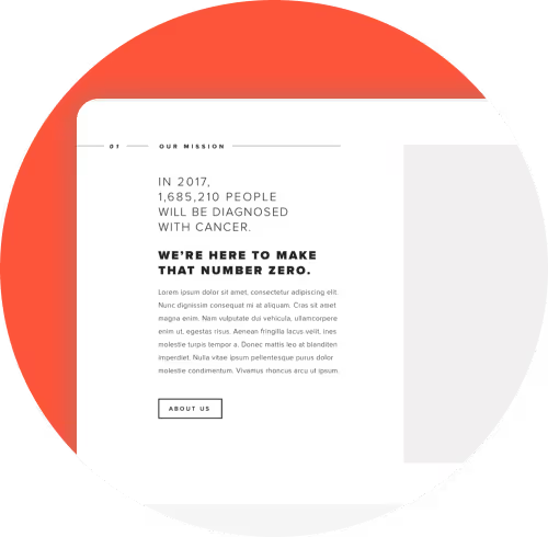
The Cancer Research Foundation is funding the best minds in cancer research, on a mission to reduce cancer deaths to zero. With a new visual identity, a refined messaging strategy, and an improved digital experience, the new site is helping these “Cancer Research Venture Philanthropists” move closer to achieving that goal.
“The team was truly collaborative. They also pushed boundaries on design, thinking and overall branding. They weren't just a "yes" studio. They delivered on what we asked but they pushed us to think different and outside of our own conventional thought process"
Carlo Navarro, Director of Digital Strategy

The Challenge
Driving urgency to take action.
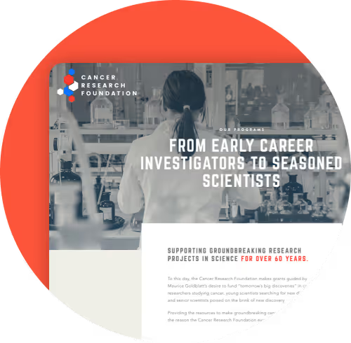
CRF has an amazing story to tell, but their previous website wasn’t doing that story justice. It was outdated, difficult to update on the backend and confusing to navigate on the frontend. They needed their website to drive the urgency of their mission to increase donations and, in turn, help further their impact.

The Process
Start with story.
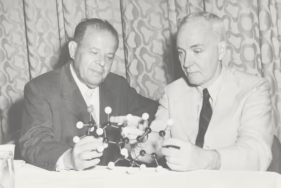
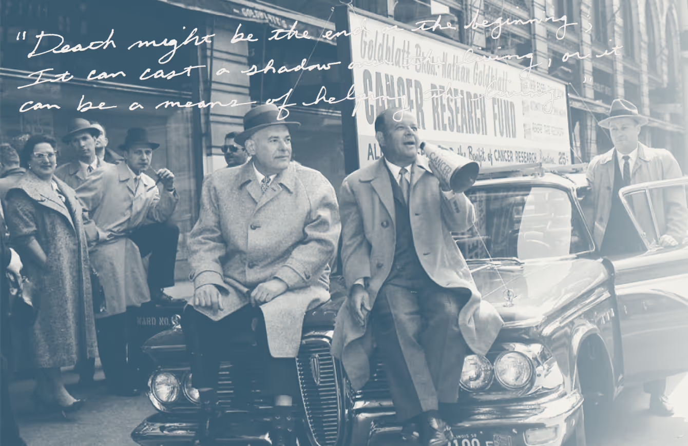
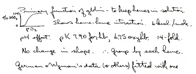
Over the past 60+ years, the organization has funded 180 of the brightest minds in cancer research. From their founding to the present day, their commitment to their mission is relentless. We drew inspiration from old black and white photographs and hand-written letters showing some of their pioneers hard at work. We wanted to balance their long history of impact with their cutting edge approach to research today. The result is strong, emotional messaging—of "fighting" and "hope" and "bold ideas"—that better tells their story and moves users to action.
Establishing a new identity.
To modernize their brand and strike the right tone with users, we crafted an entirely new visual identity—logo, typography, color palette, and style guide. We used elements of the hand-written letters and old photographs in the design itself, further driving home the organization's long history of impact.
Making an impact.
The main goal of the new site was to connect with potential donors and increase donations. We prioritized this conversion in designing the user flow. In addition, we integrated with a donation platform on the back-end to make it a frictionless process. To remove any decision fatigue, users can either donate a custom amount or choose from three benchmark sums. And it worked—there’s been an 81% increase in donations with the new website.

The Process
Start with the story.
Over the past 60+ years, the organization has funded 180 of the brightest minds in cancer research. From their founding to the present day, their commitment to their mission is relentless. We drew inspiration from old black and white photographs and hand-written letters showing some of their pioneers hard at work. We wanted to balance their long history of impact with their cutting edge approach to research today. The result is strong, emotional messaging—of “fighting” and “hope” and “bold ideas”—that better tells their story and moves users to action.
Establishing a new identity.
To modernize their brand and strike the right tone with users, we crafted an entirely new visual identity—logo, typography, color palette, and style guide. We used elements of the hand-written letters and old photographs in the design itself, further driving home the organization’s long history of impact.
Making an impact.
The main goal of the new site was to connect with potential donors and increase donations. We prioritized this conversion in designing the user flow. In addition, we integrated with a donation platform on the backend to make it a frictionless process. To remove any decision fatigue, users can either donate a custom amount or choose from three benchmark sums. And it worked - there’s been an 81% increase in donations with the new website.


The Identity
Logo experimenation.


Red
#fd553a
Beige
#f2f1ec
Navy
#44535f
Gray
#6f6f6f
Blue
#008cff
Light Gray
#d8d8d8
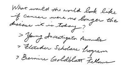
Handwritten design elements.


The Solution
CRF is funding the best hope against cancer: research. We are honored to join them in their fight for a cure, designing a new website that better connects with potential donors and drives urgency to take action.
Identity design including logo, new color palette, typography
Multiple color palette and logo iterations to build the right identity to strengthen the CRF brand
Introducing visual assets and new brand elements throughout to bring the brand to life
Used real hand-written letters from cancer pioneers as design accents
Modern, interactive design to balance showcasing the history of the organization with its future-thinking vision
Give WordPress donation integration to generate more donations


.avif)
The Results
81%
increase in
donations
donations
1k+
researchers funded
to date
to date
1k+
researchers funded
to date
to date
The Awards

CSS Awards:
Best UI, UX, Innovation
Best UI, UX, Innovation

CSS Awards:
Special Kudos
Special Kudos

Awwwards:
Honorable Mention
Honorable Mention
Behind the Scenes
Hands Free and Designing with Color


