Iconic Past, Bright Future
Apollo Theater is “The Soul of American Culture,” a nonprofit performing arts center known for its decorated history as a powerful catalyst for Black artistry and creativity. Apollo wanted to reimagine their digital space to showcase their current work, both physical and digital, while supporting their future growth. Working as a holistic, intentional team, we helped modernize the look and feel of their website while amplifying what matters most: Apollo’s commitment to their community and culture.
The Challenge
More Than a Theater
Apollo Theater is a unique space that acts as a hub for culture, film, literature, theater, music and more. In addition to providing educational content, they hold a wide array of programming including concerts, community conversations, comedy shows and plays. As an ever-evolving cultural icon of Black culture that offers many resources and events, Apollo needed a website that was bold, easy to navigate, and built for the future.
The Process
Still Pushing Boundaries
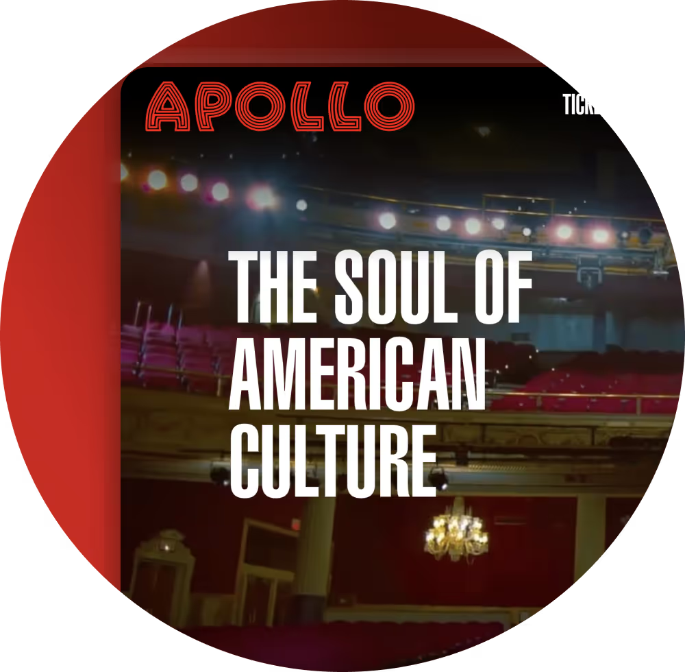
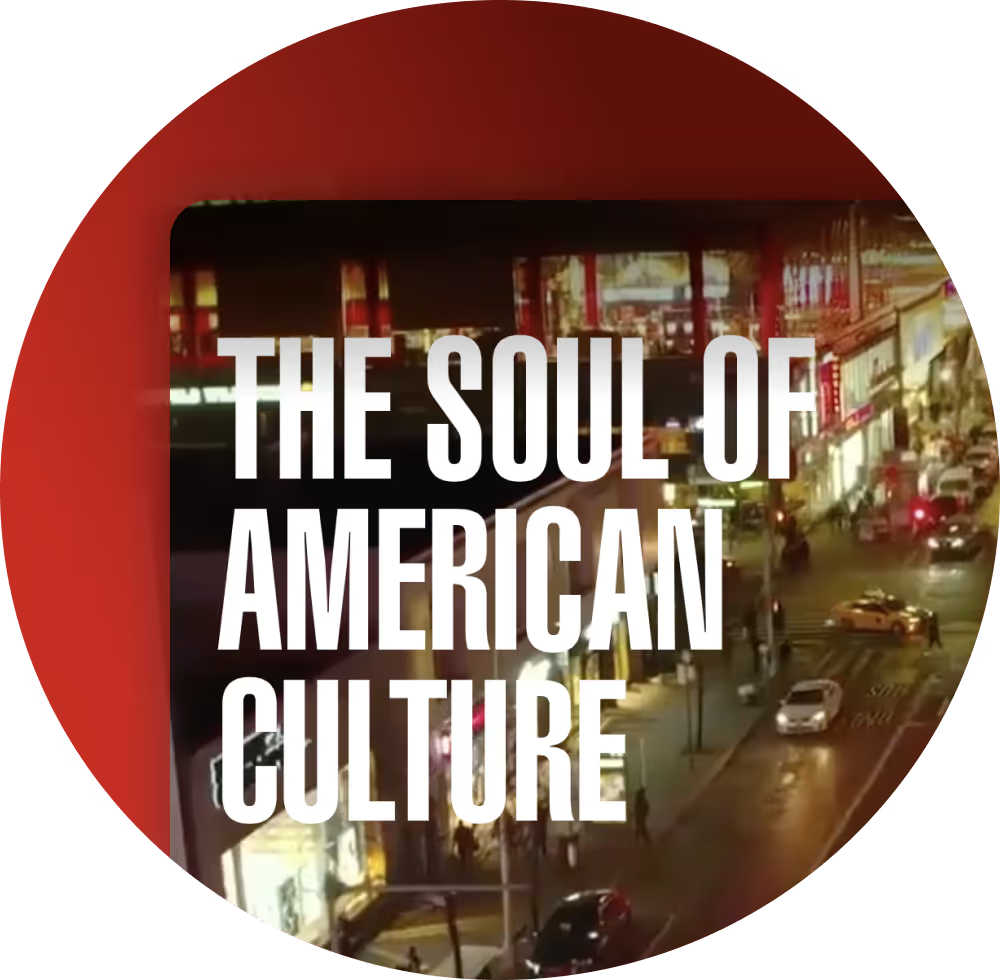
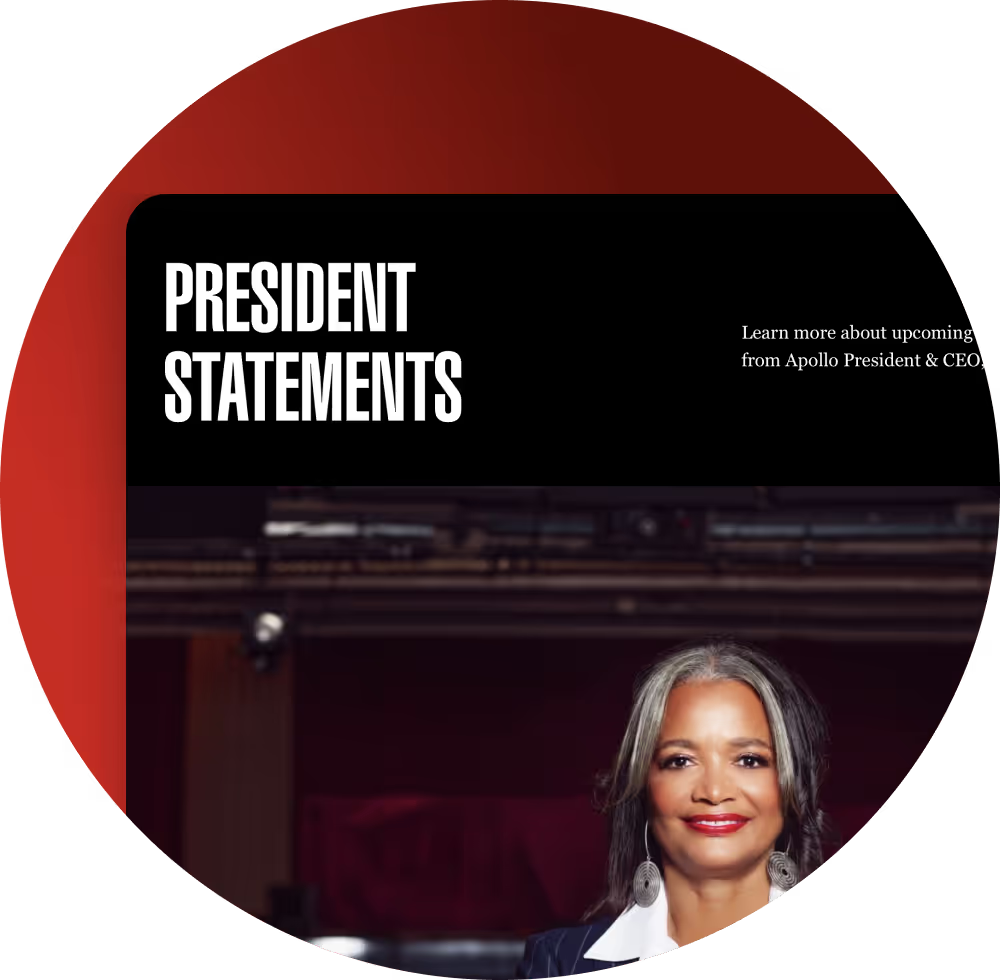
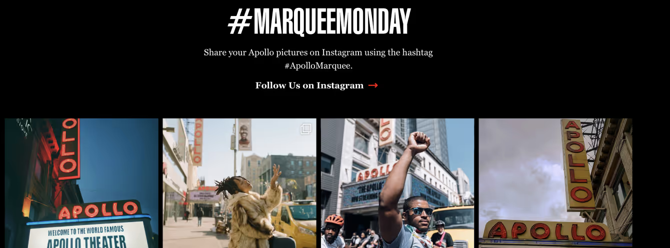
As one of the most impactful pages on the website, Apollo needed a homepage that was “alive.” It needed to be fresh, modern, and reflect Apollo’s immense energy towards boundary-pushing work. With this in mind, we introduced a design that was reflective of the space itself. We switched from a white to a black background, with focused, “lit” areas featuring bold graphics and content, emulating the captivating feeling of stepping into a theater. To support Apollo’s various audiences and promote their countless resources, we restructured the homepage to make the content easily digestible by introducing “card stacking” rather than long lists.
Building Apollo's First Digital Stage
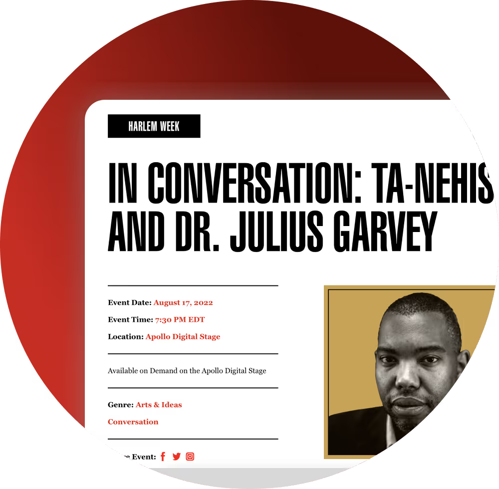
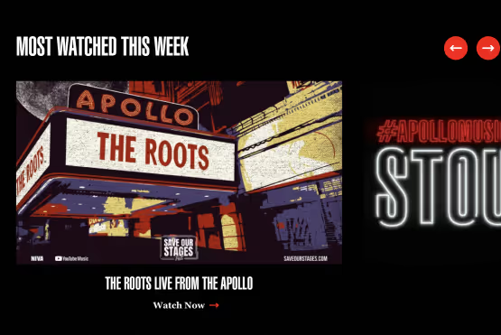
With the growing demand for virtual options, we created a digital stage to both reflect and be a replacement for their physical stage. In order to create a “living” space where audiences can easily explore content, we moved away from lists and created interactive content sections built for encouraging engagement. This included features like immediately playable video capabilities and navigation menus for continued exploration. Additionally, we constructed robust event detail pages that provide users with further information and easy access to content.
Make it a Date
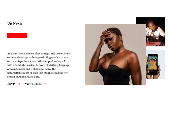
Events were a core component of Apollo, happening constantly both in-person and digitally. They needed a distinctive calendar and ticketing page that worked for their unique schedule. The Tickets & Events page was structured to show cards that presented featured events first and then continued onto a comprehensive calendar. As events at Apollo often lasted more than one day, we ensured upcoming listings defaulted to a calendar view for easy viewing. Lastly we introduced a filtering system, which allowed users to sort through numerous events by category, location, genre and more.
People First
People are at the heart of Apollo. The intense passion of all who walk through their doors–emerging artists, creative legends, dedicated team members, and loyal audience members–make the theater iconic. To reflect this, we drastically shifted from a text-based focus to a heavily visual design. Because photos and videos were most impactful in representing the significance of Apollo’s history, current mission and people, bold imagery and photography is integrated across the entire site.
Future-Forward
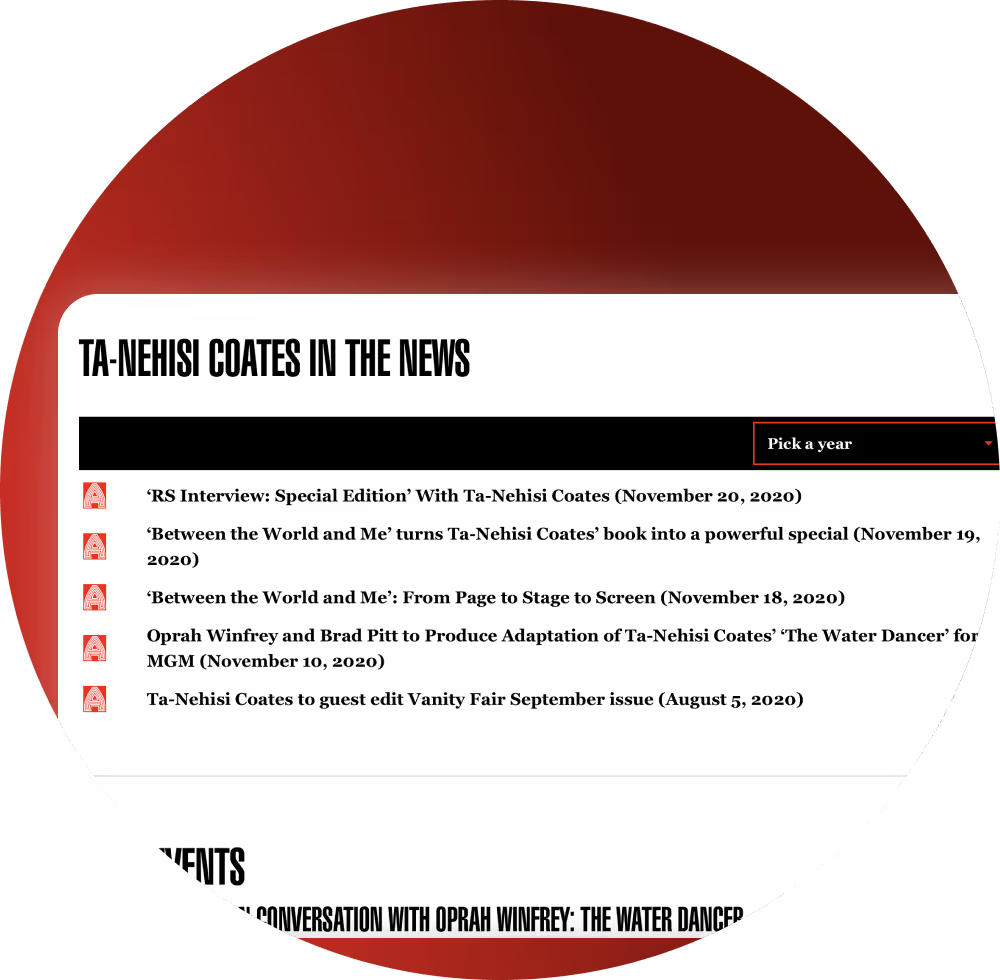
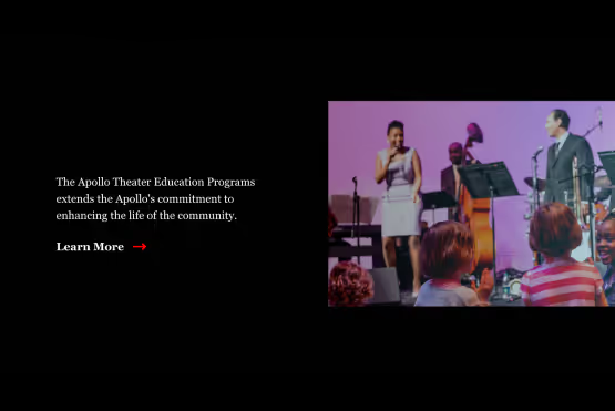
Apollo’s website needed to not only reflect their decorated history and current boundary-pushing ventures, it needed to be equipped to handle future growth as well. With a large amount of content, we created a digital library to present their past work in the most effective way possible through a featured post section, a filterable search function, and more. To support Apollo’s continued upward momentum, we redesigned the Giving and Education pages to simplify the user flow while focusing on the most important components such as program announcements and donation opportunities. For everything else, we provided a robust, flexible template.
A Fully Committed Team
From the start, our teams collectively built a foundation of understanding for Apollo’s vision for their digital experience. We dug into the work together with vulnerability, and acknowledged the realities of the work and the world in which it existed. We created a partnership that was human, full of give-and-take, guidance, and care. As our partnership evolved, so did our work–leading to a final product that reflected Apollo’s intense passion towards their values.
The Solution
Apollo’s new website embodies what makes the theater so legendary: a focused, driven mission to be a catalyst for new artists, audiences, and creative workforces with an unapologetic focus on Black culture. It tells the story of Apollo's iconic past, boundary-pushing present, and groundbreaking future. It’s bold, dynamic, strikingly visual, and–most importantly–ready for whatever Apollo does next.
Key Process Solutions
Messaging strategy workshop to uncover key audiences and core messaging needed to tell a compelling story
Stakeholder coordination to ensure feedback was heard and communicated between teams
UX research including a navigation analysis and heuristic evaluation to discover the most impactful way to present content across the site
A robust, flexible template to equip Apollo with tools that support their future growth
Key Features
Visually bold homepage that aligns Apollo’s digital space with their brand’s energy and aesthetic
Digital stage to bring Apollo’s content to a wider audience and encourage engagement with their work
Custom calendar that makes a large amount of content easily digestible and speaks to different audiences and their needs
Digital content library to make archiving content easy, while continuing to showcase it in an impactful way