Accessibility: A brief 6,000 word introduction
At Clique, one of our 3 values is “make somebody’s job easier.” Every time we build something, we challenge ourselves to keep this value at the forefront. Why build, if not to make things easier, simpler, and more accessible?
Maybe you—like us—want to build accessible stuff too. That’s awesome.
What Is Accessibility?
Accessibility is the practice of designing products, devices, services, or environments for people who experience disabilities. It’s about removing barriers that might prevent people with disabilities from accessing something. It’s about creating opportunity for everyone to participate in x, y, or z.
It’s About Inclusion

Web accessibility is all of this, but on the web. It’s more than just screen readers.
The Goal of this Guide
Our intention is to help you begin your accessibility initiative. It’s a great place to start, but—to be clear—it’s just that: a start. It outlines important stuff you need to know, from why you should care (hint: many, many reasons) to how you can have the biggest impact on web accessibility efforts in your role.
Use this guide as it best suits you. Read it from beginning to end, or reference it to refresh your mind on a specific topic. Favorite it. Open tab it. Pop it in your newsletter. Share, share, share.
You Should Care About Web Accessibility
Home-delivered grocery services are becoming a commodity in the U.S. Anyone who has used one knows the convenience of food dropped off at the front door. Imagine the gratitude you’d feel if, for whatever reason, you were unable to drive and lived miles away from the nearest store. Maybe you don’t have to imagine it, because you’ve felt it; you know that home delivery doesn’t only make lives convenient, but can improve them significantly.

In a New York Times article, Mary West shared her story with home delivery services. West is “visually impaired” and wasn’t able to read labels in grocery stores. For her, shopping was a dependent activity, relying on friends, family, or employees to help her. Now, with the launch of digital grocery delivery services, she orders online with voice recognition software.
Mary West’s story is just one voice among those currently living with a disability. For her (and many others with disabilities), home delivery isn’t just convenient, it is empowering; it is independence.
A good experience for the general public can be life-changing for a disabled or impaired individual.
A bad experience for the general public is usually much worse for a disabled or impaired individual.

Imagine if the people who can benefit from the internet most, beyond just a convenience, can’t use it. That’s the problem with inaccessible websites. The internet has a lot of power; it has the power to improve lives, but only if it works for everyone.


1 in 5 people in the U.S. currently have a disability
It is an ethical responsibility to serve all Americans, not just 80%. It is an ethical responsibility to build inclusive things.
Myth: designing for accessibility will make things worse.
Example: the curb cut.

A curb cut is the flattened edge between an elevated curb and crosswalk. It allows for smooth transition between the sidewalk and street. Although curb cuts are designed to help people using a wheelchair, they help everyone. Pushing a stroller? Riding a bike? Dragging your legs after an intense leg day at the gym? Curb cuts (and designing for accessibility) often make experiences better for everyone.
You might be thinking: “cool metaphor, but does it actually apply to digital stuff?”
Short answer: yes.
Quick example: captions.
Captions were originally implemented for people who are hard of hearing to interact with audio content (ex. dialogue and sound effects in movies). However, captions also benefit people who forget their headphones or students who learn through reading rather than listening or me watching Peaky Blinders (their cockney accents are just too hard to understand sometimes, okay?).
Another way to frame how designing for accessibility can lead to better solutions for everyone is the Trickle Down Accessibility model.
In short, building for accessibility can make solutions better for everyone

Still not convinced yet? Well I’m out of metaphors, but here’s a few more reasons to care about web accessibility.
1) You Want to Improve Lives
Web accessibility is about inclusion. It’s about making sure everyone can use the technology, platform, or site you’ve built without huge barriers. Maybe you’re passionate about equal opportunity and want to help build more inclusive things (yay you!).
2) You Want to Make More Money
I mean, who doesn’t? *winks at manager*
If money is on your mind, here’s some numbers to consider. 1 in 5 people in the United States currently have a disability. This amounts to around 56.7 million (yes, MILLION) people in the U.S. These people control around $175 billion (yes, BILLION) in discretionary income. More users = more money.
3) You Want to Avoid Lawsuits
Lawsuits can happen to anyone. Lacking in accessibility — *cough* *cough* discriminating — could be grounds for a case; in fact, it has been to a few major companies.
Making Your Website Accessible is The Law
There are two main laws that dictate the legal precedent for web accessibility: The Rehabilitation Act of 1973 and The Americans with Disabilities Act (ADA). Both were a result of the Disability Rights Movement, an ongoing movement in which people with disabilities are demanding equal protection under the law.
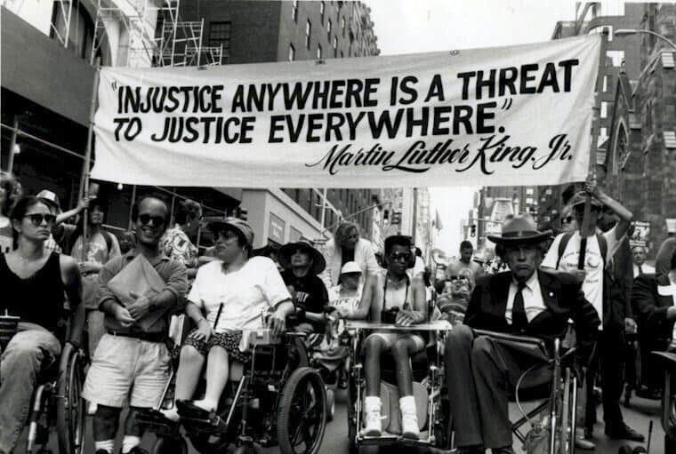
The Rehabilitation Act of 1973
The Rehabilitation Act of 1973 prohibits discrimination on the basis of disability in programs conducted by federal agencies, receiving federal financial assistance, in federal employment and in the employment of federal contractors. In 1998, the act was amended to add Section 508, which requires federal agencies to provide accessible electronic resources and information technology to people with disabilities, and specifically, calls out the Internet. Section 508 built grounds for web accessibility focused lawsuits for both members of the public and employees. However, this act does NOT require non-government funded or related companies to comply. Friendly reminder: it doesn’t mean that you can’t.
The Americans with Disabilities Act (ADA)
Technically a labor law, The Americans with Disabilities Act (ADA) is the most extensive piece of legislature for disability rights. The ADA guarantees people with disabilities the same opportunities as everyone else in employment, purchase of goods/services, and participation in government programs. Because it was founded in 1990 before the widespread use of the Internet (feel old yet?), there is not a specific section that mentions web accessibility. However, lawsuits have leveraged the ADA to set a precedent for the ADA to apply to intangible goods and services (including websites). Specifically Title II, which states that communications with persons with disabilities must be “as effective as communications with others,” and Title III, which addresses public accommodation of people with disabilities.
If you do not follow the guidelines of accessibility, you might be sent an ADA compliance notice. To learn more about the specifics of that process, read this article on ADA Website Accessibility Requirements and Guidelines.
Additionally, there are laws all over the world to address disability rights and web accessibility.
One last thing. Clique is an expert in a lot of things (#humblebrag), but legal advice is NOT one of them. We recommend consulting with your legal people to learn about how the law applies to your specific industry, consumer-base, and business. Clique is not responsible for any legal decisions you make after reading this guide. Have I been explicit enough? (Uhhh legal people? We good here? Cool.)
What is a Disability?
A disability can be permanent, chronic, or temporary.
For example, a motor disability can be something that a person is born with and a permanent piece of their life (ex. Cerebral Palsy), or it could be the result of an accident and be temporary.
A disability can be the result of a disease, trauma, or genetics.
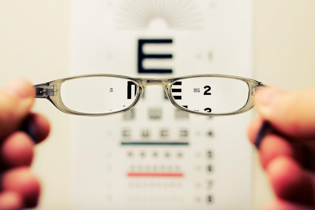
Poor eyesight, a relatively common disability, can be the result of developing glaucoma, staring at the sun, genetic history, etc. Wait—back up—needing glasses is considered a disability? Yes. In fact, needing eyesight correction was a BIG problem, but with the development of assistive technology, it has become a much more common accommodation in our society.
“Abled” and “disabled” are just two ends of a vast spectrum. People, situations, and abilities are unique. When building things, it’s important to take all levels of ability into account as well as the different categories.
1. Visual
A person with a visual disability has an impairment in their vision. Ability ranges from poor vision (usually corrected with glasses/contact lenses) to complete blindness. Color-blindness is also a visual disability.
2. Hearing
A person with a hearing disability is limited in their ability to interact with audio content. Ability ranges from mild to severe hearing loss to complete deafness.
3. Motor
A person with a motor disability has physical impairments which can impede movement, coordination, or sensation. Examples include spinal injuries, loss or damage of limbs, cerebral palsy, muscular dystrophy, multiple sclerosis, arthritis, Parkinson’s disease, etc.
4. Cognitive
Cognitive disabilities encompass conditions that alter cognition (head injury, autism, developmental disabilities) and learning disabilities (dyslexia, dyscalculia, ADHD), distractibility, inability to remember or focus on large amounts of information.
5. Seizure
A person with a seizure disability is more susceptible to seizures caused by strobing, flickering, or flashing effects.
People with Disabilities are Using the Things You Create
How? With the help of assistive technology and adaptive tools. Some common assistive technologies to be familiar with include…
Screen readers: Software that translates on-screen information into speech. Sneak peak: this is where alt text, proper HTML rule following, and breadcrumbs become super important.
Magnifiers: Both hardware (a physical lens) and software (the ability to zoom) that increases the size of the content on the screen.
Large print and tactile keyboards: Keyboards with bigger letters and/or raised letters that allow users to read and press the keys with more ease.

Eye tracking systems: Reads and translates a user’s eye movement as actions on the device.
Speech recognition: A device with the ability to listen to your speech and translate it into actions or text. Everyday examples of things that use speech recognition include Siri, Alexa, and Google Home.
Closed captions: Text across the bottom of a screen that can translate either live or past audio or video into a readable script for the user.
Sip and puff device: A mechanical straw that inserts in a user’s mouth and interprets a breath as actions on the device.
Head mouse or head button system: Allows for the interpretation of a user’s head movement or tapping of the head on a button as actions on the device.
Accessibility Advice for Everyone

Designing for accessibility is like baking chocolate chip cookies.
When you bake chocolate chip cookies, you add the chocolate chips in at the beginning, mixing them into the batter with all of the other ingredients. Now, imagine if you waited until the cookies were done to add the chocolate chips. It wouldn’t work. Well—to be fair—you might eventually get a few chocolate chips shoved into the cookies, but
- It would be messy.
- It would require immense effort.
- It would produce a worse result.
Accessibility is the chocolate chips of building websites. It’s another ingredient in the mix, and—if you’re anything like my chocoholic sister—it’s the best part of the cookie.
If you take one thing away from this article it should be this: listen to people with disabilities BEFORE, AFTER, and WHILE you are building something.
Web accessibility shouldn’t be a checklist at the end of a project. It shouldn’t be a let-me-think-about-accessibility-for-five-minutes-before-I-build-this-thing either. It should be a fully integrated part of what you do. If you include people with disabilities, in the testing, build, and post-launch, chances are you’ll end with something pretty dang accessible.
W3C, WAI, and WCAG
The World Wide Web Consortium (W3C) develops international standards for the Web: HTML, CSS, and many more. Its main initiative is the WAI, and it publishes the WCAG.
The Web Accessibility Initiative(WAI) is an initiative to create standards and support materials to help you understand and implement accessibility in the digital space.
The WCAG (Web Content Accessibility Guidelines) is a comprehensive document explaining how to make accessible content—images, videos, text, animations, designs, and the overall structure/code—on web pages or sites for people with disabilities. The WCAG also governs PDFs and similar documents.
The WCAG 2.0 vs. WCAG 2.1
The WCAG 2.0 is available online for people to reference but, because it was published in 2008, it lacks accessibility tips about widespread devices today. However, the WCAG 2.1 was just released (yay upgrades!) and it provides 17 new success criteria for creating web accessible sites. Specifically, the WCAG 2.1 addresses in greater detail…
- mobile accessibility
- people with low vision
- people with cognitive and learning disabilities
All success criteria from 2.0 are included in 2.1, but here is an expansive guide outlining the new guidelines included in the WCAG 2.1.

To make the WCAG easier for users to navigate, W3C organized the guidelines under four principles: perceivable, operable, understandable, and robust.
Perceivable
“Information and user interface components must be presentable to users in ways they can perceive.” AKA—content must be available to the senses either through browser or other assistive technologies. The perceivable principle includes making sure that content is distinguishable (color choice, contrast levels, text zoom capabilities, etc.) and also providing alternative content (alt text, captions, subtitles, etc.).
Operable
“User interface components and navigation must be operable.” AKA—the user must have access to all controls and interactive elements using either the mouse, keyboard, or an assistive device. The operable principle includes giving users enough time to interact with the page (pause capabilities, elimination of countdown clocks, etc.) and labeling navigation and links clearly to signal the meaning to the user (alternative texts, clear call-to-actions, etc.).
Understandable
“Information and the operation of user interface must be understandable.” AKA—content is clear and limits confusion and ambiguity. users need to be able to read and comprehend the information. The understandable principle includes making the content readable (elimination of jargon, abbreviations, and complex vocabulary, etc.) and predictable (normal patterns of information, consistency, expected behavior, expected location for elements, etc.), and additionally helping users identify their errors (labels and instructions, error prevention, suggested corrections, etc.).
Robust
“Content must be robust enough that it can be interpreted reliably by a wide variety of user agents, including assistive technologies.” AKA—content must be future-friendly and translatable across platforms/programs. The robust principle includes making the content flexible across devices and also writing valid code.
The conformance levels of WCAG: A, AA, AAA explained
Not everyone has the needs or resources to meet all of the guidelines (and that’s okay). In fact, some sites aren’t capable of meeting all requirements due to the purpose of the site. For example, an academic site may need to time tests given to students, which is in direct violation of Guideline 1.2 (timed material needs to have an alternative option or the ability to pause). To know if you can meet certain accessibility guidelines, we recommend consulting your client, leader, and a legal team.
There are different conformance levels of WCAG: A, AA, and AAA. Generally, A (lowest level) is not enough to meet legal conformance, AA *might* be enough to meet legal conformance, and AAA is *usually* enough to cover legal conformance.

~ One last casual reminder that none of this is legal advice and should not be treated as thus. Consult your legal teams, people! Got it? Good. Onward! ~
Another way to think of the levels is that A includes things you MUST be doing, AA includes things you SHOULD be doing, and AAA includes things you MIGHT be able to do (and if you can, you should). How do you know if you should try to meet AAA? Look at your users. Does a significant portion of your users have a disability? If you’re a screen reader company, nursing home, or university, for example, chances are the answer is “yes, you should be hitting on most AAA requirements.”
Ultimately though, whatever business you’re in or users you serve, it’s ethically responsible to try to meet as many guidelines as you can.
Accessibility Advice by Role
Q: Who on your team is responsible for accessibility?
A: Everyone.
Accessibility is not just a client-side problem. Leaders, content strategists, UX designers, visual designers, front and back end developers, project managers, and clients all contribute to building accessible stuff.
Leaders
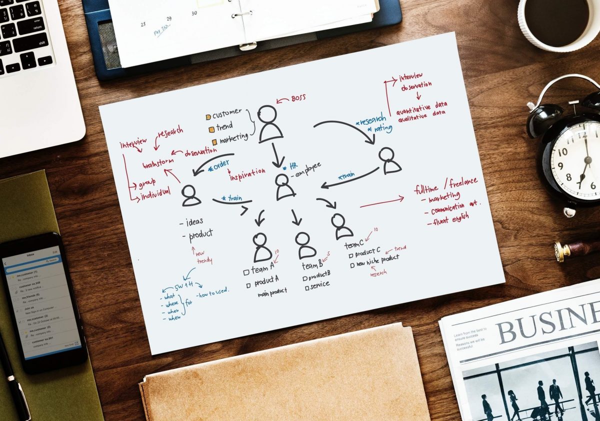
“Management is doing things right. Leadership is doing the right things.” — Peter Drucker. Accessibility is the right thing to do.
Although it might not be earth-shattering advice, leaders need to lead by example. Leaders need to make accessibility a priority. Incorporate it into the workflow and education practices for your team. Write it into the budget. Talk about it. If you make web accessibility a priority, your team will follow.
Here’s some quick tips to help you start considering web accessibility.
- Frame accessibility as a challenge, not a burden
- Know who on your team is responsible for different WCAG requirements and what should be happening at each level of the process
- Train and educate your employees on web accessibility
- Build a diverse and inclusive team and culture
- Start now
Content Strategists

Content strategy and creation play HUGE roles in web accessibility initiatives. The content team must create content that is readable, available, and comprehensible for people with disabilities. The simpler the experience, the better for everyone.
Now, the specifics:
1. Use clear language, especially in call-to-actions
Basically, keep things simple. Describe the specific action that will happen when the user does an action. For example, on a shopping cart button “I want it!” is not great copy and may confuse people, while “add to my cart” is clear and specifies exactly what action will occur. This practice helps people with cognitive disabilities as well as people from different cultural contexts (it’s the curb cut effect in action!).
2. Avoid jargon, abbreviations, and high reading level vocabulary
Basically, keep things simple (see a pattern here?). In doubt about whether to include a definition for a vocabulary word? Pop in a link. Not sure if a description is too jargon-heavy to comprehend? Work with your UX team to conduct user testing and ask the opinion of people with disabilities.
3. Stop using dark pattern techniques
Stop with your tricks! Writing “yes, I want to save money” or “no, I want to pay full price” as the only two options for subscribing to a newsletter can confuse people. Instead, be clear about the benefits AND choices that the user has; it doesn’t mean you can’t get creative, it just means you have to try a little harder (ex. “yes, I want to sign up and save” and “a good newsletter that could help me save money? no thanks”).
4. Create consistent content
Simple, patterned copy (ex. creating numbered lists like this one here) makes comprehension easier. Also, using the same commands for the same/similar actions helps people with cognitive disabilities recognize the pattern and learn how to use the site.
5. Write good alt text
Screen readers help users with low vision “read” the website. When the browser lands on an image, make sure that the alt text is descriptive and concise to communicate what the image is to the user. To learn more about specific alt text guidelines, read this alt text guide.
6. Care about captions
All video and audio content need accurate captions to go with it. Someone has to write it. Why can’t that person be you? If this is too time consuming, prioritize it in the budget and hire a freelancer or captioning company to do it for you.
7. Don’t rely on sensory/context characteristics to define
When you’re writing copy for a site, make sure that you’re being descriptive enough for people with disabilities. Relying on context to explain things can cause issues. For example, stating “click the red icon” to a user with colorblindness or “click on the left button” to a user who relies on a screen reader are inaccessible descriptions.
**To view content-filtered WCAG guidelines, visit this filterable WCAG guideline and check the “content creation” tag on the filter sidebar.
UX Designers
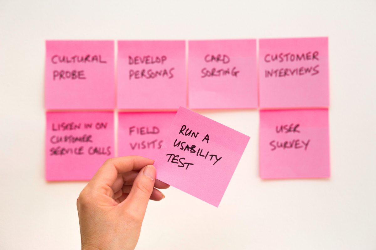
How do UX designers come into play for web accessibility efforts? It’s right there in your job title: the users! You’re tasked with reminding your team of the users when they build stuff. You should be a voice for ALL users with diverse experiences, including people with disabilities.
Now, the specifics:
1. Include people with disabilities in user testing
Although the exact numbers vary project-to-project, chances are that some target users have a disability. Listen to their opinions throughout the process (before, during, and after) to ensure that if there are any web accessibility issues, your team finds out early.
2. Simplify the layout of the content
Work with your content strategy team to ensure that you are communicating as clearly as you can when copy and design come together. Are there small changes you can make to the user flow, sitemap, or story to communicate better? Can you simplify the layout? If so, do it. Also – don’t forget to avoid dark patterns (tricks used in websites and apps that make you buy or sign up for things that you didn’t mean to).
3. Pay attention to how errors are communicated
One of the most common barriers for users with accessibility is when it comes to filling out a form. When a mistake is committed, be sure to notify the user with contextual, descriptive, and visual cues.
**To view interactive design filtered WCAG guidelines, visit this filterable WCAG guideline and check the “interaction design” tag on the filter sidebar.
Visual Designers

You can do a LOT to help web accessibility efforts. Oftentimes, visual designers have the biggest impact (yay you!). When you design, ask “does it make using the site easier or harder for people with disabilities?”
Myth-buster time: accessibility will not make your website ugly.
Clean, modern, minimalist designs can be accessible. White space and contrast are two trends that align with designing for accessibility. Accessible things can be beautiful. Need proof? Check out 18f.gov, a government site that meets a level of AAA accessibility.
Now, the specifics:
1. Design with patterned learnings in mind
Don’t just chase trends to chase trends. Consider common user assumptions as a rule book that you shouldn’t stray too far from. For example, an “X” is a symbol usually used to communicate the action of “close.”
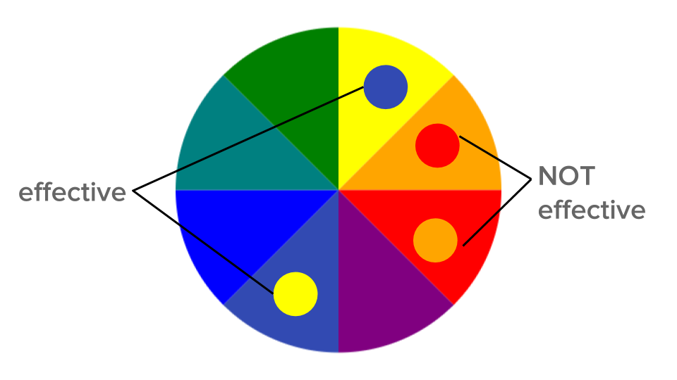
2. Use color as a compliment, not a one-man-show
People with colorblindness need more than just color to communicate a message. Error messages should not solely rely on a red outline, but there should be text and symbolic representation of the error as well (ex. add an ‘x’). Additionally, in infographics or data, adding labels creates a colorblind-friendly design.
While I’m talking color, also consider color contrast (higher contrast = better accessibility) and follow best practices when choosing a color palette for the website. To learn more about color, read our color and accessibility article.
3. Pick fonts that are comprehensible and compatible with magnifiers
Make sure that the fonts you’re choosing are first, readable (ex. does an “L” look different than an “I”?), and scalable (set up line heights to correctly scale with the fonts size).
4. Don’t make animations TOO busy
Animations enhance the purpose, content, and messaging on the page. Make sure that they make the content easy to comprehend (for people with cognitive disabilities) and/or pausable (for people with seizure disorders). Flashing images, loud colors, and sometimes busy patterns can trigger seizures or be distracting for people with cognitive disabilities and conditions, so please, just be mindful.
5. Think about the size of interactive elements
How many times have you accidentally clicked on something while trying to click on something else? All. The. Time. When you design interactive elements (i.e. buttons), think about the size, especially on mobile devices or tablets. Touch screens are delicate things.
6. Allow people to pause
When creating animations, audio, video, or text/image carousels, give users control. First, if things move too quickly, people with disabilities may have trouble taking in the information and comprehending it within preset time. Second, people with cognitive disabilities and/or seizure disorders may be sensitive to moving design. If you give them power, they can stop the animation before it becomes an issue.
Woohoo. Done. That’s the main stuff. As a designer, the last recommendation is to use the WCAG as a resource for whenever you create something new. The more you practice designing for web accessibility, the easier it will become. Rather than seeing accessibility as a barrier to your creativity, see it as a challenge.
Can you make breadcrumbs look cool? Let’s go.
Additionally, check out this infographic from WebAim specifically for designers and accessibility.
**To view visual design filtered WCAG guidelines, visit this filterable WCAG guideline and check the “visual design” tag on the filter sidebar.
Front and Back End Developers

You do not need permission to write accessible code. You do not need permission to write accessible code. You do not need permission to write accessible code.
With that said (and said and said) you’re pretty lucky. In order to write accessible code, usually you just need to do is follow the rules of HTML.
Now, let’s talk specifics:
1. Use the correct HTML element for your content
HTML communicates to the browser what kind of content it contains and how it should be translated. Screen readers run on these assumptions. Using correct elements is a simple way to make something accessible.
2. Support keyboard navigation through HTML reordering
Browsers support tabbing through link, form, and button elements. Relying solely on CSS to move elements instead of reordering the HTML and hiding elements form tab flor (faking buttons with Javascript) or disabling tab via tabindex= “-1,” hinder the ability for keyboard navigation to work.
3. Write good alt text for your images
Screen readers help users with low vision “read” the website. When the browser lands on an image, make sure that the alt text is descriptive and concise to communicate clearly what the image is to the user. To learn more about specific alt text guidelines, read this alt text guide.
4. Use ARIA attributes when applicable
Accessible Rich Internet Applications (ARIA) is an optional spec to define ways to markup HTML typically controlled by Javascript. Leveraging ARIA tags to associate elements of the code make things accessible that, with HTML alone, naturally aren’t.
Do you only write back end code? You still need to consider people with disabilities when you are creating platforms for CMS. People with disabilities should be able to update the content without huge barriers. Specifically, for form builds, make sure all fields have accessible labels and the links have useful and specific text instructions.
And, remember: you do not need permission to write accessible code. Not from the designer, not from the head of development, and not from the lead of the company. Just do it.
**To view development filtered WCAG guidelines, visit this filterable WCAG guideline and check the “developing” tag on the filter sidebar.
Project Managers

Because you are the direct link from your team to the client, you’ve got to do the web-accessibility-should-be-a-priority hustle. You’re in charge of communicating with the client to understand what they need and relaying it to your team (and holding your team accountable for their delivery).
If you’re working with a client where people with disabilities are a key part of their user group (government, nonprofit, education, etc.), you should be aware that web accessibility is not only a priority, but a HUGE initiative that MUST happen. You could also act as a mini resource for your client in terms of recommendations and advice (of course, after you tell them to speak with their legal team).
Clients

Make web accessibility a priority for your project. Ask agencies what accessibility initiatives they practice. It should be a requirement to winning your business. Why? In general, accessible websites are more usable, and get more traffic.
After looking at your resources, consumers, and environment, consult with your legal team (you thought I was done saying that didn’t you?). Seriously though, lawsuits can happen to anyone.
How to Check for Accessibility
You read the WCAG, followed the rules, and built something that you think is pretty dang accessible. How can you check to make sure you rocked it? Ideally, the best way to make sure that what you created is accessible is to ask people with disabilities. However, in addition, you can run an accessibility audit.
As with everything, the way to get better at running accessibility audits is to practice, practice, practice. Pick a local, small-scale website and walk through the WCAG. Do they break any guidelines? Is it an easy fix, or something necessary for their type of business? Take notes. Patterns will emerge and soon, you’ll be faster and more efficient at checking for accessibility on the things you build.
There are tools that help check accessibility at a high level. Pretty cool, right? For developers, there are tools and extensions (axe core and chrome’s lighthouse are two big ones) that you can add directly to your system that will run and automatically check code as you go. However, they aren’t perfect; sometimes these tools miss HTML references.
Use the tools in conjunction with your own audit, not as a replacement.
Be an Accessibility Advocate
So — you’ve read this guide and are ready to spark change in your team (I’m not crying, you’re crying). Inspiring others to get on board is no easy task, but here’s some tips to get you started.

1. Know Your Audience
What keeps them motivated? Is it their values? Money? A looming lawsuit? Whatever the reason, know it and frame your argument as to why they should care.
2. Find a Friend
Is there someone on your team who would be supportive? Is there a professional group in your area already dedicated to web accessibility (there is one in Chicago)? Like dominos, once one team member joins you, more are likely to follow. If your team already has an inclusivity committee, that’s a great place to start.
3. Start Small
Are there quick fixes to teach your team? Is there something in the building process you own and can take an accessibility lead on? Taking little steps forward is better than standing still.
4. Keep it Coming
Is there a weekly/monthly meeting for you to showcase important accessibility issues? Can you make a checklist for people by role? Keep web accessibility at the forefront of people’s minds.
5. Be a Resource
Can you answer questions for your team? Can you offer to conduct accessibility audits? Be open and be patient. To a newbie, web accessibility can seem like a lot of information and a lot of work. If you offer to answer questions, people will be more likely to dive in.
Additionally, WebAim, a source of web accessibility information, has a model of reform guide to help you implement web accessibility initiatives with your team.
In Conclusion,
The next time you build something, whether you’re a project manager, content strategist, designer, developer, or leader, make it accessible.
Why?
1 in 5 Americans currently have a disability, and it’s ethically responsible to serve them. As a sweet bonus, it saves you money, protects you from lawsuits, and leads to creative, beautiful ideas that improve the overall experience for everyone (like a simple curb cut).
How?
Talk and listen to people with disabilities throughout the duration of a project. Also – using the WCAG as a resource is a great start.
Who?
Everyone has a role when it comes to building web accessible stuff.
Simply put, we are responsible for what we create in this world. Let’s hear it again for the people in the back:
We are responsible for what we create.
So make it good, make it inclusive, and make it web accessible.
More Accessibility Resources
Because, we’re not afraid to admit that we still have a lot to learn. Here’s our favorite web accessibility resources.
General
- WebAim
- WCAG 2.0
- WCAG Quick Reference
- WCAG Guidelines Filtered by Tag (content, development, visual design, interactive design)
- WCAG 2.1
- DIY Web Accessibility Blueprint
- Google Web Accessibility Guide (free)
- A11Y Project
- 10 Guidelines to Improve Your Web Accessibility
- Model of Reform – general advice for starting to become an accessible-focused organization
ARIA Tags
- Accessibility of Rich Internet Applications
- To ARIA! The Cause of, and Solution to, All Our Accessibility Problems
Alt Text
Code Extensions
Design
- Inclusive Components Blog
- “Ethical Design: The Practical Getting-Started Guide”
- “A Primer to Web Accessibility for Designers”
- “Your Interactive Makes Me Sick”
- “Accessible By Design”
Color
- Color and Web Accessibility (Clique’s overview)
- Accessible Color Palette Builder
- Color Contrast Analyzer (Chrome)
- Contrast Checker Extension (for Sketch)
- Color Contrast Checker (WebAim)
- Designing Systematic Colors
- Color Safe – Accessible Web Color Combinations
- Color Contrast for Interface Design
Legal
Other
- Accessibility Wins– showcasing accessible sites and designs
- Web Accessibility Gone Wild – variety of mistakes, misconceptions, and silly things
Lastly, HUGE thanks to our own team here at Clique specifically, Shara Miller, Carly Ho, and Fen Slattery, developers whose passion and hard work inspired this guide.
Fen travels the country to lead workshops and discussions around web accessibility. For their work, visit their personal website.
Frequently asked questions
What is web accessibility?
Web accessibility ensures websites are usable by people with disabilities, including visual, auditory, motor, and cognitive impairments. This includes screen reader compatibility, keyboard navigation, sufficient color contrast, captions for videos, alternative text for images, and clear navigation. Approximately 15% of the global population (1 billion people) has some form of disability, making accessibility both an ethical imperative and significant market opportunity.
What are WCAG guidelines?
WCAG (Web Content Accessibility Guidelines) are international standards for web accessibility developed by W3C. Current version is WCAG 2.1 with three levels: A (basic), AA (standard for most compliance), and AAA (enhanced). WCAG 2.1 AA is the legal standard referenced in ADA lawsuits and Section 508 compliance. Guidelines cover: perceivable content, operable interfaces, understandable information, and robust technical implementation.
Is web accessibility legally required?
In the US, web accessibility is legally required for: government websites (Section 508), businesses under ADA Title III (court interpretations vary by circuit), higher education institutions receiving federal funding, and healthcare organizations. While the ADA doesn't explicitly mention websites, courts have increasingly ruled websites are "places of public accommodation." In 2021, 2,895 ADA website lawsuits were filed in federal court, making compliance both a legal protection and risk mitigation strategy.
How much does it cost to make a website accessible?
Building accessibility from the start adds approximately 5-10% to project costs. Retrofitting accessibility into existing sites costs significantly more: $15,000-40,000 for comprehensive audits and remediation of small-to-medium sites, and $50,000-150,000+ for large enterprise sites. However, the average ADA website settlement is $30,000-75,000, making proactive compliance far more cost-effective than legal defense. Ongoing accessibility testing should be 3-5% of maintenance budgets.
What are the most common accessibility violations?
The top accessibility violations include: missing alt text on images (67% of homepages), insufficient color contrast (53%), empty links or unclear link text, missing form labels (47%), missing page language declaration, keyboard navigation issues, missing heading structure, and inaccessible PDF documents. These issues prevent screen reader users, keyboard-only users, and users with visual impairments from accessing content. Most violations are preventable through proper HTML and design practices.