How to develop digital marketing fluency: A comprehensive introduction

Digital marketing fluency has never been more important.
New tools, technologies, strategies, and skills are being introduced into our world every day.
Combined with the fact digital marketing spend is trending up in a major way, Forrester predicts it will reach $120 billion by the year 2021. Not to mention, the largest living generation (millennials) spends about $600 billion dollars a year
Skilled marketers with an understanding of user experience, analytics, and optimization are in high demand.
How can you capitalize on this opportunity?
At Clique, we’re so into this stuff that we decided to teach it. A few of our team members — Director, Brent Williams, UX Director, Michael Facchinello, and SEO Director, Brendan Hufford designed a class in partnership with the University of Chicago Graham School. The class is a required course in their Digital Marketing and Integrated Communications certificate program.
The idea aligned with our three values:
- Build something – a class covering the fundamental elements of modern marketing.
- Be a student and a teacher — an opportunity to share our unique approach to marketing blending design, analytics, and UX.
- Make someone’s job easier — a chance to help marketers learn strategies, tools, and critical thinking skills to help their organizations grow.
Our goal was to provide a fundamental understanding of modern digital marketing skills, a stronger analytical toolkit, and instill greater confidence managing campaigns, teams, and vendors.
“Our certificate program incorporates real-world marketing case studies and projects. We cover topics ranging from brand awareness and development to social media and consumer research design. Overall, the program’s content will help students implement a successful web marketing strategy,” says Karine Bravais, Associate Director of Professional Development Programs at The University of Chicago Graham School.
In this article, we wanted to share our knowledge with more people beyond the classroom. What follows is an overview of the modules our trio teaches in the class.
- Part One: Web Structure, Tracking, and Data 101
- Part Two: Customer Personas, Journeys, and User Experience
- Part Three: Using Data, Analytics, and SEO to Make Smarter Decisions
- Part Four: Collecting Data, Conversion Design, and A/B Testing
- Part Five: The Intersection of Influence, Storytelling and Data
Buckle up!
Part 1: web structure, tracking, and data 101
The web can be a big and intimidating place.
Did you know there are more than 1.8 billion websites, and over 4 billion internet users? That’s more internet users than half of the global population.
For marketers, this is great news. We like to be where the people are and where they’re going.
In this section we’ll cover:
- How the web works and how users are tracked online
- The three types of data
- How data impacts the buying and selling of ads<
- Where your website fits in
- How to prioritize the data you gather
- How to use Google Analytics for tracking and analyzing data
- Common challenges and limitations of Google Analytics
How the web works
Let’s kick this off with some terminology!
Technically speaking, the internet is just a wire buried in the ground. Any two computers connected to the wire can communicate with each other.
A “server” is a special computer connected directly to the internet. Each server has a unique IP address — they help other computers find each other.
Your computer is a called a “client.” It’s connected indirectly through an Internet Service Provider (ISP), like Comcast.
Web pages are files on a server’s hard drive.
Search bots (aka spiders 🕷️ or crawlers) crawl every web page to find new information. Once they find a website, they download, consume, and catalogue everything on that page and make a copy of it.
Then, they use the links on that website to find a new website. And so on, and so forth — FOREVER!
And that’s what shows up in the Search Engine Results Pages (SERPs).
How users are tracked online
The primary way is in the form of cookies. Cookies whet the appetites of marketers.
“Cookies are used to remember things about websites: your login information, what you have in your shopping cart, what language you prefer. They are created by websites and sit in your browser until they expire”, says Privacy.net
The tracking of our behavior across devices leads to the creation of rich user profiles from purchased and assumed data.
Why should you care about tracking users on the web?
Tracking user data helps you become a more efficient and effective marketer. It leads to better attribution models, personalized messaging, and lifecycle nurturing.
Let’s break this down.
- Attribution models help you identify which channel led someone to buy something. They help you know where you’re getting the most bang for your buck. You can read more about attribution here.
- Personalized messaging helps you automatically appear more human on the web. If you’ve ever received an email addressed directly to you and couldn’t possibly have been handwritten, you’ve experienced it. Marketing automation tools, segmented databases, and target landing pages are just a few ways to inject personalized messaging into your marketing.
- Lifecycle nurturing helps you coordinate your communication strategy and act as a more empathetic salesperson. As Hubspot explains, “lifecycle stages help you organize your contacts based on the stage they are at in your sales cycle: subscriber, lead, marketing qualified lead, sales qualified lead, opportunity, customer, or evangelist.”
Thanks to data management systems (DMS), marketing automation tools, and over 6,829 marketing technology solutions in the marketplace, companies can leverage the data collected on the web to help achieve marketing goals.
The three types of data
Data is the new oil everybody wants. And you need it to stay competitive.
Data can be categorized in three ways. 1st, 2nd, and 3rd party data.
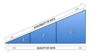
1st Party Data is the data you collect straight from the source—your own audience. This is the data in your CRM, your email subscribers, etc. It also includes info not stored online like surveys, customer feedback, etc.
1st party data is great because it’s available at no additional costs. You know it’s accurate. You know it’s relevant because it’s from your audience. And you own it outright.
However, there can be challenges collecting enough 1st party data to support good decision making. To mitigate, look to other sources.
2nd Party Data is someone else’s first-party data. For example, Nike purchases access to GQ Magazine’s 1st party data on running enthusiasts. 2nd party data is sold in a private data marketplace, also known as a data management platform.
A data management platform (DMP) is software that holds audience and campaign information in a digital warehouse of sorts. Agencies, marketers, and publishers use this data to target users more effectively online.
2nd party data adds volume to your first party data and helps you reach new audiences and prospective customers. In fact, you may get entirely new insights from this data making your existing data more valuable.
3rd Party Data is aggregated data from a collection of sources. For example, Company A pays other companies (publishers, businesses, etc) for their 1st party data, compiles it into a single data set, and sells it as 3rd party data.
One key consequence of 3rd party data is a lack of exclusivity. Chris O’Hara, Head of Global Product Marketing at Salesforce notes that, “The biggest problem with third-party data is that all of my competitors have it. In programmatic marketing, that means both Ford and Chevy are likely bidding on the same ‘auto intender’ and driving prices up.”
How data impacts the buying and selling of ads
There are two types of platforms that automate media buying/selling across multiple sources.
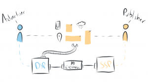
Demand-side platforms (DSPs)and Supply-side platforms (SSPs)
A Demand-side platform (DSP) “is a piece of software used to purchase advertising in an automated fashion. DSPs are most often used by advertisers and agencies to help them buy display, video, mobile and search ads.”
A few DSPs to note are Facebook Ads Manager, Rocket Fuel, DoubleClick’s Bid Manager, and Amazon’s AAP.
A Supply-side Platform (SSP)“is used by online publishers to automate the selling of their advertising space, or inventory. It’s basically the same as a DSP but from the other side.”
SSPs you may have heard of are Google’s DoubleClick or Yahoo’s BrightRoll.
Where your website fits in
Your website either supports your business or is the cornerstone of it. The data you gather can help you increase conversions, tell your story, and grow your business.
But before you start collecting data, you’ll want to answer a few questions. These questions help you understand what problems your website should be solving for. They help figure out the why, what, and how of the data collection process up front.
- What business outcomes are you ultimately looking for?
- What can your digital presence realistically do to drive this?
- How can you develop your web presence to achieve this?
- What measurement tools do you need in place now to know if you’re successful?
- How are you going to execute your digital strategy?
- How are you going to measure the effectiveness of your digital strategy?
- Who is going to make and manage changes to the website once it’s complete?
How to prioritize the data you gather
There’s a lot of data.
But where do you start analyzing it? How do you know what really matters?
Fortunately, in this sea of information, there are certain metrics to help you focus on making sure you’re generating revenue.

The three most important metrics to track are:
- Lead Acquisitions – How much does it cost to bring in more potential customers?
- Conversions (on and off-site) – How much does it cost to turn potential customers into paying ones?
- Customer Value Capture – How much does it cost to retain customers and get repeat business?
Understanding these costs helps you do three things:
- Make smarter allocations– Build an accurate attribution model
- Refine the user experience – Optimize your website to get people engaging with you
- Spend wisely– Distribute ad spend accurately and effectively.
More key metrics
Here’s another list of key metrics that matter to help you gauge the ROI of your marketing efforts. They keep you focused on real business growth.
Let’s go over what they are and how they’re calculated.
Equations coming in 3 … 2 … 1 … 🚀
What is it? “A company’s CAC is the total sales and marketing cost required to earn a new customer over a specific time period.” It varies depending on your business, but it could include the total costs of marketing, sales, customer service, advertising, etc.
How is it calculated? CAC can be calculated by dividing all the costs you spend on acquiring new customers in a given time period by the number of customers acquired in that same time.
![Formula: [total costs of customer acquisition] / [number of customers acquired]](https://cdn.prod.website-files.com/68128afb86a12a6f7a764ce0/689a503009b1a6e58e89635b_customer-acquisition-costs-formula-1024x185-1.png)
Churn Rate
What is it? Churn rate is the percentage of customers or subscribers who cancel or don’t renew their subscriptions during a given period. Churn rate can be expressed in months or years.
How is it calculated? In a given time period, add the total number of customers you acquired and the number that canceled or didn’t renew subscriptions. Divide the total number of users who canceled/didn’t renew, by the total number of customers acquired, and multiply by 100%.
![Formula: [customer cancellations] / [customers acquired] X 100%](https://cdn.prod.website-files.com/68128afb86a12a6f7a764ce0/689a503009b1a6e58e896346_churn-rate-formula-1024x184-1.png)
Average Customer Lifetime (ACL)
What is it? The average time a customer remains active before they drop off.
How is it calculated? Divide 1 by the Churn Rate (as a percentage).
![Formula: 1 / [churn rate]](https://cdn.prod.website-files.com/68128afb86a12a6f7a764ce0/689a503009b1a6e58e896352_average-customer-lifetime-formula-1024x181-1.png)
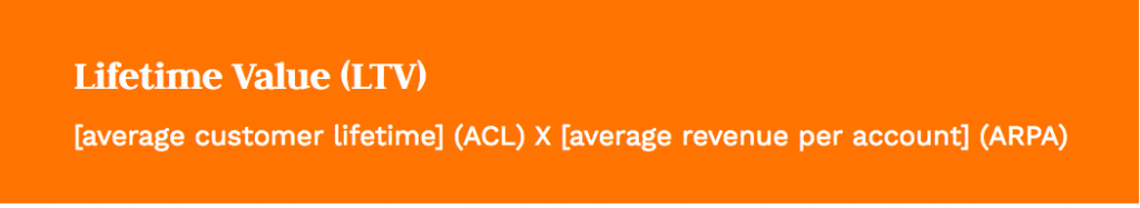
Lifetime Value (LTV)
What is it? “The ratio of users who click on a specific link to the number of total users who view a page, email, or advertisement.”
How is it calculated? The Lifetime Value of a Customer (LTV) is calculated by multiplying your Average Customer Lifetime (ACL) by the Average Revenue Per Account (ARPA) in a given period. ARPA is simply Total Revenue divided by Total Customers Added.
Click Through Rate (CTR)
What is it? “The ratio of users who click on a specific link to the number of total users who view a page, email, or advertisement.”
How is it calculated? Take the number of clicks divided by the number of views/impressions of an element.
![Formula: [total clicks] / [total impressions]](https://cdn.prod.website-files.com/68128afb86a12a6f7a764ce0/689a503009b1a6e58e89634f_click-through-rate-formula-1024x185-1.png)
Cost Per Thousand (CPM)
What is it? The price per 1,000 advertisement impressions on one page. If a website publisher charges $2.00 CPM, it means an advertiser must pay $2.00 for every 1,000 impressions of its ad.
How is it calculated? Take the cost of 1,000 ad impressions and divide it by the total number of impressions. Then multiply by 1,000.
![Formula: [total clicks] / [total impressions]](https://cdn.prod.website-files.com/68128afb86a12a6f7a764ce0/689a503009b1a6e58e89634c_cost-per-thousand-1024x186-1.png)
Cost Per Click (CPC)
What is it? The price you pay for each click on an advertisement. “A website that has a CPC rate of 10 cents and provides 1,000 click-throughs would bill $100 ($0.10 x 1000)”
How is it calculated? Divide the total costs of each click on your ad and divide it by the total number of clicks.
![Formula: [total costs to an advertiser] / [number of clicks]](https://cdn.prod.website-files.com/68128afb86a12a6f7a764ce0/689a503009b1a6e58e896355_cost-per-click-1024x181-1.png)
Fortunately, there’s a way to keep track of these metrics in one place.
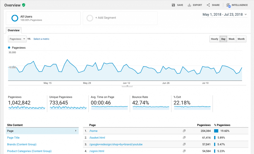
How to use Google Analytics for tracking and analyzing data
Insert Google Analytics.
Google Analytics is a free tool to help you analyze your website traffic. Businesses of all sizes take advantage of the tool to understand their customers and how people navigate their website. However, it’s just one of many tools you can use to analyze your website.

“Ultimately, it’s not the tool that’s important — although GA happens to the most commonly used free option. What matters is that you understand how to bring data into your decision-making process,” says Brent Williams, Director at Clique.

Here, we’re going to talk about using GA to gather data as it relates to User Experience. Jen Cardello, VP of Strategic and UX Insights at Fidelity Investments points to 3 high-value uses for analytics for optimizing user experience.
1. Issue Indication: Identify potential problems impeding your goals
An effective measurement plan includes goals/macro conversions, desirable actions/micro conversions, and web metrics.
- A goal is the primary action or result you’re targeting. For example, 50 leads per month.
- A desirable action is a smaller action that supports the goal you’re targeting. For example, visiting your consulting service section or reading about your services.
- A web metric is the translation of those actions in analytics. For example, “time on page” can tell you how long the average reader spends on your services page.
You can use analytics to track these KPIs and monitor what might be helping or slowing you from reaching your goals.
2. Investigation: Uncover the potential causes of those problems.
In addition, you can use analytics to dig into macro conversion issues and test your hypotheses about the sources of a series of issues.
- Traffic issues – How are people navigating to your website? Where is traffic coming from? What search engine might be responsible for a decrease in page visits?
- Technical issues – Are your page elements loading properly?
- Content/Visual Design issues– Will new wording better communicate a call-to-action? Is your imagery or page layout is distracting?
- Navigation issues – What’s being clicked on? What isn’t? How are people navigating on your website.
3. Triangulation: Adding data to supplement qualitative research
Finally, you can use Google Analytics to confirm findings from qualitative research like usability testing or user interviews. For example, are people using the same search terms to find things on your website that they use in a user interview?
Read more about the specific examples here.
“Without competency in an analytics platform, you limit your ability to identify problems, track progress, and confirm/refute assumptions about your site,” says Williams.
Common challenges and limitations of Google Analytics
While Google Analytics is a great tool, it does have limitations. Keep these caveats in mind when using GA for measuring campaigns, analyzing data, and managing teams.
- 1. Not enough data
Sometimes, there simply isn’t enough data to make informed decisions. We recommend having at least 1000 monthly visitors in a given channel to justify making directional changes. - 2. Not accounting for filtering
If you don’t account for the proper filter, your data might be confusing. For example, you might be getting a good amount of direct website traffic, but your conversions are down. Red flag, right? Maybe not. If you filter out people in your company who visit your website, your conversions may be fine. - 3. Managing permissions
It can be tricky figuring out the right balance of who should have access to Google Analytics. In large organizations, too many people with access can create bottlenecks. Jeff Molitor, Director of Digital Strategies at Clique suggests you “ensure to employ a top-down permission structure for users. Be mindful that permissions set at the account level will be able to manage and control property and view elements that you may not want to share.”
Part 2: customer personas, journeys, and user experience
When thinking about your website and the experience you want visitors to have, there’s always a person at the center of it. And whether it’s a reader, prospective buyer, or a volunteer, giving thought to all potential touch points is vital to create a quality user experience.
To understand how all these parts intersect we’ll cover the following topics in this section:
- Defining and creating customer personas
- How to use analytics to inform your customer persona
- Limitations of using analytics for gathering customer data
- The benefits of customer journey maps
- Defining User Experience (UX), User Interface (UI), and Usability
- How to use analytics to improve UX and guide your optimization efforts
Let’s dig in.
What is a Customer Persona?
According to Smashing Magazine, “A persona is a way to model, summarize and communicate research about people who have been observed or researched in some way.”
It’s usually a one-page document designed to give the wider team a top-level understanding of the user(s) you’re designing for.
It attempts to summarize the demographics, psychographics, user pains, incentives, hopes, and dreams of a particular segment of your audience.
“Personas catch flack for being overly generalized and that’s fair. Sometimes they get created and forgotten about. But even the process of creating a persona creates so much empathy for your customers. It’s an exercise that shouldn’t be set aside,” says Facchinello.
Anyone in your organization who interacts with your customers can use this information to better communicate with them. Designers can better empathize with the people they’re designing for. Content teams have a clearer picture of who to write to. Salespeople can use it to inform their conversations with new leads.
Overall, it adds clarity to the problem being solved, and who we’re solving it for. It helps everyone make better decisions.
How to use analytics to inform your customer persona
One simplified process for creating a basic persona document goes like this:
- Interview and observe multiple people
- Analyze the data you gather
- Uncover patterns in their behaviors
- Group participants into “archetypes” — more info on that here
- Create a digestible summary of these insights
The insights collected from user interviews and observations are great from a qualitative point-of-view, but you can also use Google Analytics to inform your personas.
By looking at the analytics you can gather valuable demographic information like age, gender, and location of site visitors.
You can also gather location data from Tamoco.
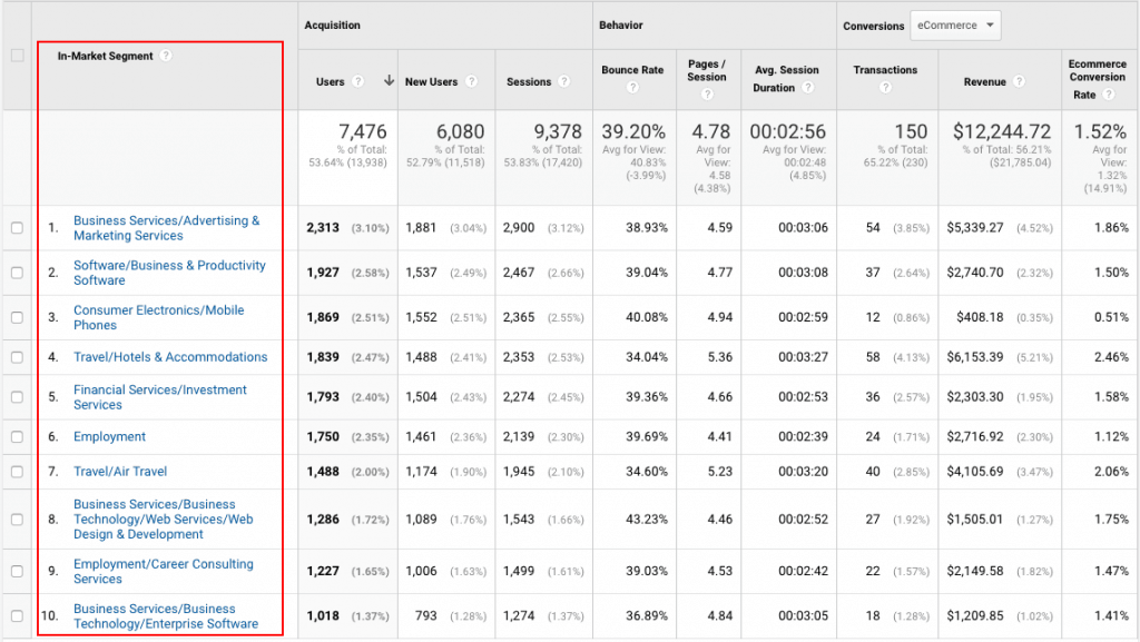
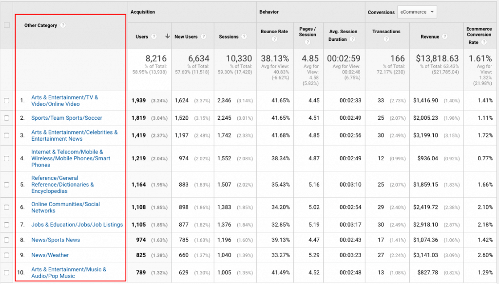
In addition to demographic info, enabling Google Analytics Advertising Features Broadly speaking, you can better understand who your users are, using the same 3rd party data used for targeting ads on the Google Display Network.
This lets you explore the broader interests of your audience in three sorts—“affinity categories,” “in-market segments,” and “other categories.”
Affinity Categories segment users based on broad lifestyle interests. For example, what percentage of your users are “cooking enthusiasts,” “sports fans,” or “technophiles?”
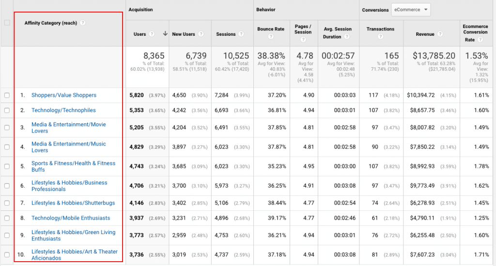
In-Market Categories group users based on what specific product categories they might be “in the market for,” such as “Consumer Electronics/Mobile Phones” or “Real Estate/Residential Properties.”
Other Categories is a more specific interpretation of a users interests. For example, categories include “Arts & Entertainment,” or “Music & Audio.”
Limitations of using analytics for gathering customer data
While these features are great for adding quantitative color to your research there are some limitations to consider.
Keep in mind this data is incomplete. According to Google, not all users have demographics and interests data associated with them. These reports may only represent a subset of your users.
Additionally, Google Analytics data thresholds are applied to maintain the privacy of users and can’t be adjusted. Per Google, “Thresholds are applied to prevent anyone viewing a report from inferring the demographics or interests of individual users.”
Smart.
Further, a single visit might be classified in multiple categories. For example, based on a user’s behavior, a single user might be labeled both a “sports fan” and a “TV Lover” (i.e. me).
And of course, some users opt out of having their data collected or choose to browse in incognito mode. 😎
Michael Facchinello, explains, “analytics can both be way too general and/or way too focused for creating personas.”
For example, women 18-34 make up about 34 million people in the U.S. and that’s just not meaningful without additional context.
“It is critical that analytics are never your only source of information about your users. It’s primarily used to confirm hypotheses or create new ones. But it lacks the dynamism to paint a meaningful picture,”
The benefits of customer journey maps
While a persona gives us a clearer picture of who we are interacting with, a customer journey map helps us to understand where.
“Journey maps take personas a bit further,” says Facchinello. “They put the persona into the context of how they interact with a product, company, or service.”
A complete one might look something like this:
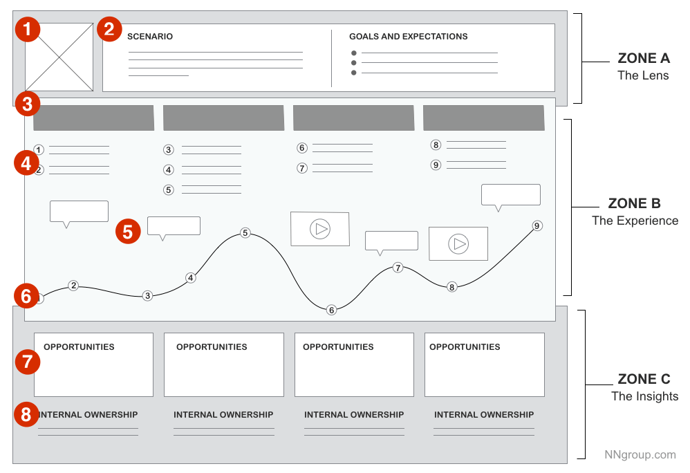
They’re used to help your team better understand the needs of your customers, and own sections of the user experience.
Kate Kaplan, UX lecturer for Nielsen Norman Group, mentions using them to instill a sense of shared vision in the organization.
“Journey mapping could be the first step in building an organization-wide plan of action to invest in customer experience, as it helps answer the question, ‘Where do we start?’ by highlighting areas of friction,” says Kaplan.
“They help you prioritize what to do and how to do it. Whether it’s filling a gap in communications or advocating for a change to your product or site,” adds Facchinello.
The visual representation helps create a memorable, easily-distributed model that can be referenced by anyone in the organization.
Insights can be used to solve for specific user challenges, too.
A designer can use them to better prioritize elements on a site to cater to a high-value user. A writer can use them to address common objections on an underperforming landing page. And department leads can use them to assign ownership on a specific part of the customer journey that’s being neglected.
The benefits are plentiful. Customer journey maps can be as useful for solving problems as they are for revealing them.
“Like a persona, the act of creating a journey map is often more valuable than the deliverable itself,” adds Facchinello.
Paul Boag, author of The User Experience Revolution, suggests the primary benefit of a customer journey map is to “put the user at the front and center in the organization’s thinking.”
Which leads us to our next topic…
User Experience (UX), User Interface (UI), and Usability: Definitions and Best Practices
It’s easy to get confused by the nuances of web design terminology.
Donald Norman, a user experience architect and consultant with Nielsen Norman Group, who coined the term ‘user experience,’ said, “I invented the term because I thought human interface and usability were too narrow. I wanted to cover all aspects of the person’s experience with the system including industrial design graphics, the interface, the physical interaction and the manual. Since then the term has spread widely, so much so that it is starting to lose its meaning.”
To simplify, I’ll define each term. Then I’ll cover the key elements that affect the quality of the experience, interface, and usability.
What is User Experience (UX)?
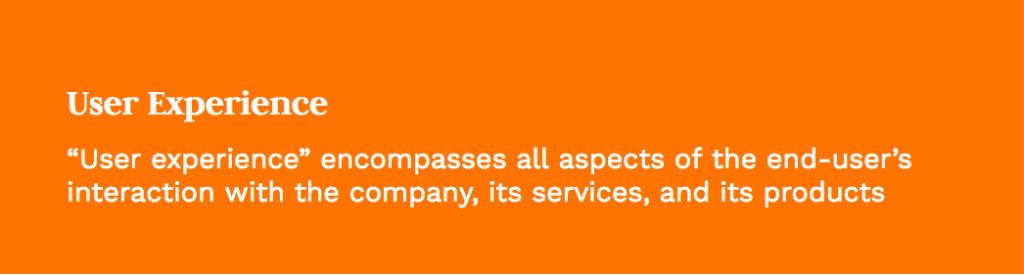
User Experience encompasses all aspects of the end-user’s interaction with the company, its services, and its products.
“UX is a method of design focused on creating something with the user as the north star in decision making. UX is not inherently about designing interfaces or applications, but really the intended outcome we aim to achieve in doing so, a good and useful experience for the user,” says Facchinello.
What makes a quality User Experience (UX)?
Usability.gov explains the core of UX is to “ensure that users find value in what you are providing to them.”
Peter Morville, president of information architecture and UX firm, Semantic Studios, suggests there are 6 key factors that influence the users experience.
- Useful: Is your content original? Does it fulfill a need?
- Usable: Is your site simple and easy to use?
- Desirable: Does your sites imagery, identity, brand, and messaging evoke emotion and appreciation?
- Findable: Is your content easily navigable and locatable onsite and offsite?
- Accessible: Does your content consider and address the needs of people with disabilities? (Our guide on web accessibility goes into more detail).
- Credible: Do your sites users trust and believe what you tell them?
What is User Interface (UI)?
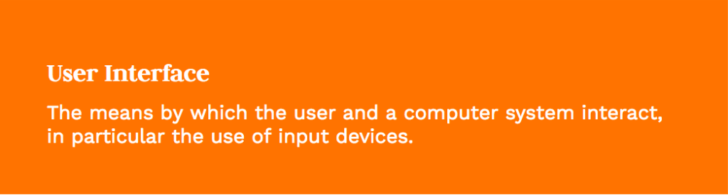
User Interface can be defined as: “the means by which the user and a computer system interact, in particular, the use of input devices”
What makes a quality User Interface (UI)?
Usability.gov suggests creating an ideal user interface design “focuses on anticipating what users might need to do and ensuring that the interface has elements that are easy to access, understand, and use to facilitate those actions.”
There are 7 best practices to consider.
- Simplicity: Does your interface convey simplicity?
- Consistency: Are you consistent in your use of common elements across your layout and design?
- Purposeful: Is the information organized in a way that draws attention to important information, aids scanning, and readability?
- Strategic design: Does your design use color and texture to direct attention toward desired actions?
- Information prioritization: Does the typography help establish hierarchy and clarify what information is important?
- System communications: Does your interface help the user navigate your content?
- Defaults: Does the site thoughtfully anticipate the goals of site visitors to reduce friction?
What is Usability?
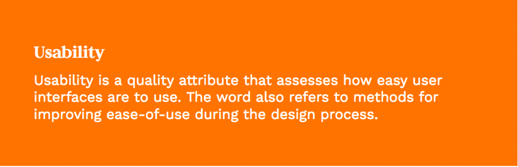
Usability can be defined as: “a quality attribute that assesses how easy user interfaces are to use. The word ‘usability’ also refers to methods for improving ease-of-use during the design process.”
According to the Interaction Design Foundation, “usability is what determines whether a design’s existing attributes make it stand or fall.”
Nielsen Norman Group defines the 5 quality components for Usability as follows.
- Learnability: How easy is it for users to accomplish basic tasks the first time they encounter the design?
- Efficiency: Once users have learned the design, how quickly can they perform tasks?
- Memorability: When users return to the design after a period of not using it, how easily can they re-establish proficiency?
- Errors: How many errors do users make, how severe are these errors, and how easily can they recover from the errors?
- Satisfaction: How pleasant is it to use the design?
How to use analytics to improve UX and guide your optimization efforts
Hopefully, you now have a general idea of what goes into designing a quality user experience and interfaces that hold up to usability standards.
But once you’ve built your site, you’ll need to make ongoing optimizations to adapt to how people interact with it.

Let’s talk about how to use analytics to optimize your website with those things in mind.
Metrics within Google Analytics are best used in two ways:
Identifying problems (problem metrics) and uncovering opportunities (performance metrics).
First, I’ll define a few problem metrics and what they might mean for your site (or not).
Bounce Rate
Bounce rate is the “the percentage of visitors to a particular website who navigate away from the site after viewing only one page.”
“A high bounce rate could mean a visitor landed on your site and left because they didn’t find what they were looking for. But it could also mean the opposite. Perhaps they found exactly what they were looking for and left happy campers.” Senior UX Specialist, Aurora Harley suggests.
Exit Rate
Exit rate is “the percentage of people who leave the site from a page; this includes people who have visited other pages on the site previously.”
You might be wondering, how is that different from bounce rate?
As ConversionXL explains, “Exit rate is the percentage of visits that were the last in the session whereas bounce rate is the percentage of visits that were the only one of the session…all bounces are exits, but not all exits are bounces.”
A high exit rate might suggest a poor page design, unclear paths, or another factor. However, if the page is the final step in a process—like a checkout confirmation or email subscription—then maybe you shouldn’t be so worried.
Time on Page
Average time on page is a measure of “the average amount of time that users spend viewing a webpage.”
A high time on page could mean that a user has a hard time completing an action on your site. But it could also mean they’re really enjoying the content on your site. (If you’ve read this far, I hope you’re the latter 😊).
The Key Takeaway
The type of page and its contents should be considered when evaluating a page’s metrics to determine if there’s a problem to be addressed.In addition to metrics that are for uncovering problems, there are a few key metrics for uncovering opportunities. We refer to them as performance metrics because the combination of (Visits X Performance Percentage) = Website Value.
Page Value
Page Value is “the average value for a page that a user visited before completing an E-commerce transaction.” It’s a way to assign a monetary value to a single page on a site.
To get a page value in Google Analytics, you have to manually enable Goals and Ecommerce “Once you enable Goals, you get metrics like the number of conversions and the conversion rate.”
According to UX Booth, “high-value pages that show a high exit rate are a good area to focus on for improvement. These are pages where users are dropping out at a key part of their journey to conversion.”
Unique Page Views
Unique Page Views are “The number of visitors who have visited a given page during a session. Multiple views of the same page in a given session are counted as 1 unique page view.”
So what do we do with all these metrics?
The purpose is to use analytics to get a deeper understanding of how people are interacting with your site. Whether they’re finding your site and leaving, dropping off on a specific part of the journey, or spending above average time on a specific page, these metrics help add color and context to your user’s experience.
The practice of analyzing your website’s data, forming a hypothesis as to why a metric is the way it is, justifying that belief, and making a measurable recommendation to improve it is called a UX Audit.
Part 3: using data, analytics, and SEO to make smarter decisions
As humans, we often make our decisions with emotions.

This won’t always lead to the best decisions and outcomes. Actually, it almost never does. If you make business decisions on gut feelings alone, you risk spending a lot of time and money on activities that might not reap any benefits.
So what does lead to higher quality choices?
Data-based decision making.
In a study at MIT’s Center for Digital Business, Andrew McAfee and Erik Brynjolfsson found, “companies in the top third of their industry in the use of data-driven decision making were, on average, 5% more productive and 6% more profitable than their competitors.”
In the spirit of understanding how to gather valuable insights from website analytics, let’s talk about:
- Defining data-based decision making
- How to execute data-based decision making
- How Search Engine Optimization (SEO) fits into your marketing plan
- SEO tools to consider implementing in your organization
Defining data-based decision making
Brendan Hufford, SEO Director here at Clique, defines it as making a decision based on quantifiable information taken from multiple sources in an effort to rule out bias.
Here are just a few of the benefits of data-based decision making.
- It prevents you from making business decisions on gut feelings and impulses. It can be useful to use your professional instincts as clues to move forward, but data can help you validate.
- It also reduces the likelihood you’ll get caught up hunting for trends. The hot marketing tactic of the day only works until it doesn’t. Peter Drucker said, “there is nothing so useless as doing efficiently that which should not be done at all.” Amen! 🙏🏾 Data helps keep you focused on the activities that matter.
- It keeps you concentrated on serving the right people.
Some businesses get stuck in the habit of marketing to an “ideal” customer as opposed to an “actual” customer.
Keeping real insights at the forefront of your decision making can be the difference between “being busy” and actually moving the needle and getting work done.
How to execute data-based decision making
In order to make smarter decisions with data, here are few things you can do.
1. Know what data is available
Before you can start analyzing, you’ve got to know what you’re working with. Do you only have access to first-party data or is there more? Do you have customer survey data you can pull from?
2. Be mindful of bad data
Just because you have data doesn’t mean it’s always right.
In 2016, for the previous two years.
They were accidentally inflating the average time users spent watching videos, resulting in data that overestimated the metric by 60-80%. Let’s just say, advertisers assessing their campaigns weren’t happy.

Stuff like that happens. When analyzing data, it’s important to be aware when you may be making assumptions based on incomplete information, assumptions, or poor data.
3. Understand the key drivers of your business
In order to know what metrics to measure, you need a good understanding of what makes your business tick.
For gyms like Lifetime Fitness and Equinox, client retention rate is a big deal. It’s usually a determining factor of the health of their business. You can use key business data to guide what website metrics to dig further into.
For example, if retention is down, what could be the reason? Are certain classes not as popular as they used to be? Have conversions on class pages on the website declined?
A keen understanding of what moves the needle in your business is the jumping off point for determining key metrics to track.
4. Establish your Key Performance Indicators (KPIs)
Speaking of KPIs…
To prevent drowning in an ocean of data, focus your analysis on a set of key metrics aligned with your goals.
Part two of this article covers the primary KPIs from a business point-of-view. But it’s important to note the key metric to track for web analytics is conversions.
Are people doing the thing your site is designed for them to do? Are they booking appointments and consultations? Signing up for your newsletter to get them into your funnel? Are they buying your stuff?
Conversions have to be the number one thing. Period.
5. Understand the problem
When evaluating your site’s performance, it’s important to clarify the problem you’re solving for.
For example, a common question is whether your site has a traffic problem or a conversion problem. If you don’t have enough traffic flowing to your site, looking at conversions won’t be beneficial yet. On the flip side, you don’t need to focus on sending traffic to your site until you optimize your conversions.
In summary, making data-based decisions is about two things: awareness (of what’s available and what isn’t) and understanding (of the problem and your business).
How Search Engine Optimization (SEO) fits into your digital marketing skills
SEO is one of the more complex and confusing marketing tactics on the web.
But it doesn’t have to be.
Hufford says ultimately, “SEO is about creating the best possible content to give a person what they’re searching for. Then, it’s the continued process of increasing that content’s rank in Google.”
When done right, the work you do builds on itself over time and can serve as a growing, sustainable marketing asset.

SEO veteran Nick Eubanks points out, “I think the hardest part is explaining that it takes time.” Eubanks recommends producing SEO case studies like this to help communicate the value throughout your organization.
“Often, you won’t see any tangible results from your work for at least 6 months. But if you consistently do good work in terms of content and links, then you’ll see a lift in search traffic,” adds Hufford.
Here are a few tools (that we love) to help you analyze your on-site SEO, grow your search traffic, and present the impact to key stakeholders.
SEO tools to consider implementing in your organization
Ahrefs is a suite of organic search research tools designed to help grow your search traffic, perform competitive analysis, and monitor your industry niche.
It’s great for researching the organic search traffic and backlink profile of any website or URL. It’s also great for keyword research and at-a-glance overviews of top-performing pages.
Between the blog and online courses, there’s a wealth of SEO and marketing knowledge as well.
SEMRush is another organic search tool built to help increase organic search traffic, enhance PPC efforts, build an effective social media strategy, and create better content.
It’s especially good for visualizing data and performing site audits. Its reporting tools are great, too, if your job entails presenting data to clients or managers.
ScreamingFrog is an SEO spider tool that lets you crawl websites’ URLs, analyze onsite SEO, and generate sitemaps among other things.
It’s great for cleaning up on-page SEO, identifying site errors, and performing other nitty gritty SEO stuff like identifying duplicate meta descriptions, tags, etc.
It’s not necessarily the prettiest tool, but it gets the job done and is terrific when working for clients.
Takeaway
Learning how to navigate these tools will make you a stronger marketer and a valuable resource in your organization. But the real skill to invest in is learning how to analyze and synthesize data to make strong recommendations for actionable improvements.
Check out more of our favorite resources for marketers Check out more of our favorite resources for marketers.
Part 4: collecting data, conversion design, and A/B testing
We’ve established that collecting the right data starts with knowing what you’re looking for. You should be looking to collect data that measures and optimizes for your business priorities.
- The difference between vanity metrics and clarity metrics
- How segmentation makes clarity metrics more clarifying
- The case for optimizing for conversions
- How to optimize a page for conversions
- How to use A/B testing to optimize your websiteIn this section, we’ll cover:
The difference between vanity metrics and clarity metrics
Another way to categorize data is by these two categories: vanity metrics and clarity metrics.
Here’s how Michael Facchinello defines vanity metrics:
“Vanity metrics are surface-level metrics, that impress but likely don’t matter. Sadly, they’re the numbers you hear the most — app downloads, page visits, number of users — but they don’t directly measure the value you’re providing or the success of your application.”
Vanity metrics make you feel good, but don’t necessarily help you make decisions.
On the other hand, clarity metrics help to reveal the compelling parts of a user’s experience for you to build upon.
“Clarity metrics provide directional insight, like the number of minutes a day your product actually gets used. I always assume a metric doesn’t matter and if I can come up with a good answer for why is it important three times it’s usually a clarity metric. These are the hidden gears that drive growth. Use them to solidify your competitive advantage,” says Brent Williams, Director at Clique Studios.

When collecting data to drive action, focus on clarity metrics.
How segmentation makes clarity metrics more clarifying
One way to enhance the value of a metric you’re looking at is with segments.
Segments are filters that allow us to break Google analytics data down by things like, traffic source, user age, gender, affinity, etc.
They help to flush out how a metric might look from a slightly different user POV. Sometimes they give insight as to how certain groups (or personas) might interact differently with the same page, contact, or element on a site.
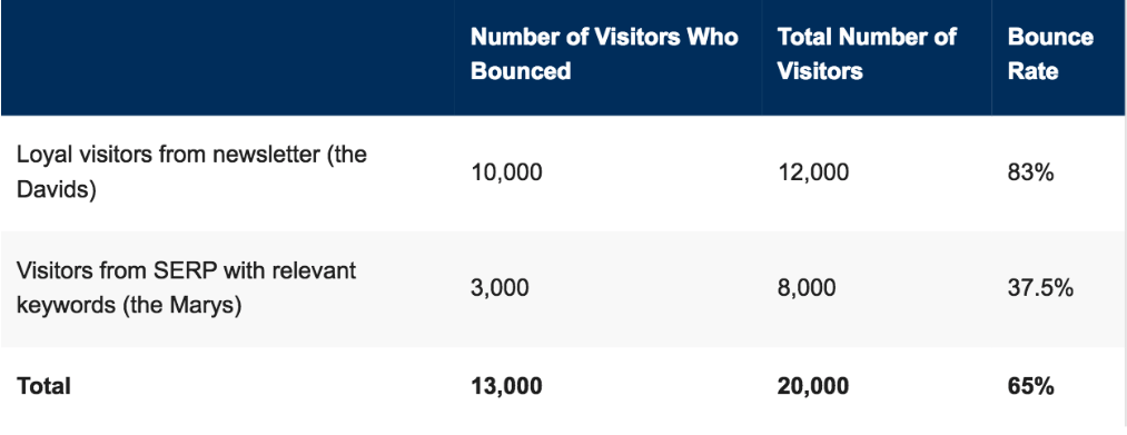
For example, say a page on your site has a bounce rate of 65%. But when segmented, loyal visitors from the newsletter bounced 83%, and visitors who found the page from a relevant keyword bounced 37.5%. This suggests users coming from the SERPs page might find the content on this page more relevant to their search.
The case for optimizing for conversions
We touched on conversion rate earlier, but let’s formally define it:
Conversion rate
What is it?:“The conversion rate is the percentage of users who take a desired action.”
How is it calculated?: Divide the number of visitors by the number of people who take a desired action. (Visits / Conversions = Conversion rate)
For example: The percentage of website visitors who take an action on the site.
Often, increasing your conversion rate is the most efficient and effective way to make more money, increase subscribers, etc.
- Take this example:
- Say your website sells a course for $100 (Conversion Value (CV)). Your site has 100,000 visitors (V) per year, with a 3% conversion rate (CR). Your total earnings are $300,000.
The most effective way to increase revenue isn’t going to be growing your traffic or raising your price point—you’ll likely want to optimize your site for conversions.
A small bump in conversions can lead to a significant impact on your business with a smaller investment of time and energy.
How to optimize a page for conversions
Enter conversion-centered design.
Conversion design is the process of designing with a specific action in mind. The best practices for conversion design are rooted in aesthetically pleasing design principles and behavioral psychology.
Here are some best practices and principles conversion design.
Reduce friction
Have you seen those job applications that make you update your entire job history line-by-line after you just uploaded your enter resume? In the past, I’ve reconsidered applying for those gigs.
People value their time and speed matters.
In a study, Marketo tested five, seven, and nine field forms for accessing their gated content.
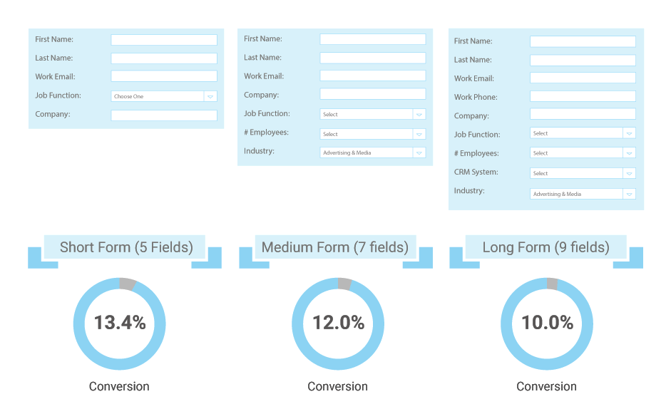
In this test, shorter form fields yielded higher conversions—and all at a lower cost-per-lead.
Less is more
Sometimes, attempting to collect more information than you need can be costly.
Expedia learned the ‘less is more’ lesson the hard way.
In their checkout process, they included an optional “Company name” field on the page to try to capture more data. Users mistook this to mean their bank name, added their banks address, and their card information wasn’t properly unverified.
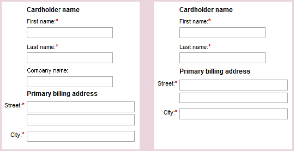
Whoops.
One extra data field was costing them $12 million a year.
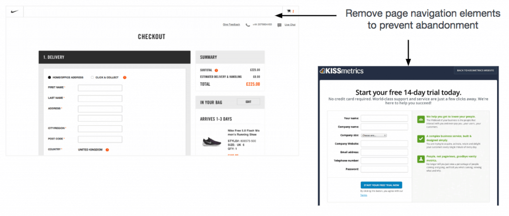
Remove distractions
We’re constantly distracted by people and things fighting for our attention — hoards of open tabs, pop-up chat boxes, and slack DMs.
If you’re looking to increase conversions at the point-of-purchase or sign up, removing distractions like site navigation elements can help keep users focused on the task at hand.
Incentivize action
Copyhackers’ Joanna Wiebe suggests using low friction words in your calls to action. “These are words that either let us achieve gratification passively or make something that is work feel less like work.”
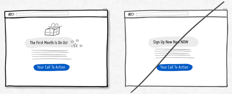
The more explicit you can be with what they’ll get in return, the better.
Build trust. Boost trust. Set expectations.
Trust is essential to getting conversions online.
Just like doing business in person, people want to feel comfortable with you before they do business with you.
Using strong language (like 100% money back guarantee) and graphical cues (Norton’s ‘Secured’ badge) helps users feel confident your site is secure and can be trusted with their information.
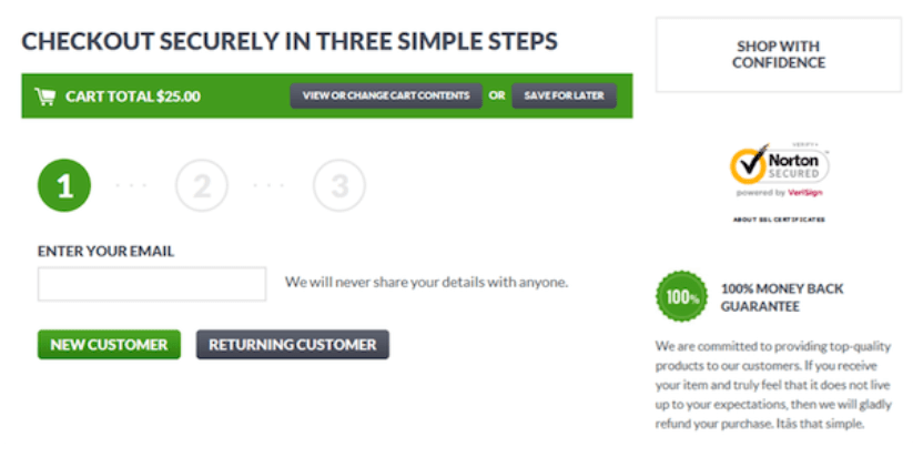
It’s also helpful to show users how far along in a process they are. Progress bars ease the tension of a multi-step process.
Use social proof
Social proof (a.k.a. peer pressure) in conversion design is based on the idea that people are more likely to convert/buy/sign up if other people already have.
Newsletters displaying how many people have subscribed, kickstarters showing how many have backed a project, hotels search results displaying how many people have already booked: these are examples of social proof.
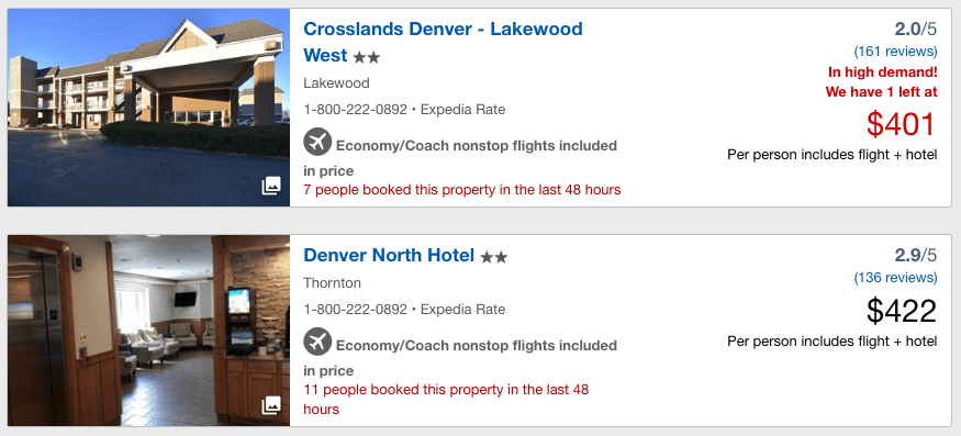
It’s a way of saying, ‘hey, don’t worry, everybody’s doing it’ to subdue your objections.
Create urgency
Urgency is a powerful way to capture users on the fence or struggling to make a decision.

Subtle (or not-so-subtle) cues suggesting a user acts sooner rather than later can have a positive effect on conversions.
How to use A/B testing to optimize your website
A/B testing is a simple way to compare two versions of a web-page, element, or app to see which performs better.
Per Optimizely, “two or more variants of a page are shown to users at random, and statistical analysis is used to determine which variation performs better for a given conversion goal.”
Former VP of Marketing at language-learning app Dualingo, Gina Gotthilf says, “you can’t predict what’s going to move the needle…anything you send out to your users — even a dot — yields valuable data.”
So how do you evaluate what to test?
Although you can learn something from each piece of data you capture, it makes a lot of time (and money) to focus your efforts on what to test.
Here are a few suggestions:
Look at pages and features with lots of traffic
The more traffic a page has, the greater the potential return.
Why?
It’s simple math.
Say you have two pages with the same conversion rate — 3%. One page has 10,000 views per month, while the other has 100,000 views. The same increase in conversions will have more impact on the page with more traffic.
Focus on products with a high value
Similarly, optimizing pages and promoting higher value products could yield better returns on your effort.
There are three variables at play: page views, conversion rate, and cart size.
This example pertains to e-commerce businesses: Let’s compare two products. Product A is $50. Product B is $75.
If we assume conversions rate and page views are equal, any lift in conversions or traffic would result in a higher monetary return for product B.
Estimate anticipated effort versus expected outcome
Finally, you should weigh the estimated time and effort you’ll spend versus what you’ll get from it.
Consider potential development roadblocks or implementation challenges that might make implementing a test more difficult. There’s no magic formula (that we know of) to make this determination, so just use your best judgment.
A/B testing rules and approach
Now you’ve got an idea of what you should be testing. Let’s talk specifics.
Lars Lofgren explains his system for A/B testing that lays out a simple approach and a few rules worth following if you’re implementing A/B tests.

Here’s a summary of Lofgren’s methodology:
The Approach
1. Stack incremental wins on top of incremental wins to get large wins over time.
“I set up my system so that the more I play, the more I win. I stack enough wins on top of each other that conversion rates triple. And any given test can fail along the way. I don’t care.”
2. Keep a backlog of ideas and always have a test ready to go
The more ideas you have to test in the queue, the better. You should be building your next test while the current one is running. This avoids wasting valuable data you could be testing.
When your test ends, you can roll right into the next one and keep the momentum going.
Of course, you’ll want to make sure you have the resources/capacity to do it.
The ‘Rules’
It helps to put some constraints around your approach so you don’t spend time overthinking.
1. Get 2000+ people through the test within 30 days
If you’re running an A/B test with traffic less than 2000 people in a month, you probably don’t have enough data to get actionable results from A/B tests.
Lofgren says, “If it takes you 6 months to run a single test, you’ll never be able to run enough tests to find the few winners.”
2. The control stands unless you’re getting > 10% gain and are 99% certain
Only make changes to the control if your tests see a 10% gain in the desired result at a 99% confidence interval. The standard marker for statistical significance is considered 95%.
So why recommend 99%?
99% confidence interval tests results tend to hold up better over time.
There’s a chance that test at just 95% confidence fall out of that range.
3. Run each test for 1-4 weeks
Each test should run for at least 1 week (to make sure you get enough data), and no longer than 4 weeks (to make sure you’re not wasting time).
For more detail on these rules, read Lofgren’s article.
Part 5: the intersection of influence, storytelling, and data
Now it’s time to help you sell.
After you’ve completed your SEO audit, customer interviews, or UX analysis, you’re ready to present your findings and suggest next steps—the way forward.
But your analysis has limited impact if you can’t communicate its value to others.
“There is evidence that people comprehend information in the form of stories,” says Williams. “Data analysis lends itself to story well. There’s always context behind the numbers that can help people understand the deeper meaning.”

Take these two examples:
A typical data report: We’ve seen a 10% increase in traffic to our product pages of the last month.
When I hear this on its own, I’m left with more questions than answers. *yawn*
What happens if we add a short story?
Data contextualized in story form:
My colleague Sarah started testing copy changes on our product pages 6 weeks ago. She focused on updating the copy to align with our new high-value customer personas. After investigating, I decided to do some analysis. I found that not only did we see a 10% increase in traffic to product pages, but it’s converting better, too. More people are filling out our contact form at higher rates, too. Tailoring our copy to specific users has a positive impact on traffic and conversions.
When you read the second version, you want to know more. The context engages you. I can hear the follow-up questions. And that’s good. Because you’ll need to have an open dialogue to be persuasive.
And that’s what this section is about. How do you sell your ideas and convince stakeholders to implement your recommended solutions?
In this section we’re going to cover:
- Why storytelling matters
- Understanding the science of influence
- A framework for telling data-driven stories
Why storytelling matters
As we touched on earlier, decision making is rooted in emotion.
“At the point of decision, emotions are very important for choosing. In fact, even with what we believe are logical decisions, the very point of choice is arguably always based on emotion.” says Jim Camp.
That means our charts and graphs and bullet points aren’t compelling enough on their own.
However, when you combine effective data with good storytelling, you can have an influence on outcomes.
Understanding the science of influence
You can leverage the science of influence (yup) to help you tell more compelling stories.
Fortunately for us, Robert Cialdini wrote a whole book about it.
In it, he talks about 6 principles that move people to change their behavior.
- Reciprocity – By giving without expecting a return, people are more willing to give back. Laying the groundwork early as a resourceful teammate can pay dividends later on.
- Scarcity– Basic supply and demand. The less there is, the higher the demand. Expressing the urgency of capitalizing on an opportunity can be persuasive.
- Authority – People tend to follow people with authority — professors, experts, etc. Citing other industry leaders or competitors helps pull those levers.
- Consistency -We tend to behave in ways that are consistent with our previous behavior. Call back to the previous alignment of POV that supports new information you’re presenting.
- Consensus – People follow the leader. By understanding the key person to influence to gain consensus, you can lessen your workload.
- Liking – Just be nice. People are more likely to listen to you. 😊
A framework for telling data-driven stories
Annette Simons, author of Whoever Tells the Best Story Wins, says, “facts are neutral until people add meaning to those facts. People stick with their story even when presented facts that don’t fit, instead of choosing to interpret or discount facts that don’t fit. This is why facts are not terribly useful in influencing others.”
Stories are powerful.
Professor of Entrepreneurship, Craig Wortmann points out that stories do two specific things that facts do not: “They provide context, and they connect to emotion.”
From that starting point, here are a few ways to frame a story that will move listeners:
- Distill – Rather than flipping through a 40-page deck, keep your presentation succinct and to the point. Save the eloquence for Q&A.
- Believe it -If you don’t believe it, neither will the audience. If you don’t believe the data you’re presenting is compelling, save your breath. Belief clearly comes across and is the only is a prerequisite for your audience to care about your message.
- Provide context – Be sure to explain how your data is relevant to the larger problem you’re trying to solve, or the greater impact you want to make.
Conclusion
Part of our goal here is to arm you with key skills, tools, and information. The hope is for you to bring that knowledge back to your teams, apply it where it fits, and help your organization reach its goals.
This information should make you more believable, competent, and confident in your role. The skills and tools will help you execute the strategy and ideas. In a marketing landscape where interpreting, analyzing, and synthesizing information is invaluable, understanding these concepts will serve you well.
“We wanted to build a program that reinforced key digital marketing concepts. These concepts help our students accelerate their marketing careers. Students have been satisfied with the course — especially that it’s taught by a diverse and experienced group of instructors” says Bravais.
In the course, we go into more detail about the content covered in this article. You also get to apply what you learn in real-time. And studies show that you retain 90% of what you do.😉. Finally, students have the chance to connect with a quality, diverse group of peers in your industry.
And of course, hang out with us!
If you’re interested in learning more about the certificate program, visit the link here.
Additional Resources
- Ad Buying
- Customer Personas
- Free Tools and Templates (Xtensio)
- UX, UI, Usability
- No More Pogo Sticking: Protect Users from Wasted Clicks (NN Group)
- The Difference Between UX and UI Design – A Layman’s Guide (CareerFoundry)
- Good UI Ideas (GoodUI.org)
- The Design of Everyday Things by Donald Norman
- SEO
- An Advanced Intro to SEO (Webris)
- Storytelling and Persuasion
- How to Give a Killer Presentation (Harvard Business Review)
- Other Resources