What actually makes me want to go to a venue based on its website

By a web design engineer, former concert photographer, and avid concertgoer.
I’ve gone to a lot of concerts. I used to photograph them too, which means I spent a lot of time in venues and even more time figuring out what was happening at venues. I also happen to work in web design as a Staff Engineer. So when I visit a venue website, it’s a little hard to just browse casually. I’m immediately noticing what about the site makes me excited to visit and what quietly pushes me away. Here’s the top three things I’m looking for:
1. The events
What actually makes me most want to visit a venue is pretty self-explanatory: the events. Therefore, on a venue website, I want to see those events as soon as possible. When I land there, I’m hoping the shows are already visible.
I’m not really taking a ton of time to look at the giant splash image or a marketing paragraph, only enough to grasp the ambiance. When I do get to the events, I don’t want to hunt through confusing calendars. I want to scroll, scan, and quickly understand what they have to offer right away.
Really, having a simple list available works incredibly well. Artist name, date, and a thumbnail image. Lists communicate a lot with very little friction, and a simple image helps too because you can instantly recognize a band or the vibe of an event. That’s enough for me to decide whether I want to click into more detail.
2. How easily I can get tickets
The second very important piece is the call to action. The more clicks it takes to get to the ticket page, the less likely I am to finish the process. A clear CTA button that says “Tickets” is an easy and accessible option.
This is something ticketing systems forget all the time. The entire goal should be helping someone buy a ticket quickly while they’re excited about the show. But a lot of sites accidentally introduce friction. You click the event, then another page, then a ticketing page, then a redirect, then a verification step…then a queue.
At some point you just think, I’ll do this later. Especially on mobile.
Ironically, a lot of that friction is meant to stop bots. But bots don’t get annoyed. People do. Adding hurdles to slow down bots often just punishes the real audience. If a venue has to choose who to prioritize, it should be the person who actually wants to attend the show.
Clear calls to action also matter more than people realize. The word people are looking for is usually “Tickets.” When language is consistent across the site, it becomes easy to scan and act quickly.
This gets harder for venues that host lots of different types of programming. Concerts, talks, community events, rentals. Suddenly the site has to explain a lot more. That’s where clear, accessible copywriting matters even more. Consistency helps visitors understand the structure without thinking too hard about it.
3. Correct and timely information
My biggest pet peeve, however, is when a venue stops updating the website.
I’ve seen events and cancellations announced only on Instagram. The official site stays frozen while the real information is scattered across different platforms, and even though social media has become an undeniable part of our lives, there’s still a lot of people who don’t use these platforms or are not logged in all the time. This creates a bunch of friction for users. If I’m trying to decide whether to go somewhere, the venue website should still be the source of truth.
Because ultimately the site isn’t just a list of events. It’s about communicating the experience of the venue itself. The challenge is balancing that storytelling with clarity.
But if I had to pick the single thing that determines whether I stick around on a venue website, it’s this: how fast can I see what’s playing and buy a ticket.
Everything else? I can take it or leave it.
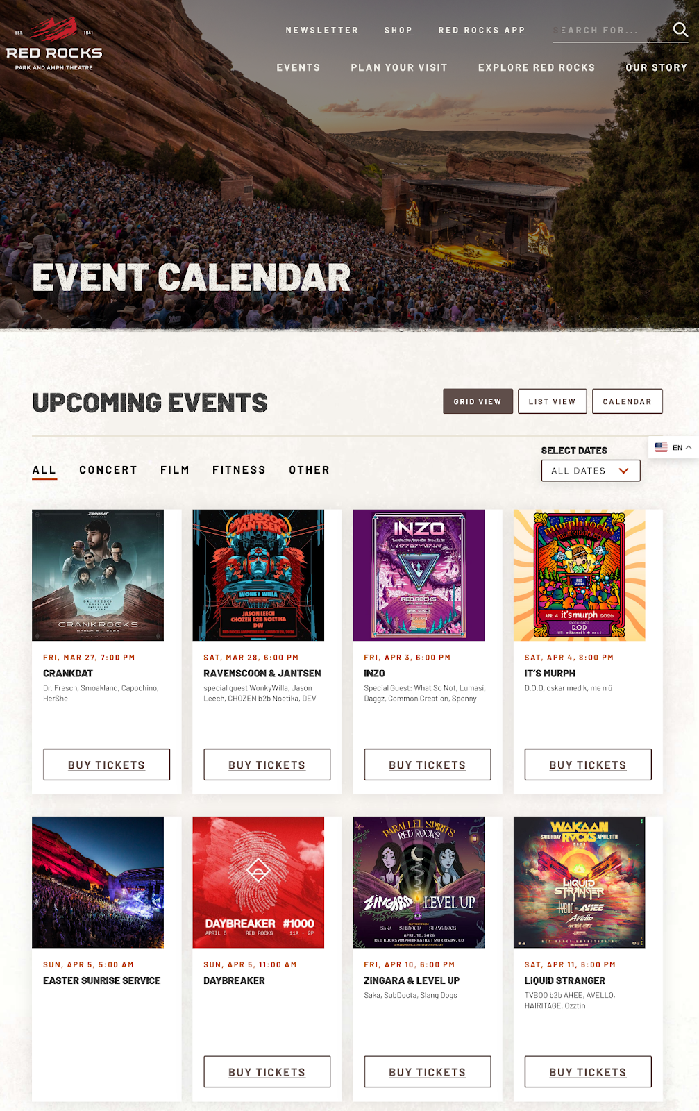
Case study: Red Rocks Amphitheater
- Allows a user to view events in multiple formats (list, grid, calendar).
- Has a consistent ‘Buy Tickets’ button, as in, if an event requires tickets, it shows it. If it doesn’t, it hides it.
- Ticket links are outbound links to their ticket provider, AXS.
- I like that you can filter by categories, which is handy if you know what you want.
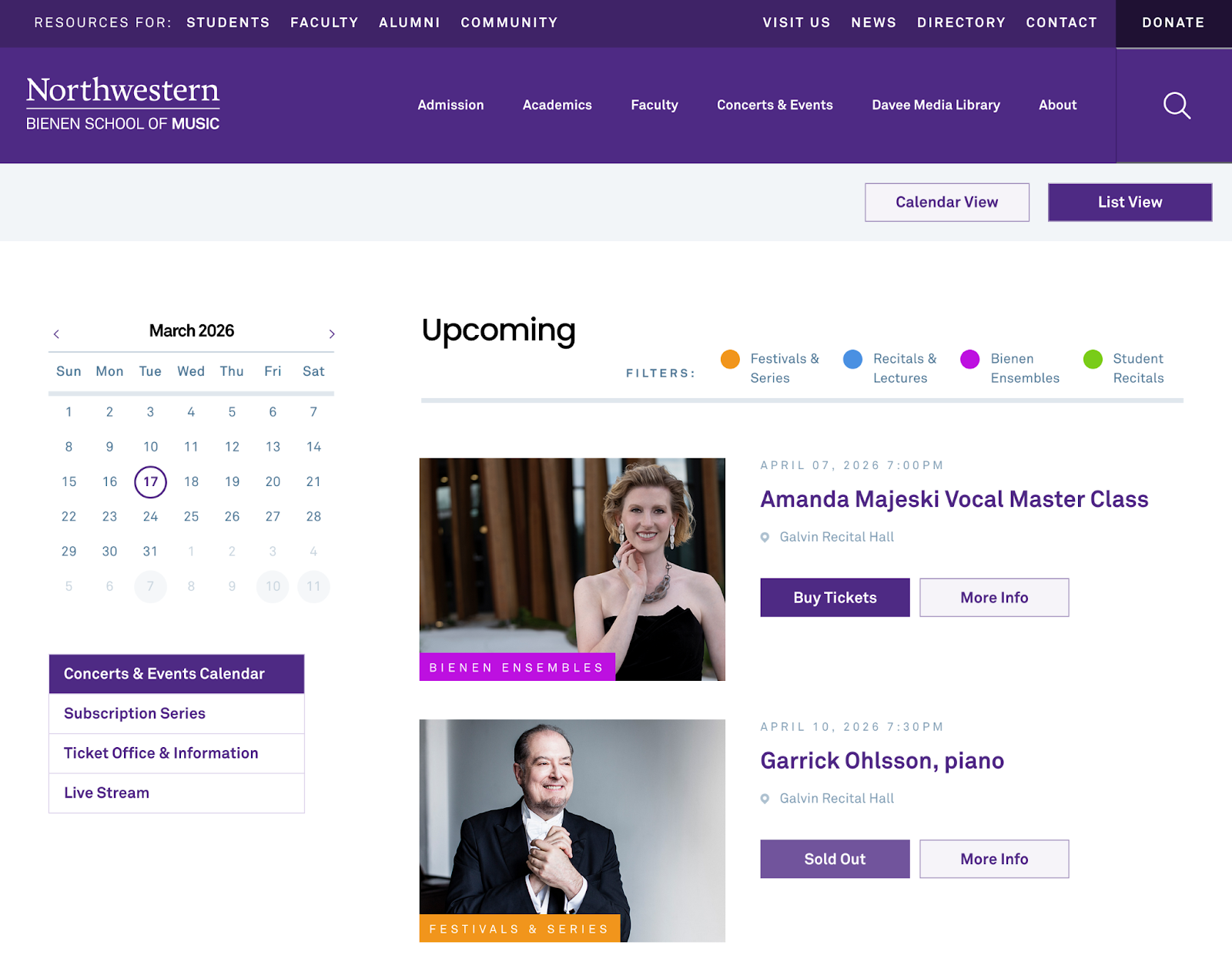
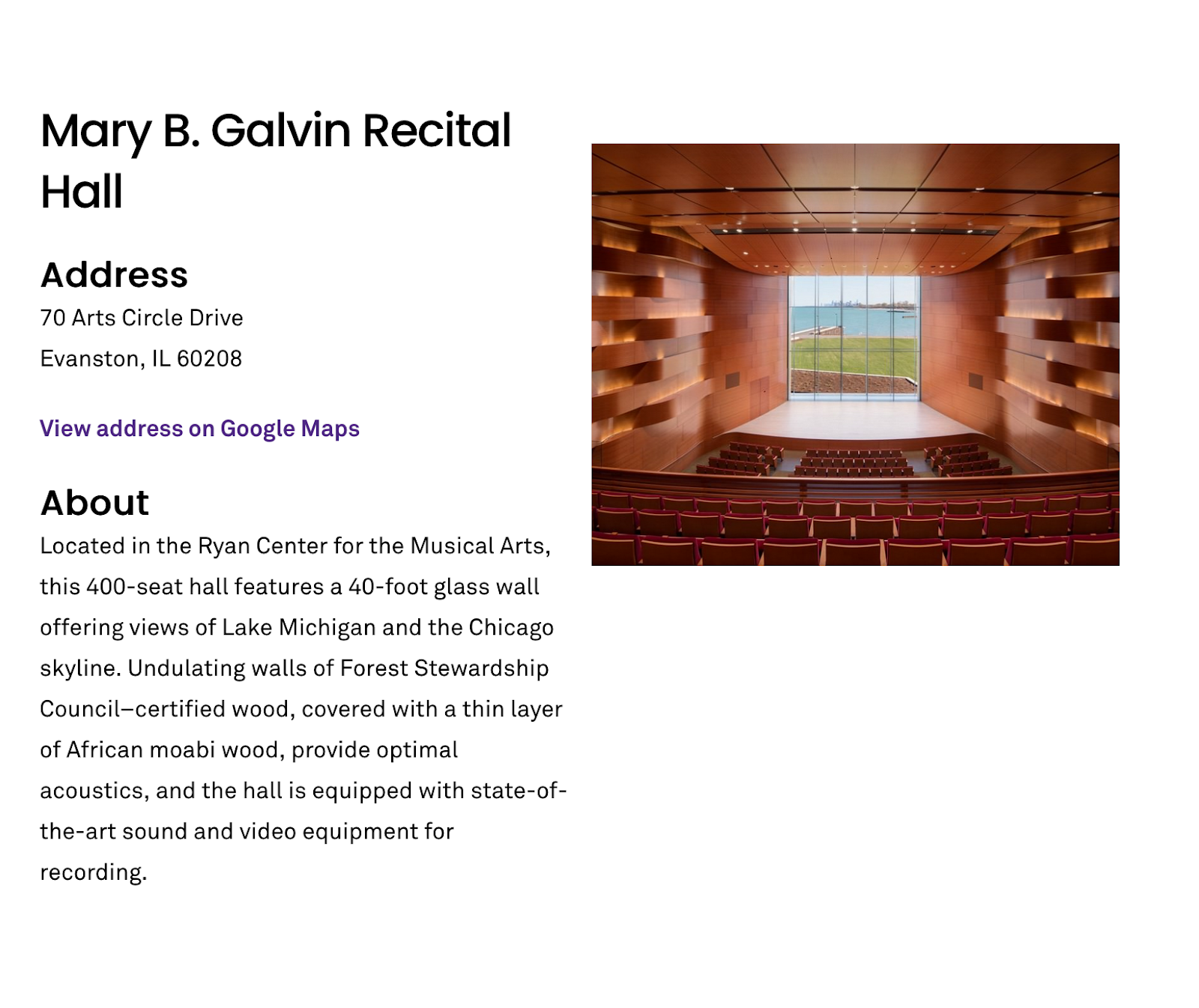
Case study: Northwestern Bienen School of Music
- Great color coded event tags.
- Their detail pages give background on the performances and events.
- Since they have multiple locations, at the bottom of each event detail page is a note about which venue the event will take place in.
- Their ticket links change and denote if an event is free or not.
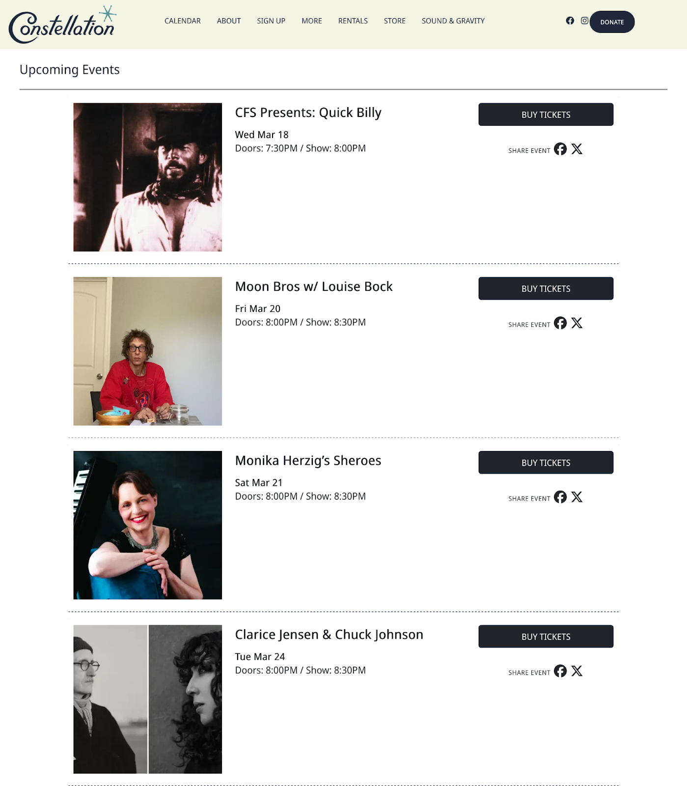
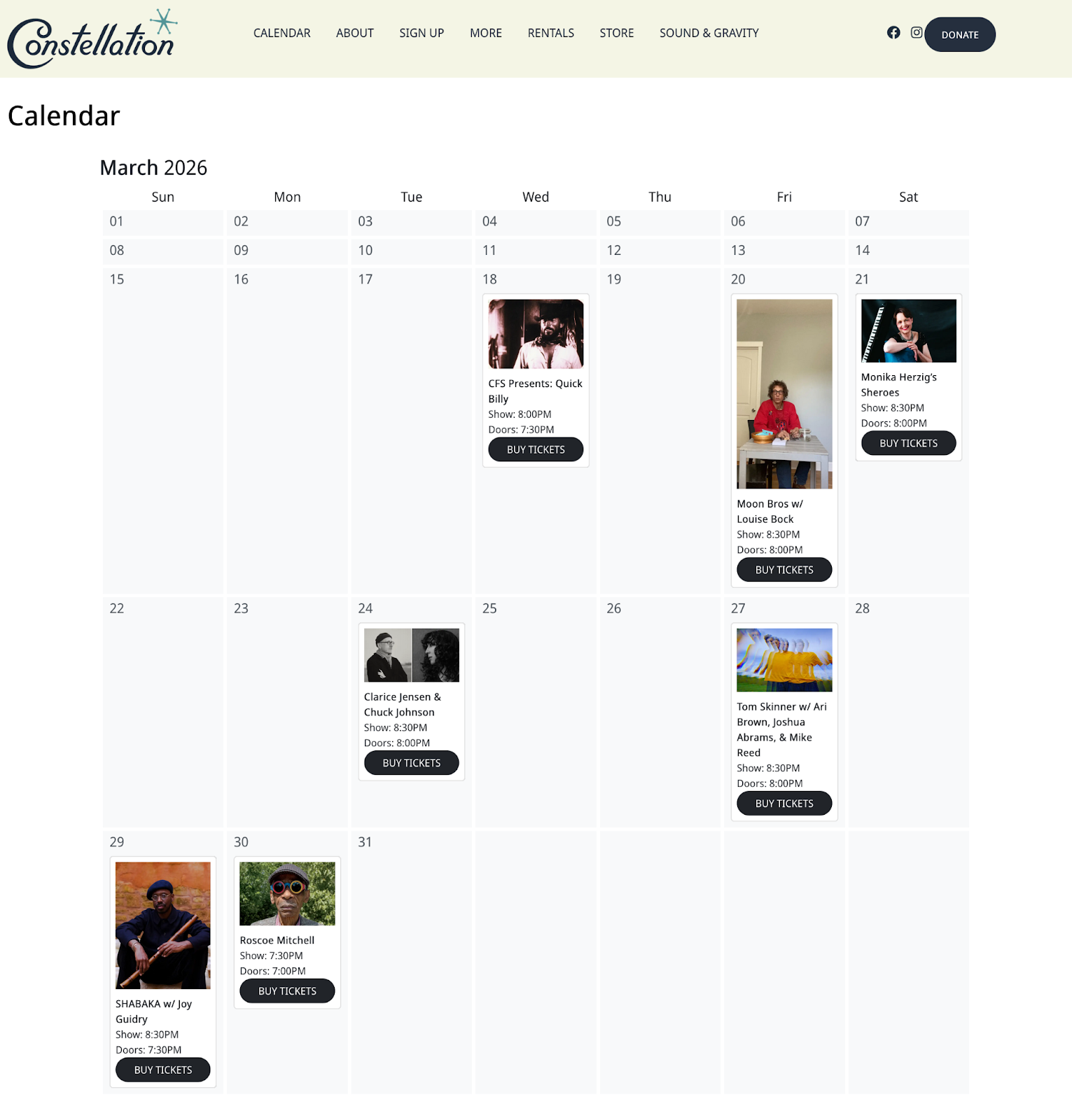
Case study: Constellation
- When you land on their site, their upcoming events are front and center. No headers or clicking around.
- Very simple (in a good way), fast site. Gets me directly to the events as soon as possible, while leaving me room to view other pages if I want to learn more about their work.
- They have a calendar view that includes thumbnails and times.
- Ticket links go to their ticketing service.