Build something that rocks.
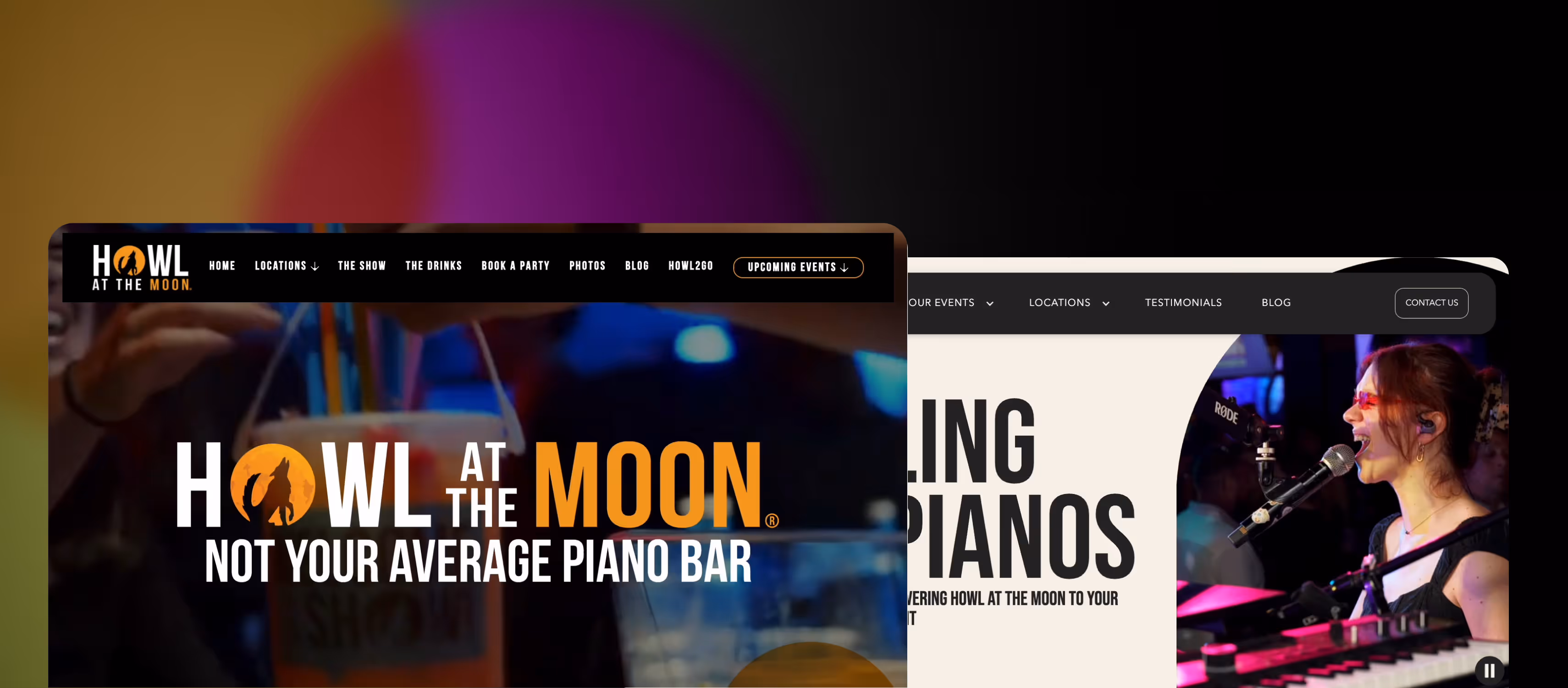
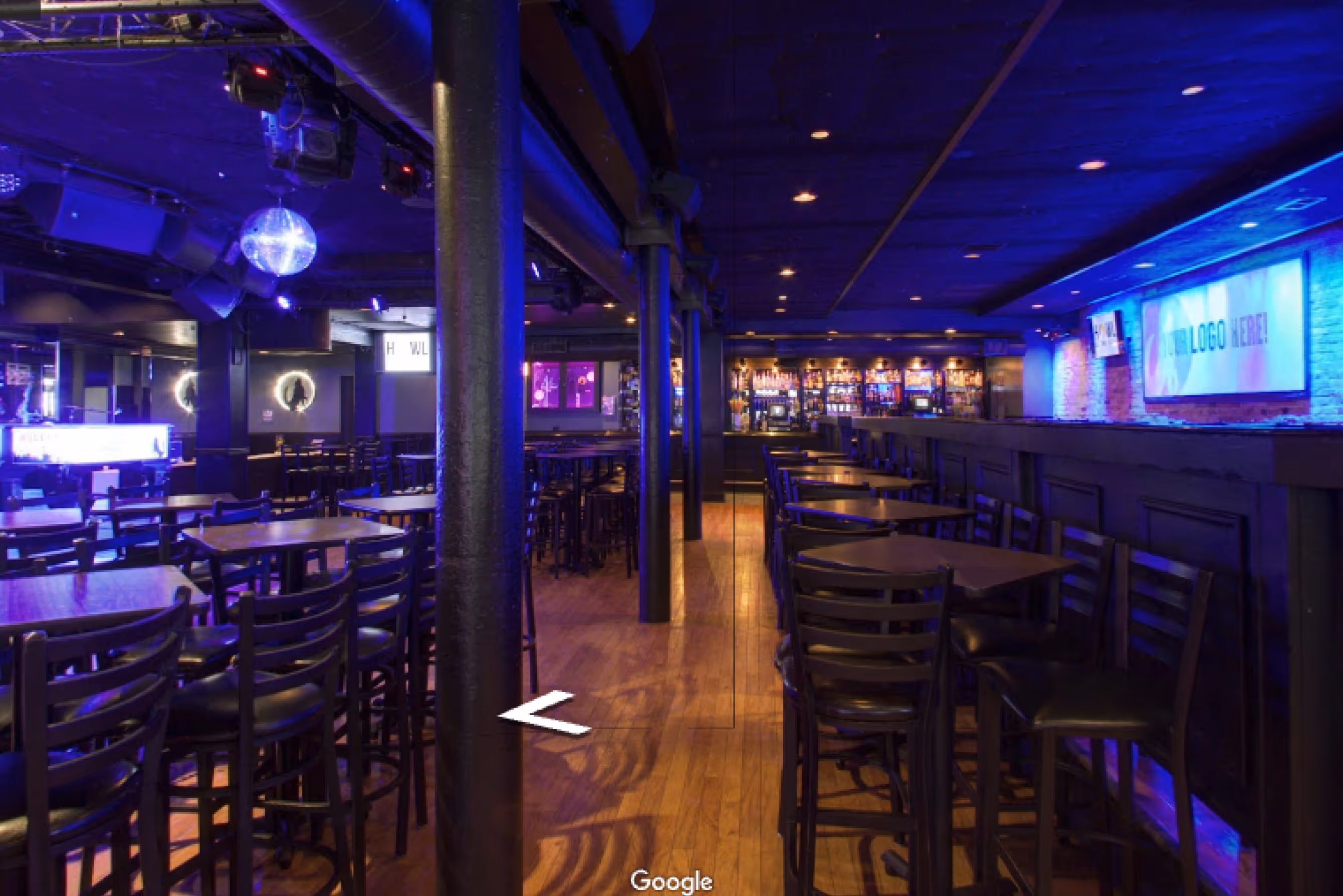
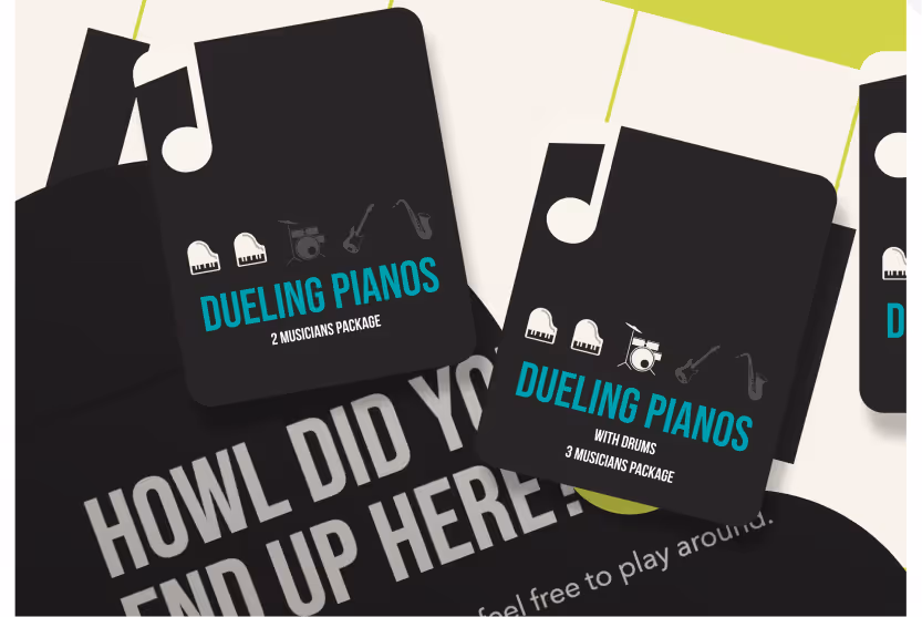
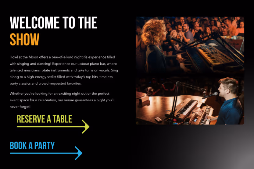
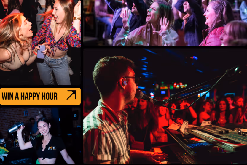
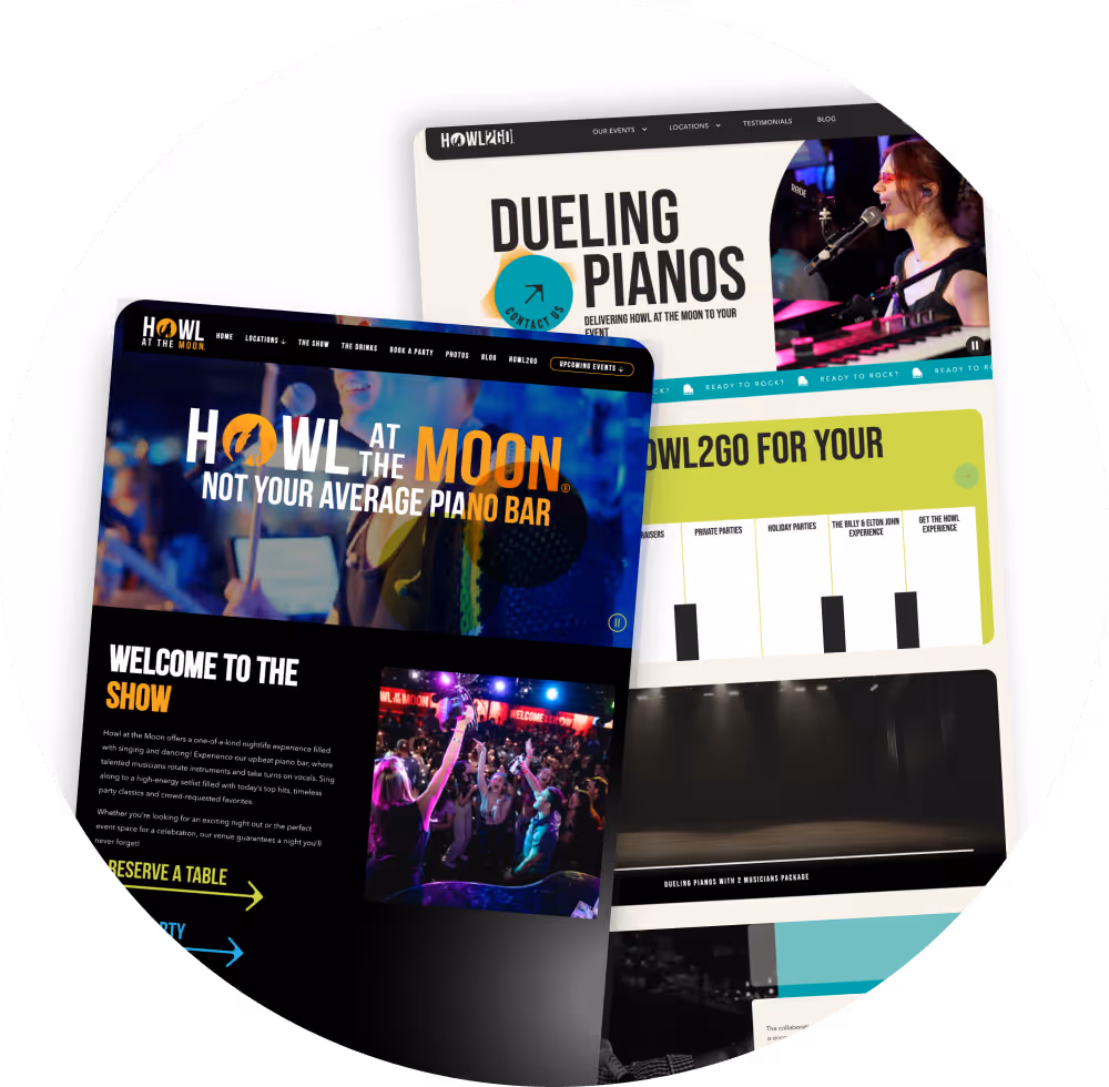
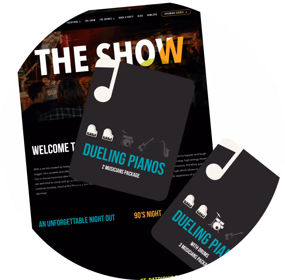
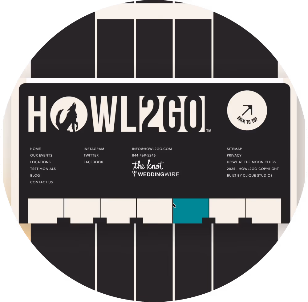
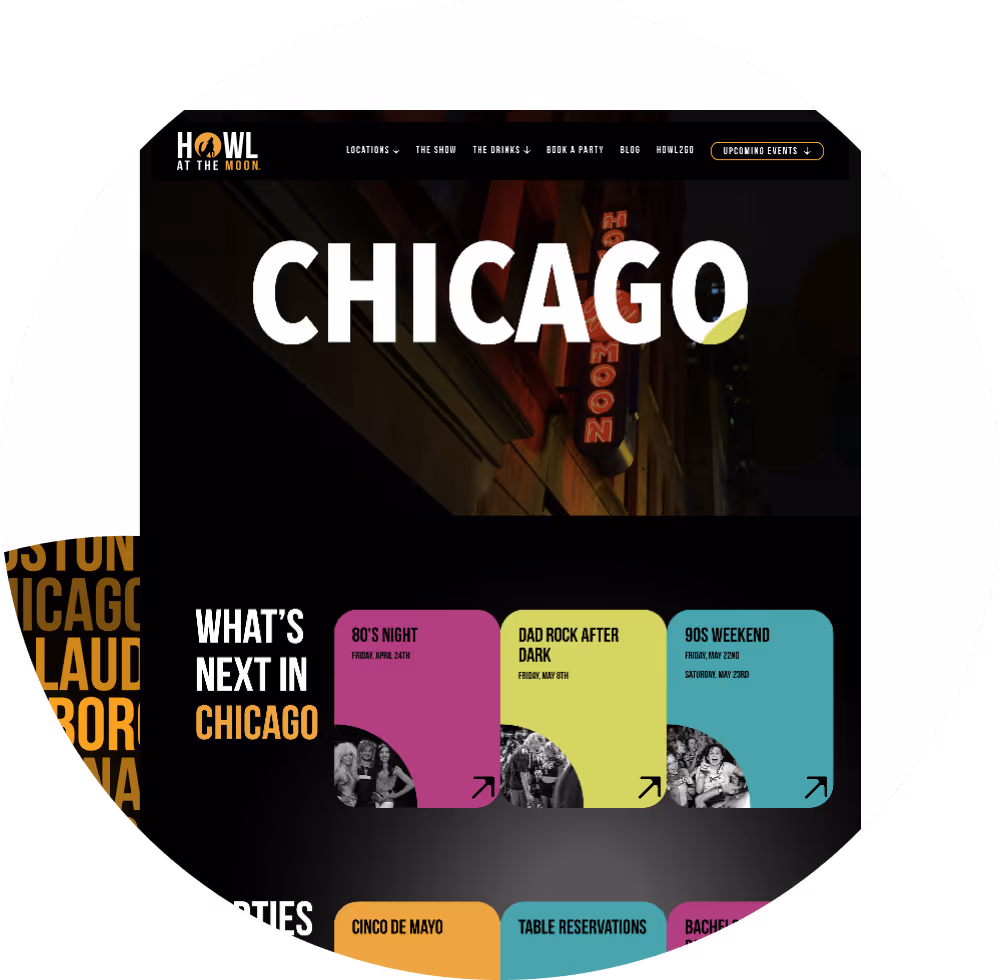
A night out at Howl at the Moon (HATM) is a one-of-a-kind nightlife experience, with singing, dancing, and an upbeat piano bar where talented musicians rotate instruments and take turns on vocals. With locations across 14 cities and 3 cruise lines, plus Howl2Go (H2G) bringing the party directly to private events, HATM has built a national reputation for high-energy entertainment. Our partnership with HATM began with a bold goal: redesign both the main HATM website and the Howl2Go site to match the energy and scale of their experiences. The result is two vibrant, interactive sites that capture the magic of Howl at the Moon, streamline content, and prioritize engagement.
Welcome to the show.


One-of-a-kind experience
In sync
Showtime
Party favors
Encore
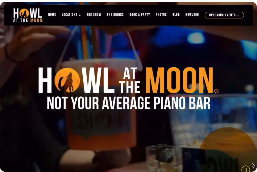
Not your average piano bar.
In sync.
Showtime.
Party favors.
Encore.


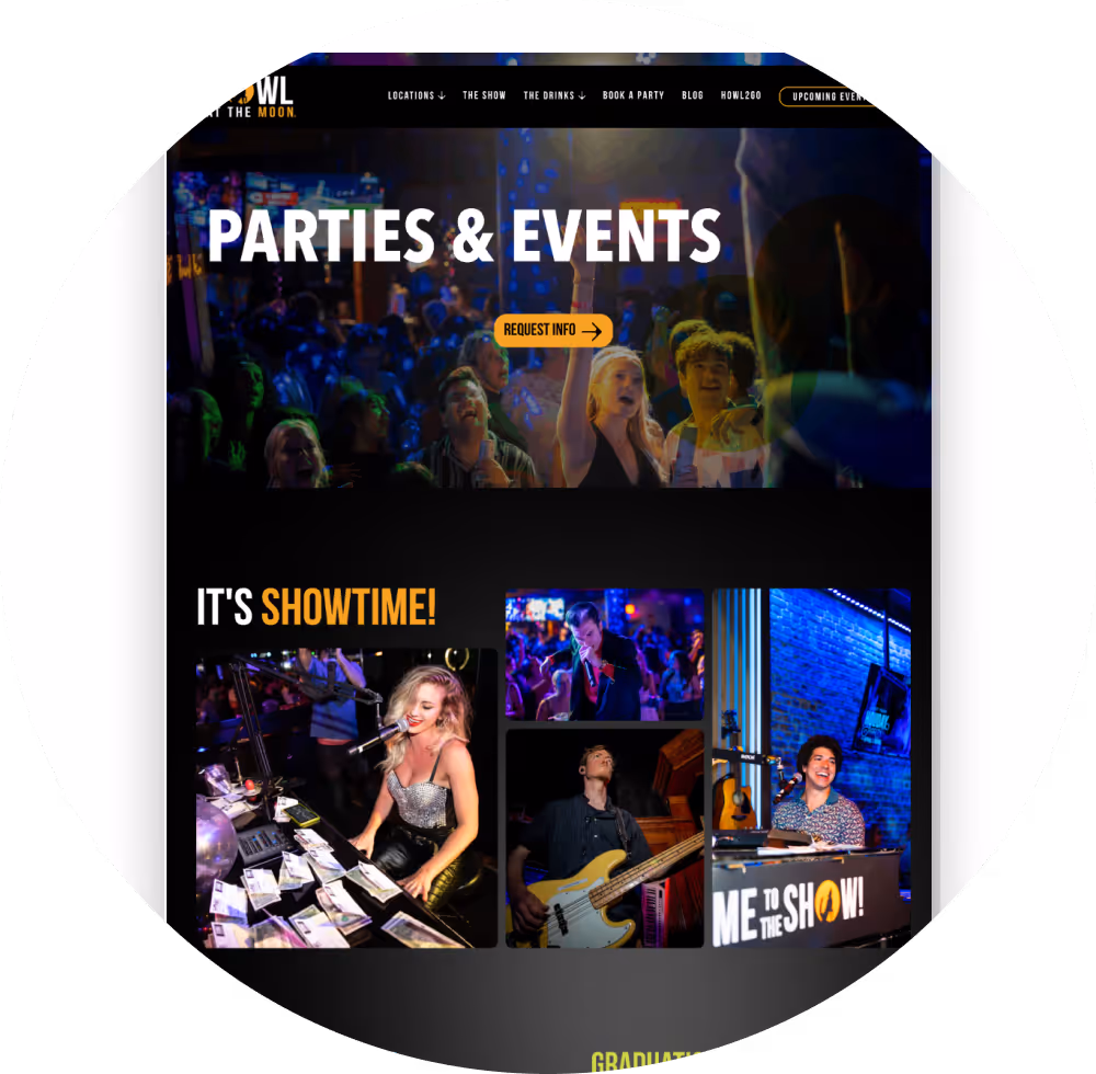
Now, when you go to either site, it genuinely feels like an extension of the live venue. (Like I said, we’ve become quite familiar. Call it working overtime.) It’s bold, interactive, and just plain fun. Howl at the Moon’s new website captures the nightlife while making it easy for visitors to explore events, locations, and booking options. Howl2Go’s site highlights private event offerings with a vibrant, playful design, clear calls to action, and optimized pathways for lead generation. All that to say…let’s keep the party going!

