
Best Practices in University Website Design

University sites are some of the most subtly complex around.
Often, they have hundreds of pages, dozens of departments, different audiences (such as prospective students, current students, staff, faculty, parents), all with competing priorities.
It’s a recipe for a confusing site and a frustrated user.
Some of our recent user experience work for leading universities has uncovered some best practices to avoid those pitfalls.
Group navigation by type
University websites can be have a lot of content, and not all content lends itself to being navigated the same way. Some pages are better found and consumed through discovery, while others are better served through one-click access. There are three main navigation types for most university websites:
Content-based navigation
These are your basic sections for About, Admissions, Academics, etc. with pages organized underneath them that lend themselves to being discovered and consumed. They should be displayed in the standard top navigation scheme.
Audience-based navigation
University websites have several well-defined audiences that frequent the site for very specific reasons. This includes faculty, staff, students, alumni and other potential audiences. One navigation strategy is to provide these audiences with a user-specific navigation to help them more easily find the content relevant to them.
Utility-based navigation
Remember when the only reason you ever used your university website was to get to “Blackboard” (or the chosen Course Management System of your university)? These tools that a user wants and needs now should be pulled out of the top-level navigation and grouped in a utility nav to give users one-click access. That includes things like the Registrar, Blackboard, and Academic Calendar.
Don’t break clearly established conventions in navigation
Prospective students often look at and compare multiple university websites in a short amount of time to decide where to attend (this is even more the case with advanced degrees). Do not be the University that tries to be super cool, hip, and different in the naming and ordering of top-level navigation. While you might want to call your Academics section “Getting Your Class On”, it’s going to be less likely to “stand out” and more likely to cause your users to ignore the page entirely. This is not the place to show your creativity—there are plenty of opportunities to speak to your uniqueness in other areas of the site.
Create a heat map
Heat maps are a good method in discovering common conventions. In a spreadsheet, list out your 30 closest competitors. Next to each university, list out all their navigation headings from left to right. Color code the navigation items across all universities to see trends (for example, all About pages are blue, Admissions is red, Academics is green, etc). When colors line up consistently, you’ve found a convention. For law schools, we found the first three navigation items should be “About,” “Academics,” and “Admissions” – after that, conventions broke down and we had some flexibility to be creative in naming and ordering.
Provide mapping
Bread crumbs
University websites have a massive page inventory. Show people where they are, where they have been, and where they can go to avoid user frustration by implementing bread crumbs. Communication majors will recognize this as the concept to “Tell the audience what you are going to tell them. Tell them. Then tell them what you tell told them.”
Be weary of hyperlink overload
Hyperlinks can be good. Too many hyperlinks makes users’ heads spin. In conducting user interviews, we found looking at a page full of hyperlinks results in immediate navigation to Google to search for the item sought, rather than clicking through the site. For resources pages, use buttons and content groupings to ease the headache and keep users on your site.
Make your “About Us” count
The folks over at the Nielsen Norman Group do a good job of laying this one out.
“The About Us page is one of the top places where prospective students go when deciding if a university is a good fit for them.”
Logically, this makes sense. And user stories are a great way to demonstrate this. For example—
“As a prospective student, I want to find out about the university so that I may determine if it is a good fit for me to attend.” -Anonymous user
Clearly delineate university programs and degrees
Prospective students want to know the university they are looking at offers the program they are interested in. On top of that, they want the ability to quickly and fully understand how the program differs from other programs offered at the university, and from similar programs at other universities.
In designing university websites, it’s important to keep in mind the massive amount of content housed within the site and the array of different audiences who are looking for it. Then, design to make it enjoyable and easy for those audiences to find the content important to them.
Some of Clique’s best university website designs:
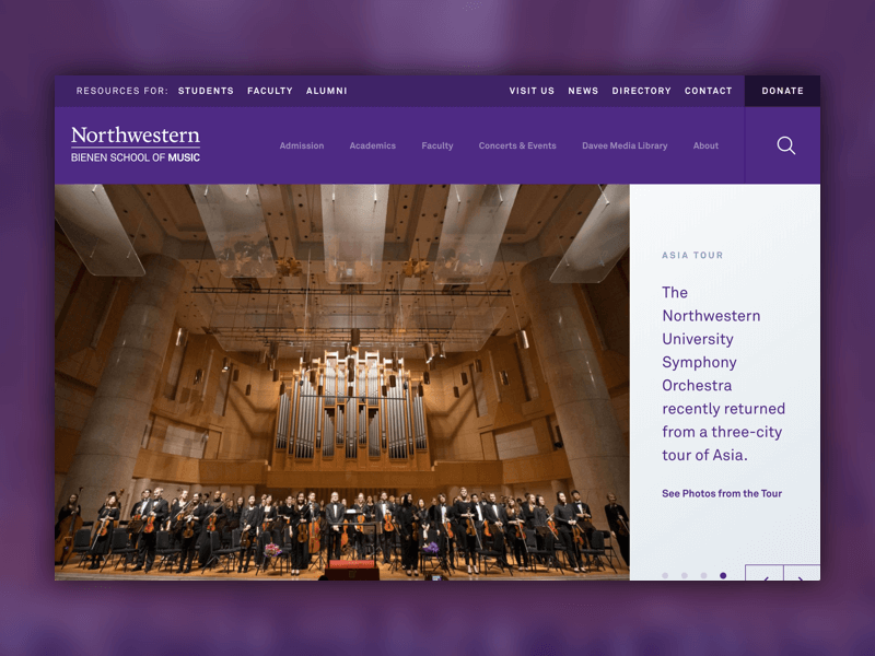
Northwestern Bienen School of Music
Check out Northwestern Bienen School of Music, which we wrote about here. As one of the best music schools in the world, they deserved a site worthy of that status.
University of Chicago GRAD
UChicago GRAD is the support system for graduate students at the University of Chicago. It offers advising, career planning, networking support, fellowships, and extracurricular activities, all designed to help students maximize their experience. The organization needed a modern, easy-to-navigate website to better serve their students.
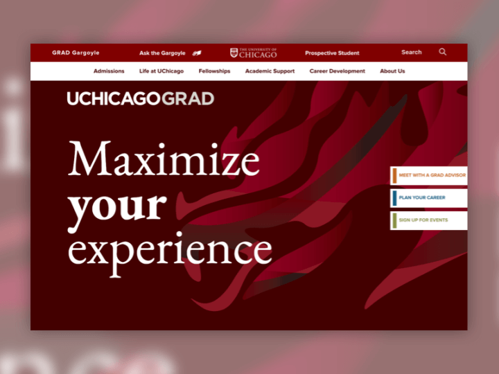
UX and Content Strategy were huge components for this project, as we streamlined their story and resources to better communicate with their key target audience: students. Through both internal and external stakeholder interviews, as well as content workshops, our team restructured their site to speak directly to students. The result is an engaging, strategically organized website that highlights UChicago’s dedication to help students navigate their postgraduate career.
Highlights:
- Simplified the site structure and navigation to align with the organization’s objectives
- Informed by internal stakeholder interviews, content workshops, and student interviews
- Designed flexible, modular templates to allow for administrators to customize each page and be prepared for future growth
- Implemented unique design elements to enhance the UX
- Sticky tabs on the right side of each page for easy targeted actions
- Enhanced filter capabilities for Programs page, the most frequently used page
- Highlighted the existing brand elements with modern animations and design
- Wrote custom copy for the homepage to speak directly to the students and better convey the organization’s mission
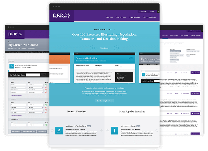
Northwestern: Negotiation Exercises Platform
- Designed and developed a platform for Northwestern University’s Dispute Resolution Research Center team that empowers educators with the ability to source, purchase, and build curriculum for use in their team based classrooms
- Interface UX enables users to manage both curriculum and student assignments
- Ability to track and assign student groups
- Ability to manage online purchasing of coursework
- Ability to track completion of activities
- Scalable solution designed to enable the business users the ability to grow their online database of course curriculum, manage user accounts, and manage online sales for the digital downloads being purchased through the platform
Other educational websites we’ve designed:
Hinsdale Public Library
The Hinsdale Public Library has been educating and inspiring the public for over a century. It has grown and evolved tremendously over that time period, and needed a website to reflect its role as a gathering place and curator of information for the Hinsdale community.
To show that this library is unlike any other, we needed a site unlike any other in the industry. To do that we designed outside the norms for a library website, shot custom photography to showcase the people and beautiful architecture, and developed a new content strategy that focuses on the community connection and the unique benefits the library has to offer.
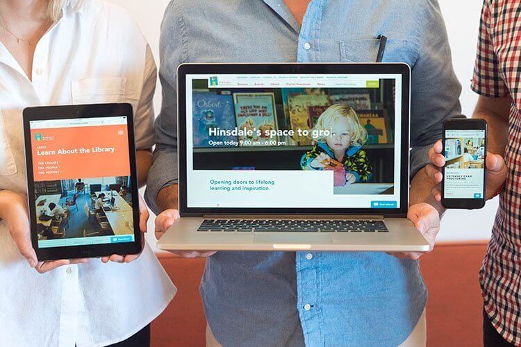
Some highlights include:
- Modern, user-centric design
- Custom photography & Content strategy
- Integrations with 3rd party platforms
- Communico
- Library Aware
- Olark
Libraries don’t have to be old and outdated…see for yourself!
Newport Children’s Academy
Newport Children’s Academy is a state-of-the-art academy facility located in Roscoe Village. Their mission is to serve the total emotional, physical, social, intellectual and creative needs of every child with well-rounded curriculum based on a variety of educational philosophies. As Newport was undergoing initial construction on their facility, Clique was hired to create Newport’s web presence alongside their brand ambassadors.
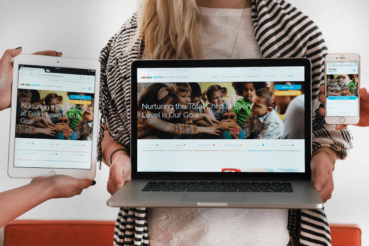
Clique designed and developed Newport a clean website offering parents and interested teachers critical information, organized by relevant grade and class. Throughout the site we added clear CTAs to easily get in touch with Newport to schedule a visit or enroll a child. It’s been a journey seeing the organization come together physically and virtually, we wish Newport and the little ones all the success!
